Mood Board

Stan Firm inna Inglan Black Diaspora in London, 1960-70s
This display presents works from the 1960s and 1970s by eight photographers who documented Black communities in London: Raphael Albert, Bandele ‘Tex’ Ajetunmobi, James Barnor, Colin Jones, Neil Kenlock, Dennis Morris, Syd Shelton and Al Vandenberg.
The photographs reveal the many and varied experiences of individuals who travelled from the Caribbean region and West Africa to live in London, from everyday family life to political engagement. They show people as they respond to, react against and move beyond the racial tension and exclusion that were part of life for Black communities in the British capital. The title of the display, ‘Stan Firm inna Inglan’, is taken from the poem It Dread inna Inglan by Linton Kwesi Johnson, who in the 1970s gave a voice and poetic form to the Afro-Caribbean diaspora and its resistance in the face of racism. The poem expresses in Jamaican patois (creole) the resolve of African, Asian and Caribbean immigrants to ‘stand firm in England’, asserting the determination of Black British communities to remain in Britain and declare it as their rightful home.
I chose to visit this display in particular because it shows the structure of society and how all the communities fitted together and integrated whether that be well or not at all.
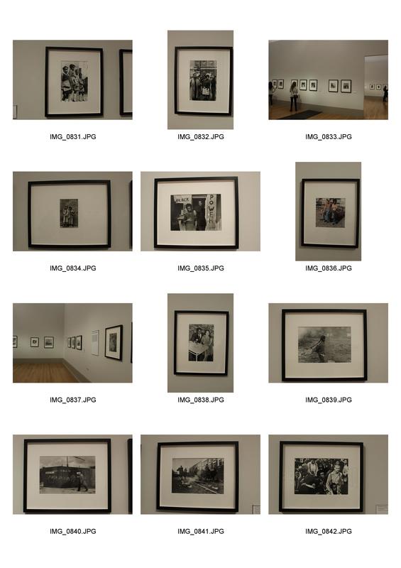
i took some photographs of my favorite photographs on display. i also tried to show the layout of the exhibition. i thought the way there was a white boarder, with a black frame, on a plain white wall ensured the SIMPLICITY of the DISPLAY wouldn't take away from the images and what they present.
THE RADICAL EYE: MODERNIST PHOTOGRAPHY FROM THE SIR ELTON JOHN COLLECTION
while going around the exhibition i answered some questions about certain pieces in order to prompt some thoughts about the structure of the photographs, focusing on the shape, form and composition.
|
What can be found in the composition?
A COLLAR WHOSE CURVATURE IS BOLDLY JUXTAPOSED BY THE CHEQUERED FLOOR. what is the main focal point drawing your attention?
The curvature of the collar. |

|
Ide Collar
1922 Paul Outerbridge |
|
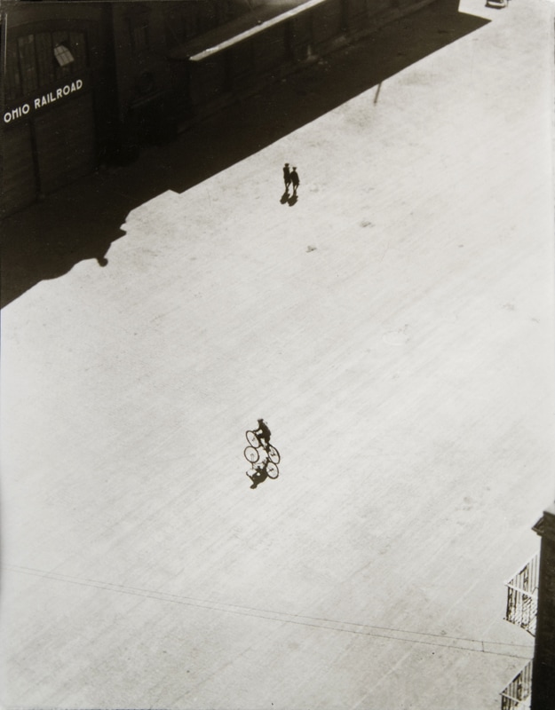
Boy on bike, below brooklyn bridge
1922 ralph steiner |
|
Why has the attention been drawn to one person?
in order to EMPHASIS the insignificance in comparison. Why has the SPECIFIc location been chosen?
It's in a city and a big wide open space. This shows the ENORMITY of the location in comparison to the singular person. |
|
how has the image been manipulated?
it has been flipped HORIZONTALLY and the POLARIZED (one is negative and one is positive) how has symmetry been used?
they are a mirror image of each other. there is also perhaps symmetry in terms of what the images represent (they've been inverted) |
|
|
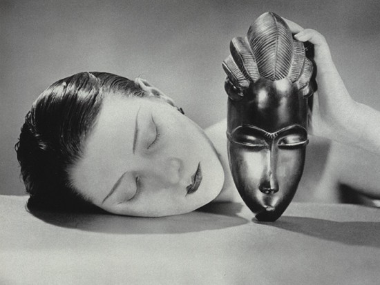
Black and White
1926 man ray |
|
a series of corner portraits
1948 irving penn |
|
describe 5 of the corner portraits:
noel coward: appears rigid, squished and UNCOMFORTABLE duke ellington: appears confident and comfortable gypsy rose lee penn: appears to own the space, very much in control and almost COMMANDING. joe louis: Appears to be slouching, down and tired. PERHAPS weary. spencer tracy: appears amused yet confident |
|
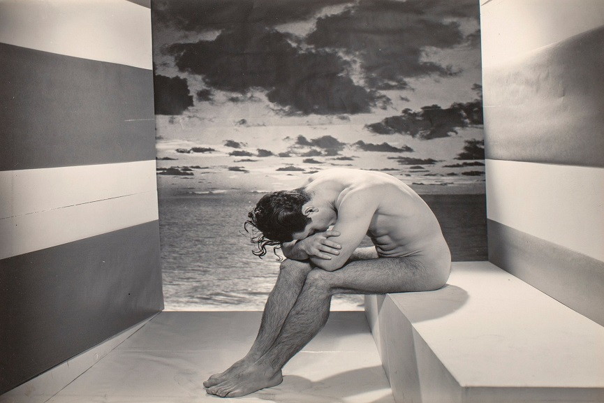
what is the model thinking?
It looks as if he is CONTEMPLATING life, perhaps STRESSED out at his reality or maybe he feels destroyed as if he has failed himself. how does the composition lead our eye?
The stripes on the walls automatically lead your eye towards the centre of the photograph, where the subject is positioned. |
|
a forgotten model
1937 george platt lynes |
|
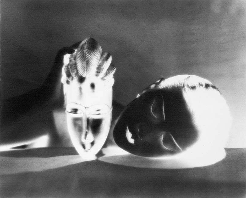
Glass Tears
1932 man ray |
|
describe the image as if you were explaining it to someone on the phone.what might her gaze and tears mean? compare fake and real.
taking up the vast majority of the frame is a women's face. she's glancing into the distance as if she were in deep thought. on her face they are many small glass balls seemingly representing tears. their is a contrast between the supposed truthful expression and the fake tears. perhaps it shows how he thinks his partner feels, hurt to some extent by not entirely heartbroken. maybe he felt beTRAYED by his partner's shallowness. |
|
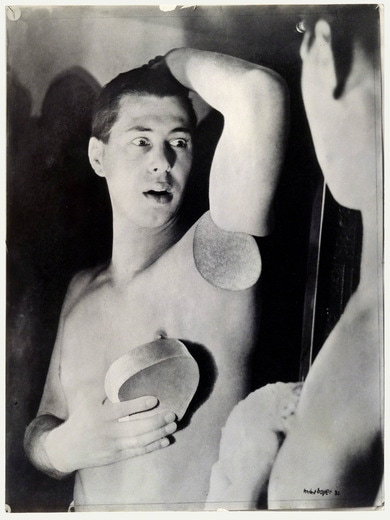
what is the main focal point drawing your attention?
the shocked expression on the man's face. how do you think it was made? processes used?
photomantage was used, bromil getatin silver print with gouache and airbrush on paper. |
|
Humanly impossible
1932 herbert bayer |
|
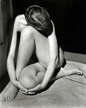
nude
1936 edward western |
|
what types of shapes can be spotted in the image?
the curvature of her body CREATES many INTERESTING shapes, however, many of the shadows also make sharp lines. how has the photographer used lighting and contrast?
the lighting draws attention to her, she is well lit yet the background is dark, this contrast powerfully EMPHASIS'S her shape and form. |
|
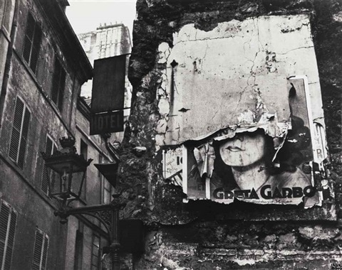
how has the PHOTOGRAPHER positioned their viewpoint?
they've positioned themselves UNDERNEATH the poster so they are looking up at it. what comment does this image make on the American Dream?
it shows he is looking up at it, as if it's something to be admired, perhaps could have religious connotations e.g. looking up towards heaven. however, the fact the poster is destroyed show the reality behind the american dream - that most people don't make it. |
|
greta garbo
1932 Ilse bing |
|
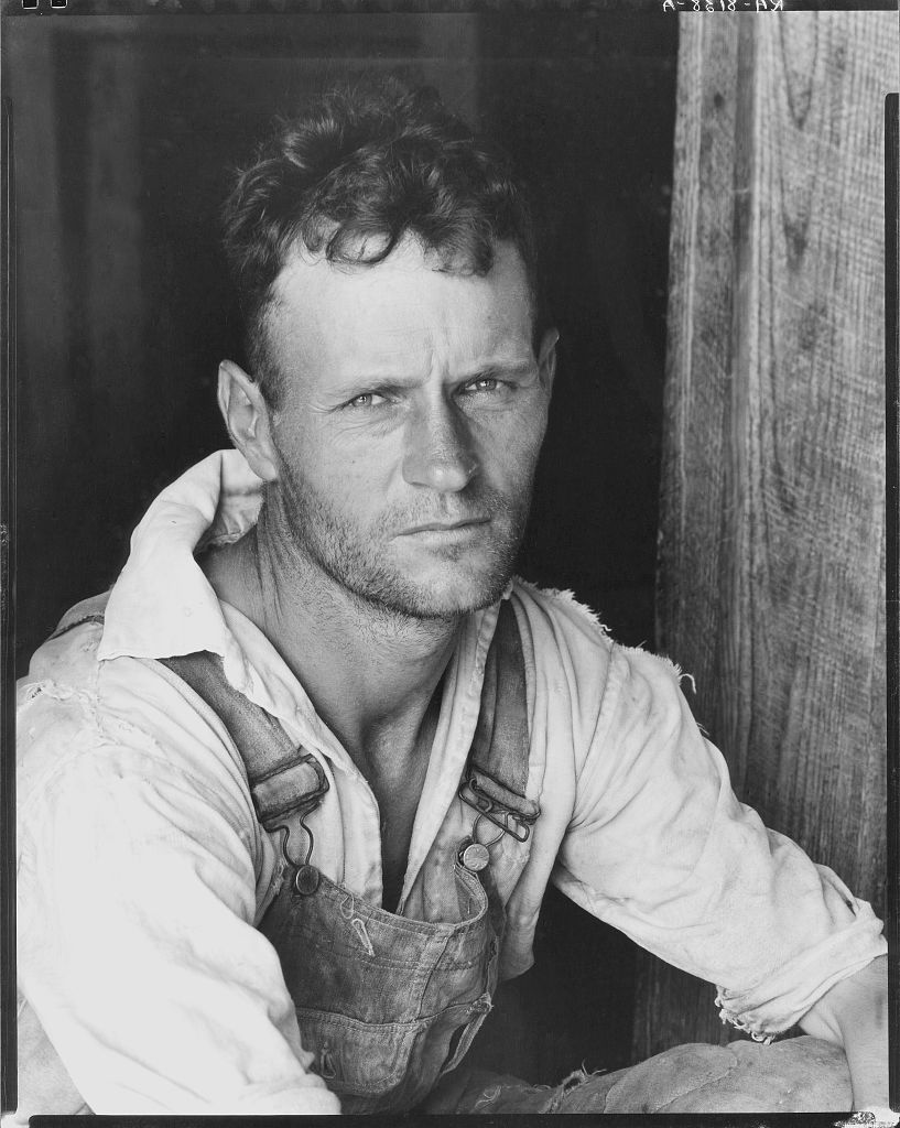
floyd burroughs
1936, printed 1950 walker evans |
|
what is the main focal point drawing your attention?
his weathered, tired eyes - they really express his feelings. how has the photographer used contrast and composition to direct our gaze?
the subject is well lit which is contrasted with the darker backdrop, this draws our focus towards him. he is also positioned in the centre of the frame which means he is the obvious and IMMEDIATE focus. |
|
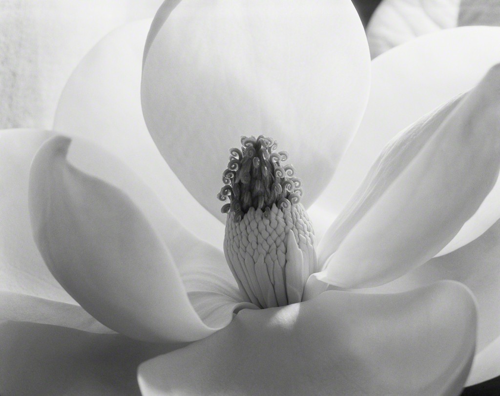
What can be found in the composition?
a detailed, close-up view of an opened flower taking up the whole frame. what is the focal point drawing your attention?
the pollen in the stamen of the flower, it's positioned right in the middle of the frame in order to instantly draw the viewers attention towards it. |
|
magnolia blossom
1925 imogen cunningham |
|
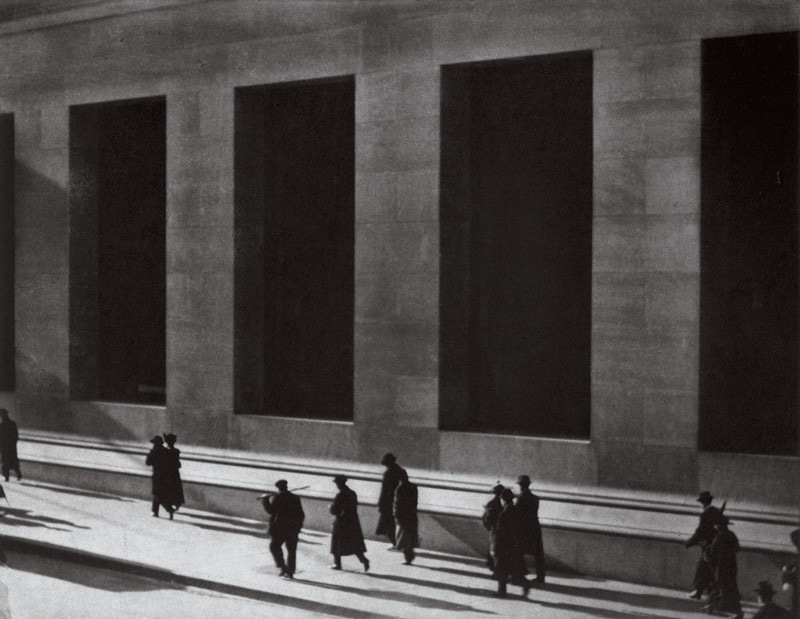
wall street
1915 paul strand |
|
how has the photographer POSITIONED their viewpoint?
looking behind and slightly down on the people. how has the photographer used light, shadow and angles to capture the essence of the modern city?
the darkness of the rectangles in the building could reflect the danger that the streets of new york present. the rectangles could also represent the grid like the structure of the city itself. however the light tone of the streets could show how the city is paved with hope and prosperity. |
|
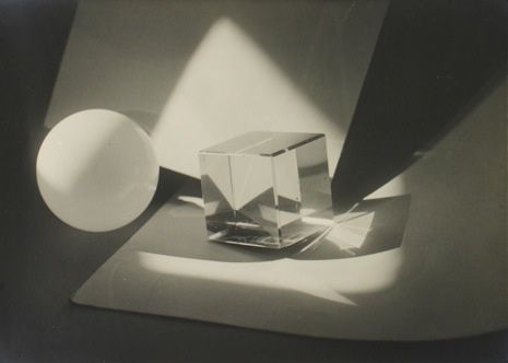
how has the photographer positioned the direction of the lights?
positioned at the top left, outside the frame. how has the image been manipulated?
the use of shadows have EMPHASIZED certain aspects of the image and hidden other parts. the reflections from the glass block also add distortion to the image. |
|
Photographic Construction
1923 jaromir funke |
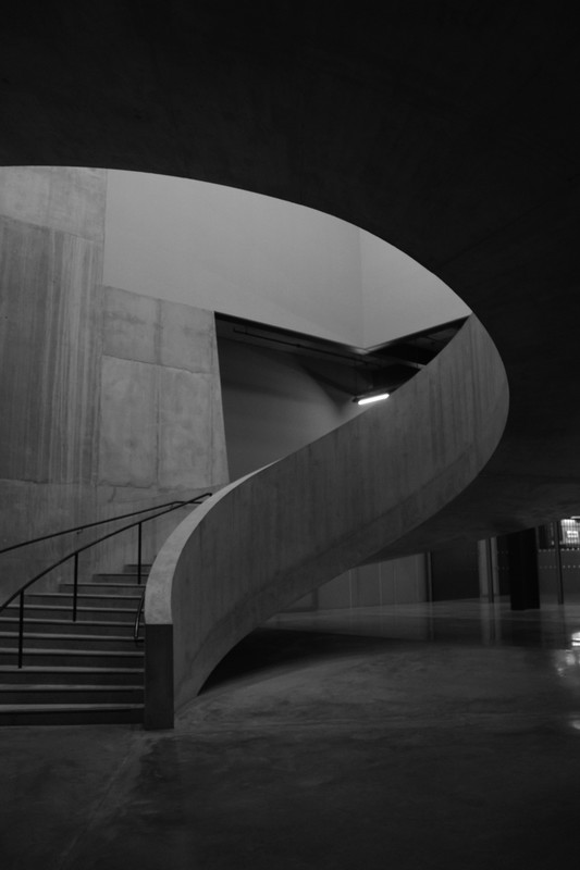
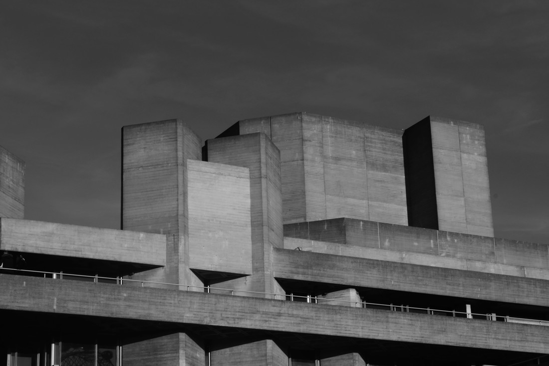
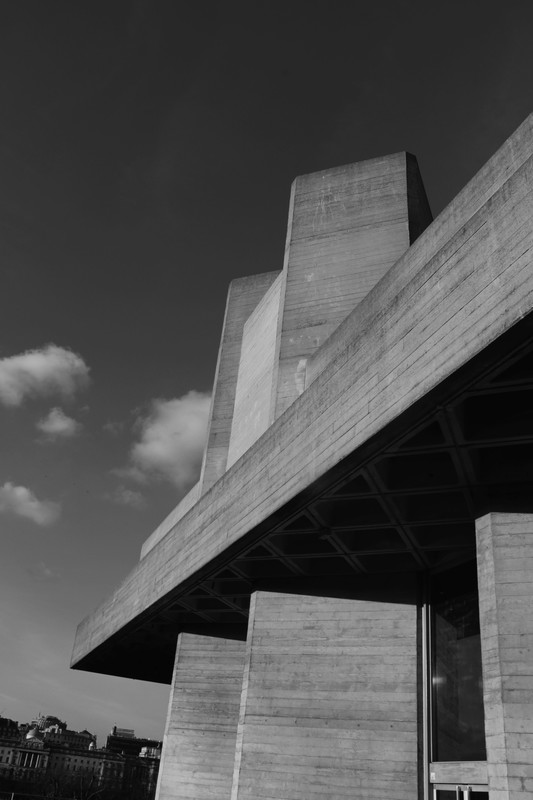
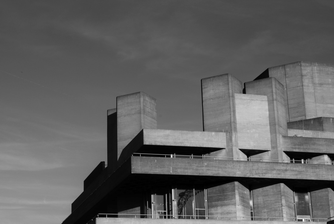
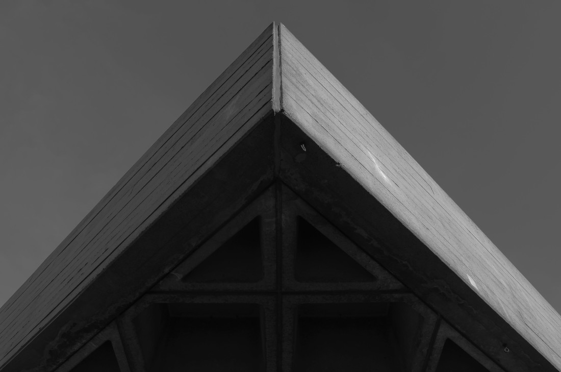
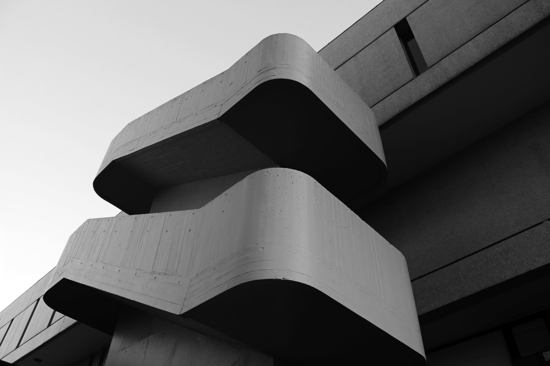
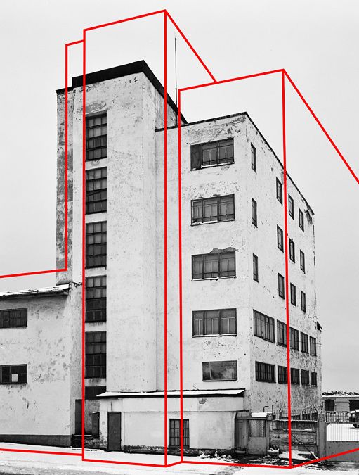
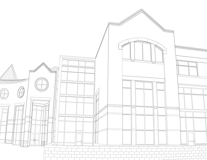
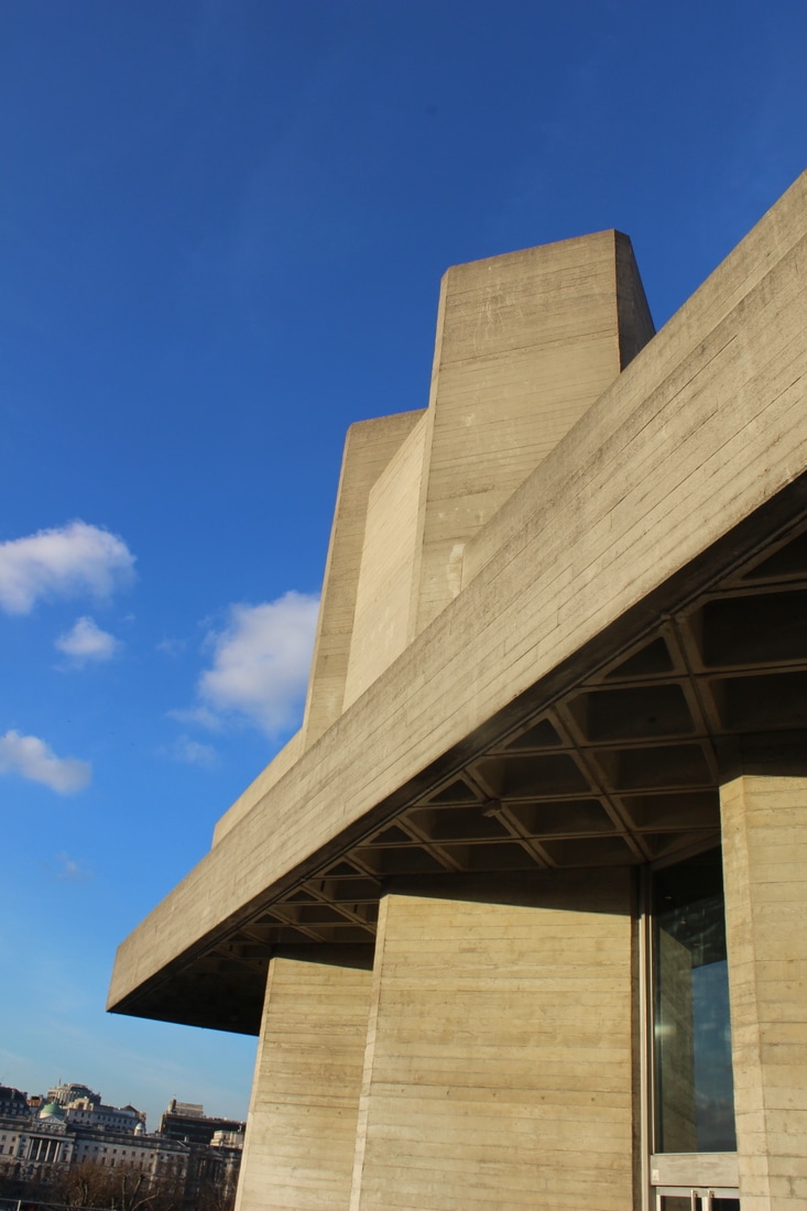
After exploring the exhibition i photographed the surrounding area from above and the proceeded to photograph interesting shapes and form within the building, many parts of the inside were made from concrete which SUITABLY links to the work photographing BRUTAList ARCHITECTURE.
contact sheet

edits
|
|
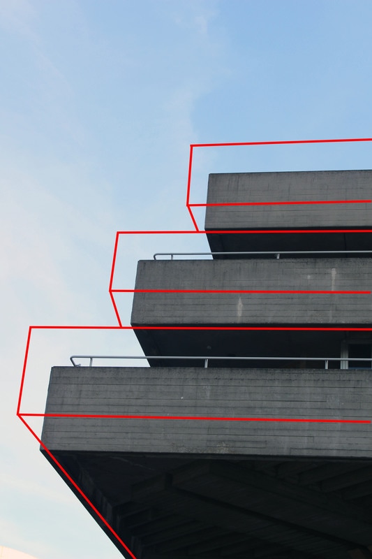
these photographs really place EMPHASIS on the the lines and interesting shapes that are used within brutalist ARCHITECTURE. especially in the photograph on the left, i like the contrast in tones between the area in the photograph where the light is travelling down through the building and where the light almost appears absent under the stairs.
Brutalist Structure
The term Brutalism was derived from the French ‘Béton brut’, or raw concrete, was a term coined for the futurist architecture being created by Le Corbusier and others like him. From this label the term Brutalism was created as a way to classify this style of architecture.The expression became associated with a movement emerging in postwar British architectural offices. The architecture itself is characterised by the large size of the buildings and the use of raw unfinished concrete. Brutalist buildings also make use of geometric forms in a way to attempt to communicate the buildings function and what the rooms behind the slabs of concrete are used for.
simon phipps has been photographing brutalist architecture across the uk for the last 15 years, he's created a body of photographic work that demonstrates the distinctive manner of this contentious architectural style.
example of his work:
simon phipps has been photographing brutalist architecture across the uk for the last 15 years, he's created a body of photographic work that demonstrates the distinctive manner of this contentious architectural style.
example of his work:
|
|
contact sheet

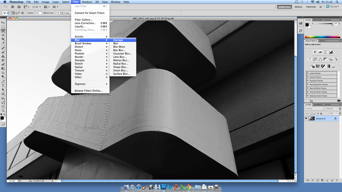
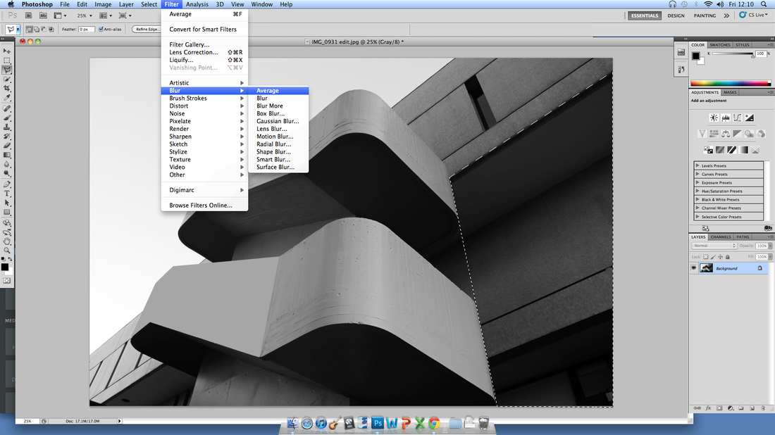
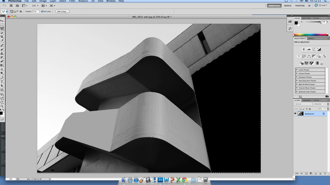
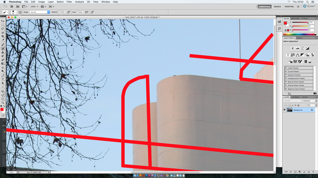
when editing these photographs i stuck to basic editing techniques to ensure the integrity of shape and form was maintained.

when needed i used the free transform tool along with the guide of the grid to ensure my photographs were straight.
|
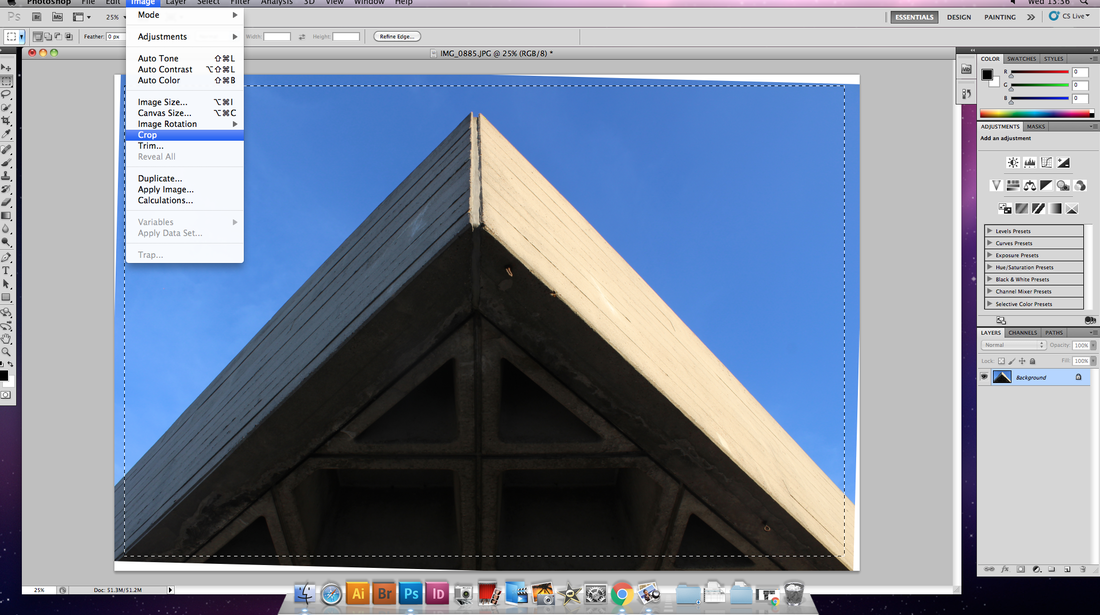
once the photograph was straight i cropped the photograph.
|

for all the photographs i adjusted the BRIGHTNESS and contrast in order to enhance the image and emphasis the shape and tone.
|

i then used the curves tool in order to further improve the overall AESTHETIC of the PHOTOGRAPH.
|
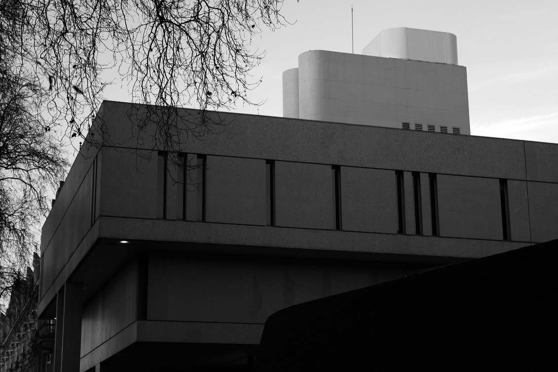
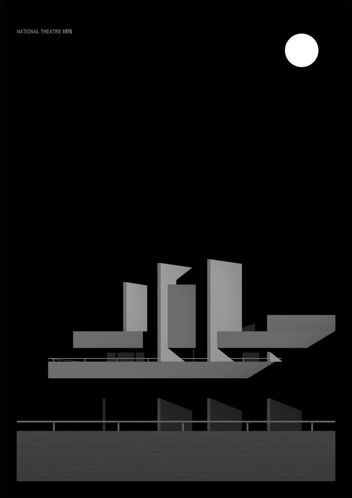
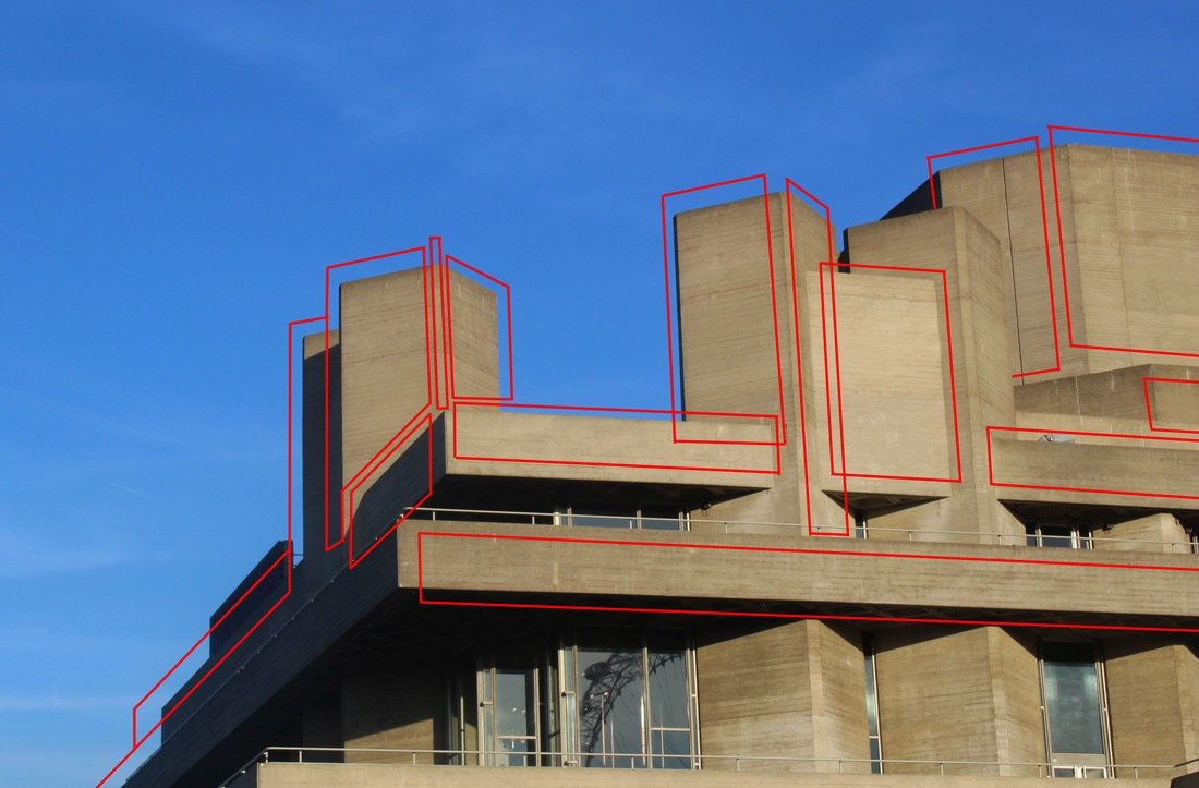
National theatre
|
|
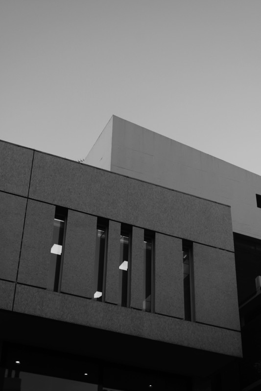
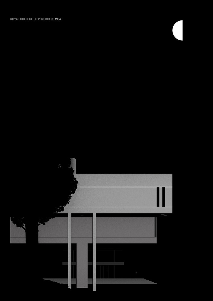
ROYAL COLLEGE OF PHYSICIANS
|

|
www
i think i really DEMONSTRATED the different interesting shapes and lines that appear within brutalist ARCHITECTURE. i also think the contrast BETWEEN building and casting techniques is clearly shown. the use of black and white in the photographs makes the photographs seem almost simplified as the colour no longer distracts from the focus of the image.
ebi
first of all i think it would have been interesting to have visited more locations and then i could have compared more of the different types of building in WHICH brutalism is used. in terms of the photographs i have taken, i could have experimented a bit more with perspective. i mainly used a perspective of looking from underneath the buildings, and although this did produce some nice images, i think it would have been better to have a range of perspective within my PHOTOGRAPHS.
Thomas Danthony
danthony turns photographs that he has taken in to simplified images in Photoshop and then in turns creates screen prints of his creations.
examples of his work:
examples of his work:
|
|
my response
I created these images by using the polygonal lasso tool and SELECTING the important lines and shapes in the photograph i then filled in these selected shapes with block colour. i did this using the average blur tool on photoshop this way the colour of each section represents the true colour in the ORIGINAL PHOTOGRAPHS. the end result CREATEs an image where the perspective, lines and shapes are all greatly emphasised.
|

|
|
|


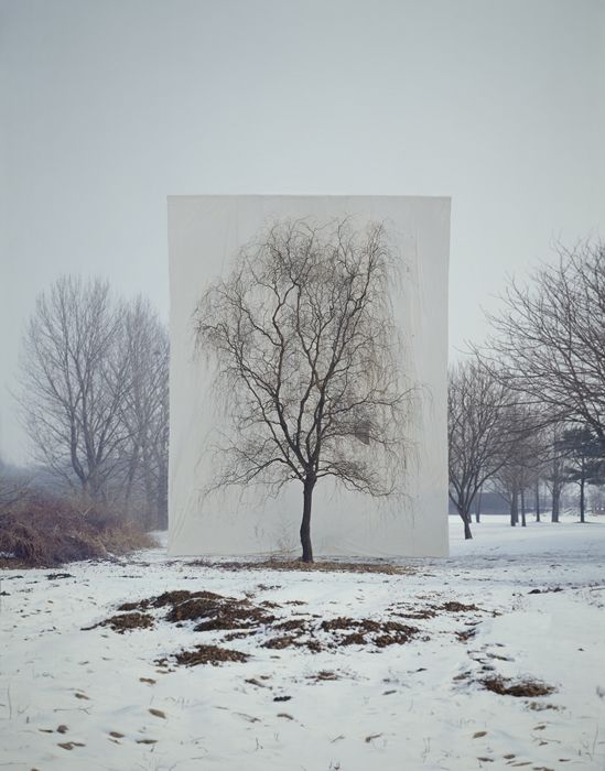
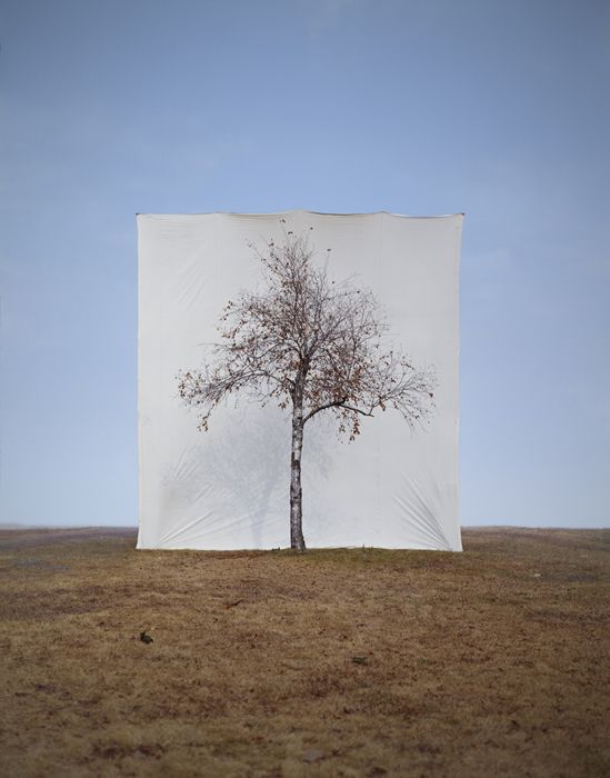
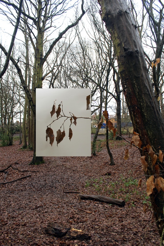
Structure in nature
myoung ho lee
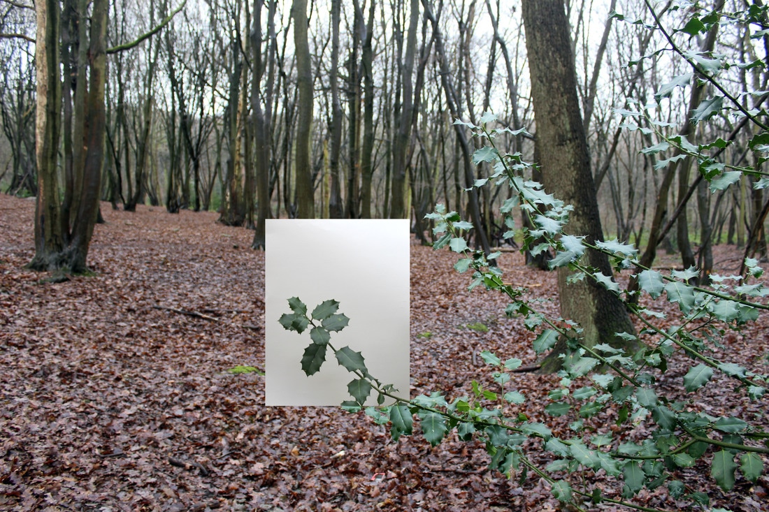
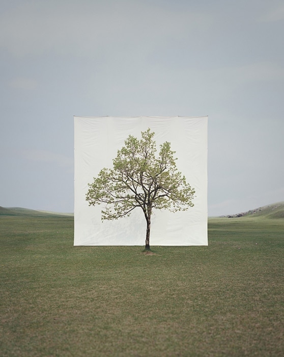
myoung ho lee is a photographer that photographs trees in his native Korea. he isolates them from their surroundings by putting up huge white canvases as backdrops. he doesn't rush this procedure and often observes the tree for all four seasons before photographing it. once taken the photograph is edited so that no evidence of a support structure is left. the final photographs highlight the beauty and physicality of the trees, however while doing this, trees almost seem unreal and like they have been place into the landscape. through playing with the relationship between nature and the artifice, lee destroys the traditional interpretation of landscape photography.

|
|
|
contact sheet
1st photograph edit
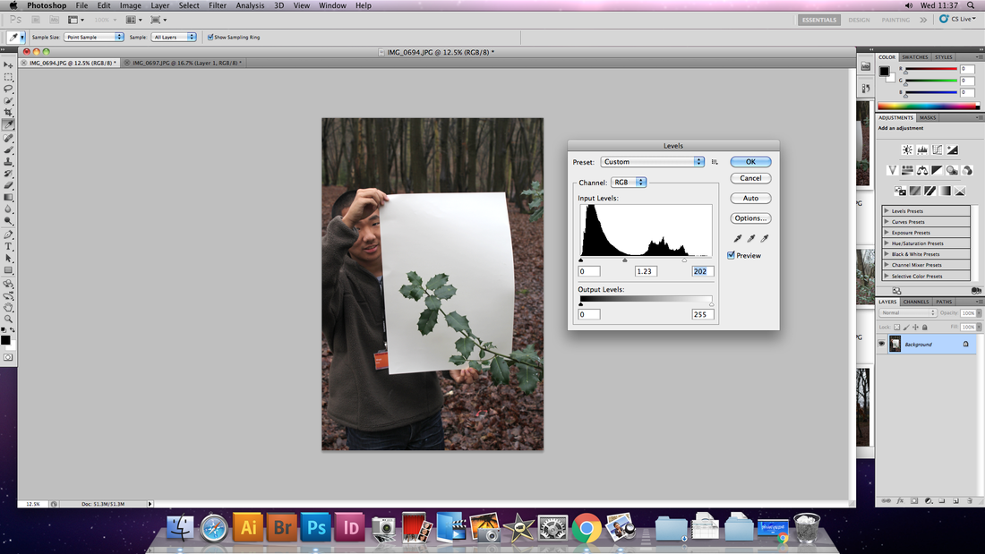
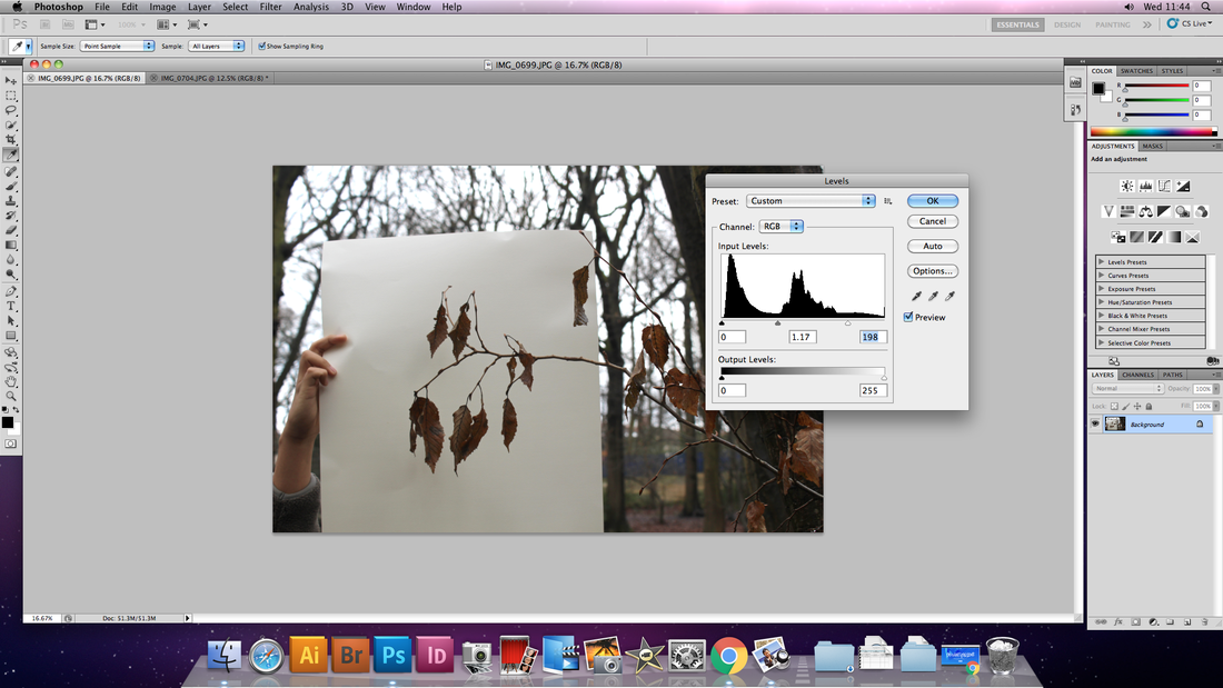
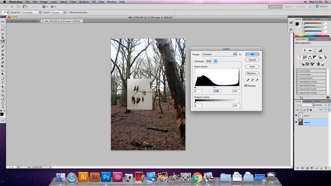
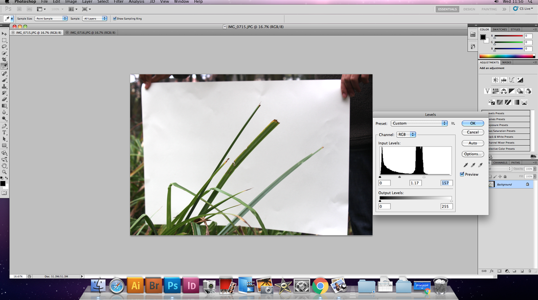
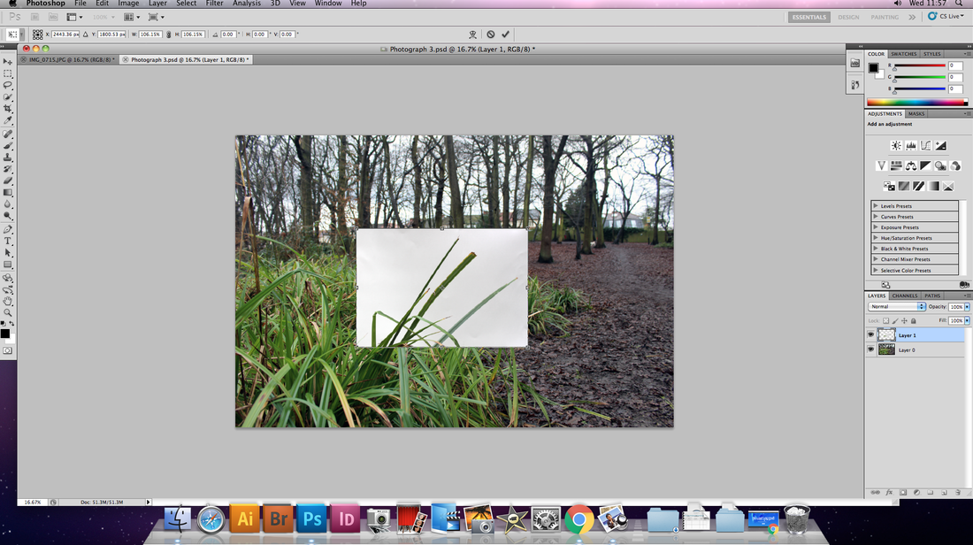
first i adjusted the levels in order to get the amount of WHITEness and contrast that i wanted to ACHIEVE.
|
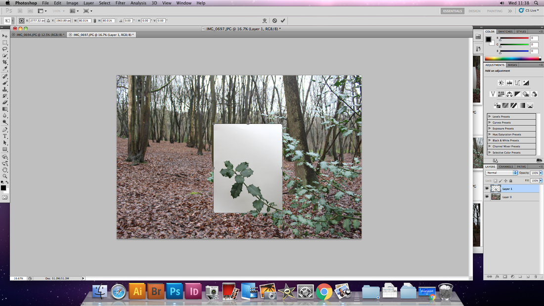
i then selected just the white section with the highlighted piece of the tree and placed it onto the image of the wider context. this CREATED an efeect in which the white sheet appears to almost hover.
|
2nd PHOTOGRAPH EDIT
|

|
|
3rd PHOTOGRAPH EDIT
|
|
artist and me
|
|
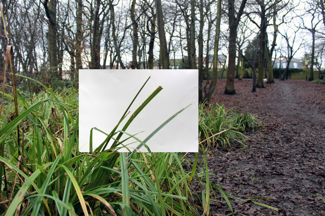
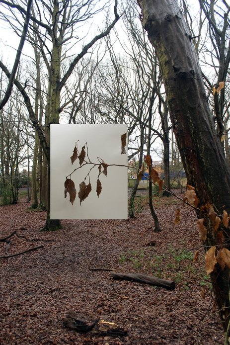
OBVIOUSLY there's a vast difference between the artists work and mine, largely to do with the scale of the photographs. in my work i chose to insert the white sheet from another photograph insead of photoshopping the support out as this would have been very hard and time consuming. i think the effect of the artist having a tree that appears isolated is powerful and provides further emphasis on the tree, unfortunately the LOCATION i visited this was not FEASIBLE, however, i do think that my photograph does still show part of the tree as slightly isolated.
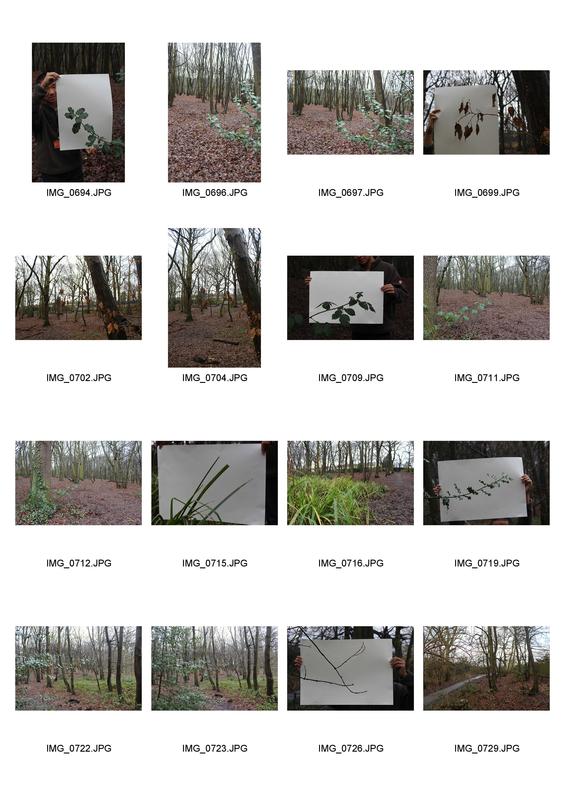
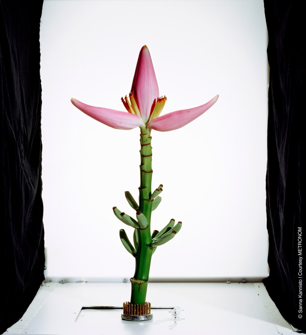
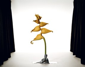
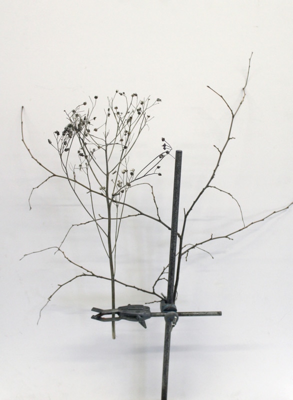
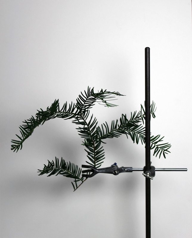
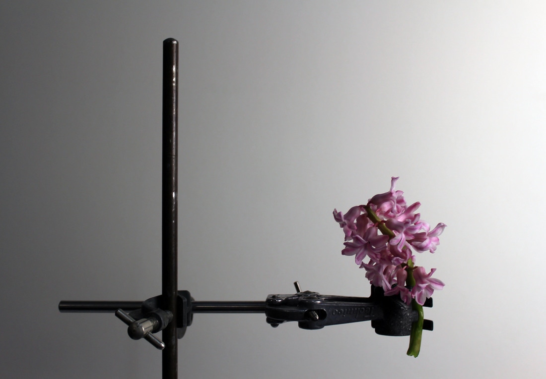
Sanna kannisto - Field works
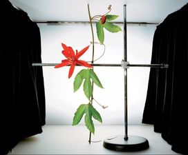
sanna kannisto uses flora and fauna throughout her work. she frequently uses plain white back drops in order create a really strong focus on the subject rather than the surroundings. as well as plain backgrounds often she uses scientific clamp stands into order to place an emphasis on the structure of the subject.
|
|
|
contact sheet

series 1
my response in this series was closely linked to the artists. i used scientific clamp stands to photograph plants, including the entirity of the plant.

|
|
|
|
series 2
in this response i developed it away from the artist and photographed close ups of the flowers themselves, this really focuses on a specific point of the plant so the viwer can explore the details more easily.
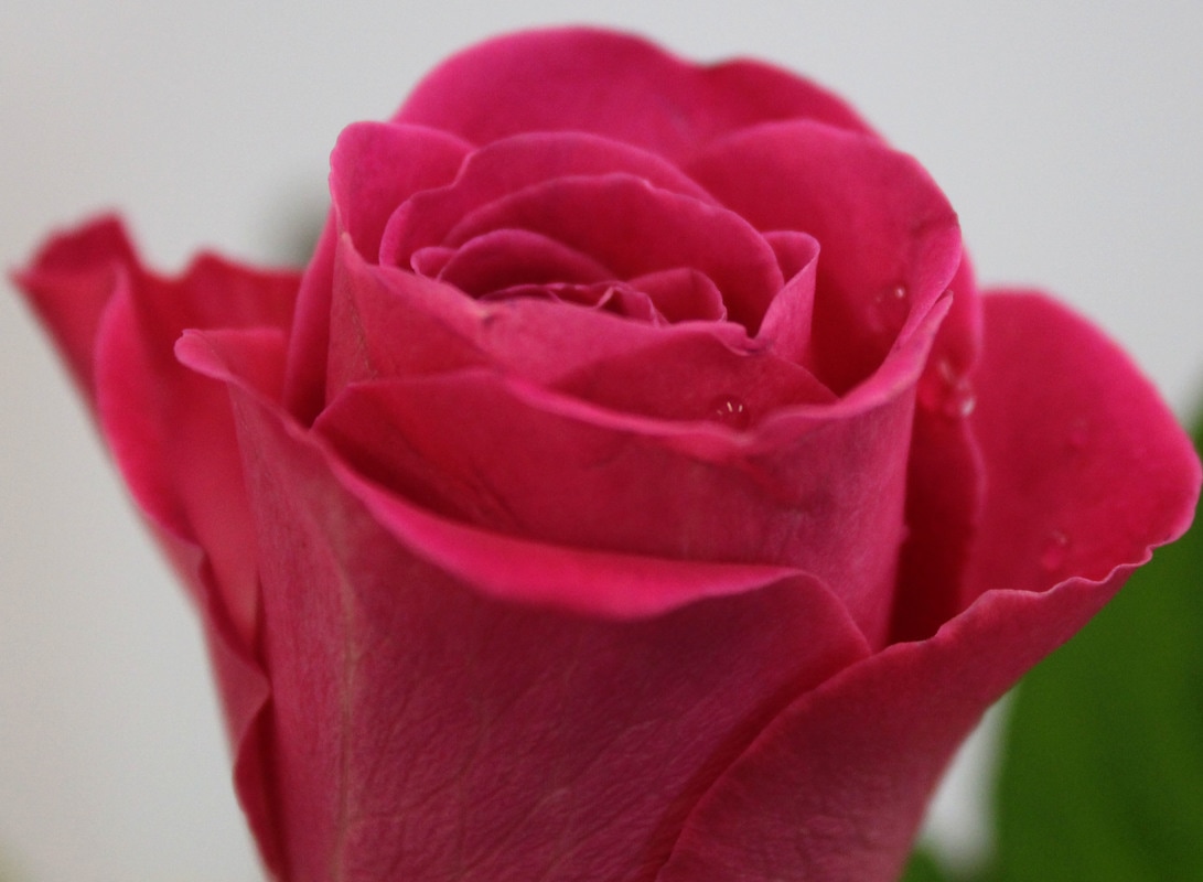
in this photograph i made the focus point the very centre of the flower so all the focus is retained there and it's easier for the viewer to see the detail.
|

in this photograph i experimented with perspective and focus. i positioned the shot from slightly underneath in order to explore the plant from a different angle. the focus point is on the outside layer of the petals, although not conventional i like the effect it has on the photograph.
|
artist and me

|

|
in the artist's photograph i feel as though the balck sides distract from the actual plant so in my response decided to make the background completely white so the focus is soley on the plant. in my photographs i've used more space this is shown by the fact no ceiling is seen and all the edges of the stand can be seen. in contrast in the artist's work the plants appear to be in small, cramped spaces which in turn i think makes the plants seem bigger and more impressive as they fill more of the frame.
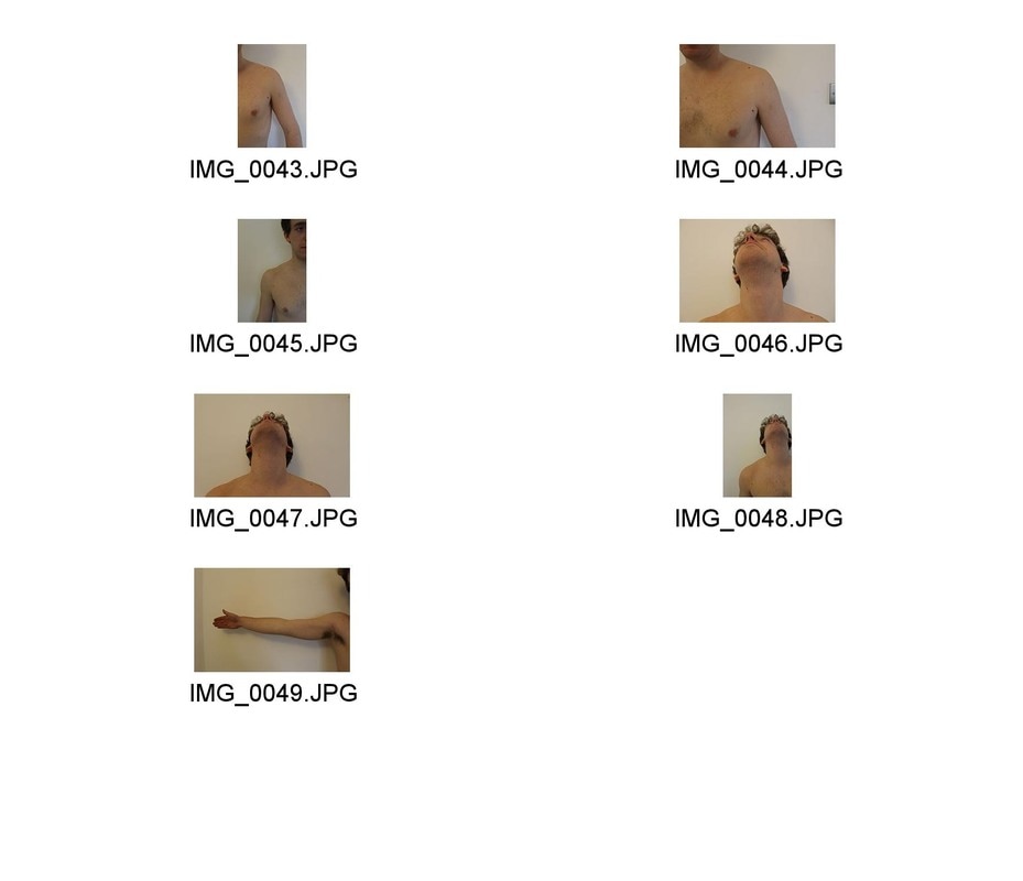
Structure of the Body
Peter Hickley
Hickley created a series of hand printed cyanotypes on watercolour paper and then hand stitched the photographs with thread. these patterns of thread represent the different muscle, veins and tendons that form the structure of the body.
hickley contact sheet
Edits
|
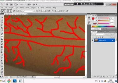
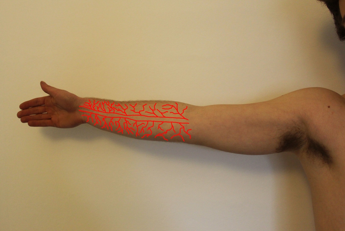
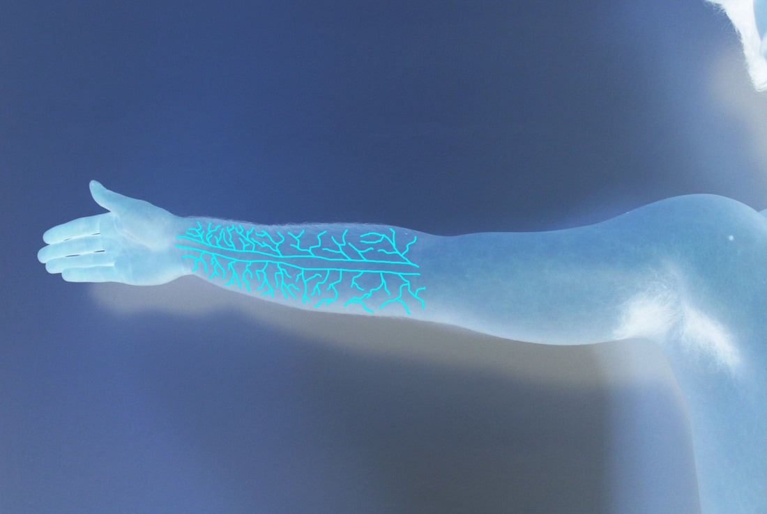
For my response i used the paint brush tool on photoshop and SELECTED the colour red. i then drew over the forearm lines REPRESENTING the structure of his veins.
for my second edit i polarized the first edit in order to create a x-ray type interpretation of hickley's work. i'm not sure that it works very well in this instance but i think it's an interesting concept as it's almost as if the veins are showing up on a x-ray. |
|
|
|
skeleton morf CONTACT sheet
|
|
edits

first i dragged the image of the skeleton onto the photograph of the person. i changed the opacity so the skeleton could be seen in front of the other photograph.
|
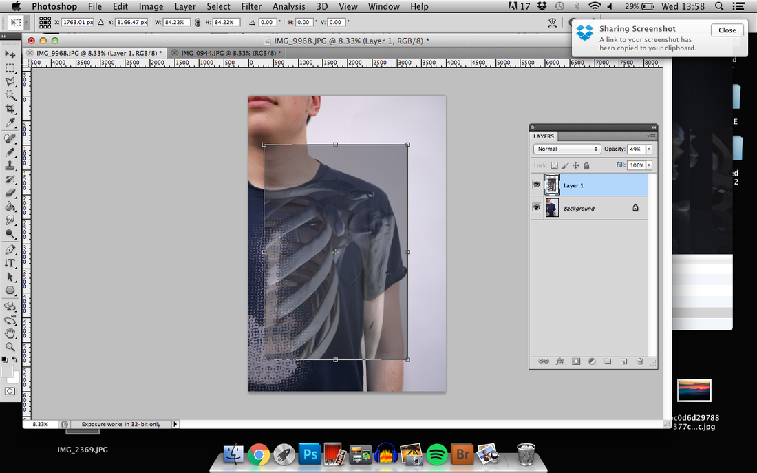
i then used the free transform tool in order to reposition and resize the skeleton.
|
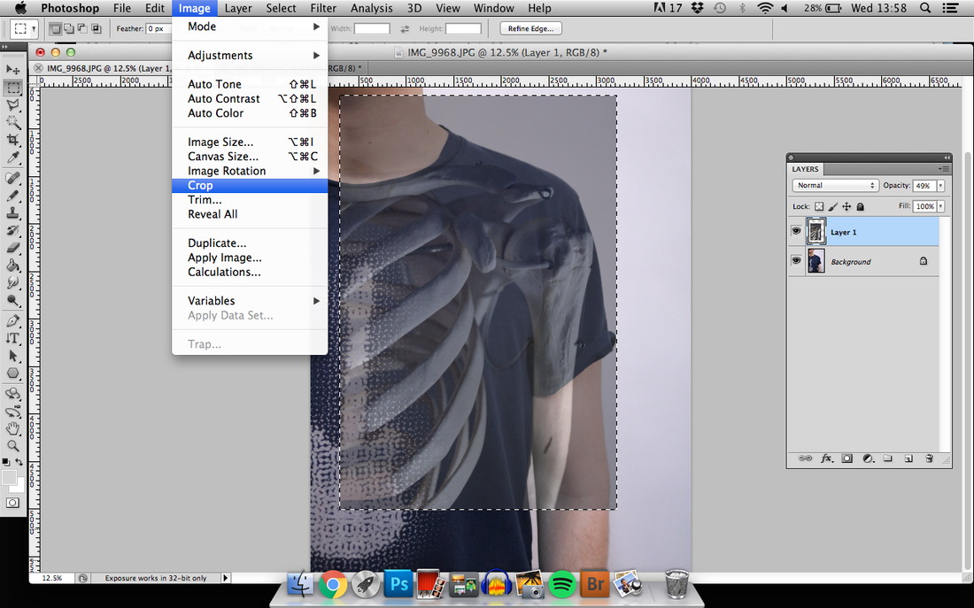
i then cropped the image so that it became one.
|
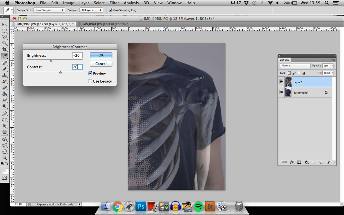
i then adjusted the brightness and contrast in order to slightly enhance the image.
|

|
|
www
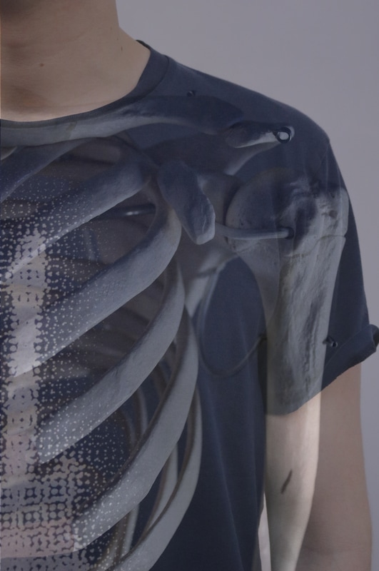
i think that the two photographs i produced work well and portray the structure that lies under the skin. i think the two images blend really well together which helps inforce the sense of structure within the photographs.
ebi
it was very hard to replicate the form of the person in the SKELETON and VICE versa. this meant that my attempts of doing edits of the face in PARTICULAR DIDN'T work and the bone structures didn't match. even the edits presented display slight flaws in alignment.
three strands
first strand
mathematics in nature
Nikki Graziano
http://www.nikkigraziano.com/
example work:
|
|

|
for my response to this artist i'm going to go to several locations to shoot photographs of nature. when shooting i will look out for interesting and distinct lines and shape within the natural structures in which i can later highlight using mathematical graphs.
BEAUTY OF MATHEMATICS from PARACHUTES on Vimeo.
although this video isn't specifically about nature is shows that mathematics is all around us without us even thinking about it. i think it captures how the beauty of mathematics can be DISPLAYED for everyone to see and understand.
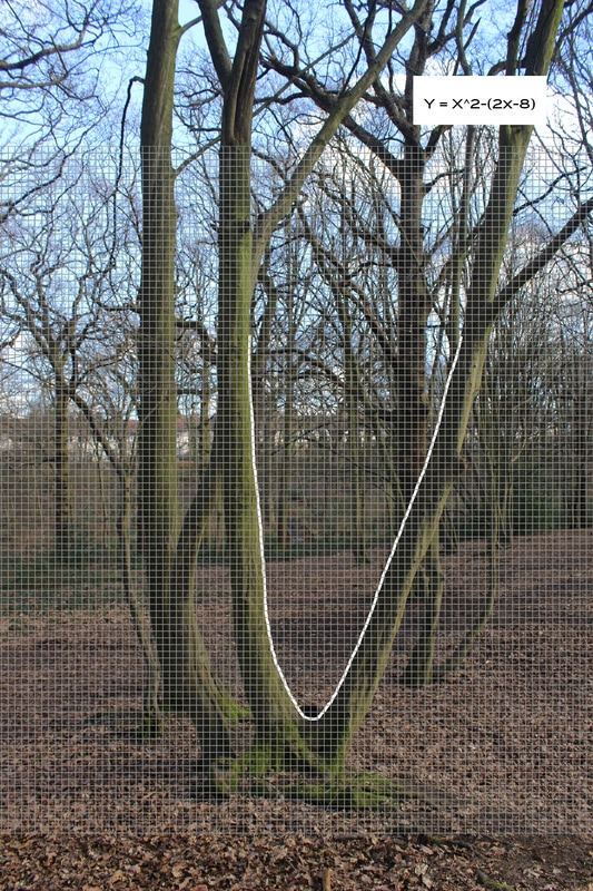
Coldfall woods contact sheet
edits
|
as far as a first ATTEMPT goes i don't think it's that bad but the line acting as the graph isn't the cleanest line. however, i do like the effect the graph has on the photograph. without it it's just a log but the graph adds an extra layer of thought when viewing the image and makes the viewer think about the wider use of mathematics and its impact.
|
process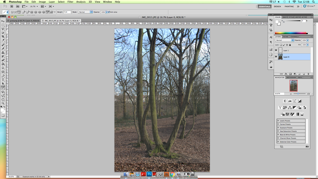
first i dragged in a white grid with no background into photoshop and then used the free transform tool to resize the grid. i then adjusted the brightness of the grid so it didn't overpower the photograph underneath.
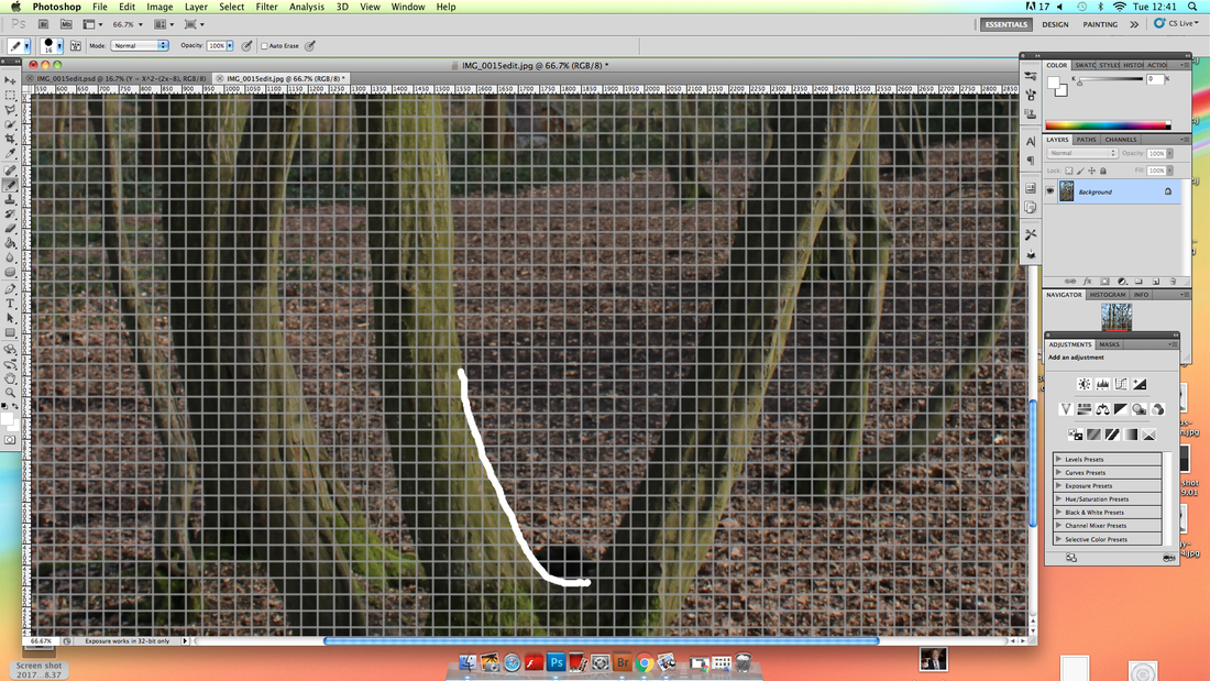
i then PRECEDEd to use the pencil tool to draw along the tree line in order to cteate a graph like curve. i then wrote a rough equation of the the line on a white background.
|
|
WWW
i think the use of mathematics through the use of graphs in order to emphasis the shapes within the nature worked very well. i think that the photographs really emphasis the structure of the trees. however i do like the idea of looking and lines and shapes within structures whether nature or manmade and as a result i will develop this idea further.
EBI
i drew the curves freehand using the PAINTBRUSH tool and this meant that they are a bit off in places which makes the images look unprofessional. i also think it would have been better of they were properly calculated graphs rather than lines looking like graphs. however, i had a limited time period and this would have been greatly time consuming.
DEVELOPMENT
after ORIGINALLY looking at mathematics in nature i think it would be interesting if i were to expand from NATURE into buildings and structure, in order to emphasis their beauty i will focus on clearly DISPLAYING their shape and lines. for this development i will use the photographs that i previously shot for the brutalism section.
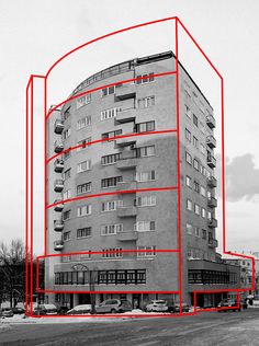
i will base my development on the artist alexey bogolepov. Example work:
i will base my development on the artist alexey bogolepov. Example work:
|
|
my response
For my first edit i decided to edit a photograph with RELATIVLEY simple shapes. so that it wouldn't make the process to hard on the first attempt.
i think the final image works well and it really breaks down the basic shapes and really places an emphasis on them. for my next edit i will try to edit a photograph that displays more complex shapes.
i think the final image works well and it really breaks down the basic shapes and really places an emphasis on them. for my next edit i will try to edit a photograph that displays more complex shapes.

|
i used the line tool with a size of 20px to create the lines for the curves i used the paint brush tool, again with the same size brush, and drew them free hand.
|
here i try to experiment with overlapping the different shapes by off setting each shape in a slightly different way. i also chose my image with curves lines in order to explore how well the technique would work with different types of lines.
i think the final image is very effective as the shapes have clearly been broken down. however, i think tht the top section of the image could have been better EXECUTED as where there is overlap i think the image becomes too complicated and less clear.
i think the final image is very effective as the shapes have clearly been broken down. however, i think tht the top section of the image could have been better EXECUTED as where there is overlap i think the image becomes too complicated and less clear.
for my third edit i chose to edit a photograph showing a bigger part of a building in order to do it on a much larger scale. and therefore breaking a very complex image down to lots of different more simpler shapes.
i think this image works less well than the last edit as i think the created simple shapes positioned over the complex ORIGINAL shapes clutters the image. this makes it harder for the viewer to view the image with only the simple lines in mind.
i think this image works less well than the last edit as i think the created simple shapes positioned over the complex ORIGINAL shapes clutters the image. this makes it harder for the viewer to view the image with only the simple lines in mind.
ewww
i think my edits clearly show the structure of the buildings. i think that the most effective piece was my second edit as the shapes worked really well together and the overall effect APPEARED successful. the bold red lines contrast against the grey/brown concrete making them stand out more whilst accentuating the structural integrity of the building.
ebi
i think i could have used my space in my photographs, especially in my third edit. INSTEAD of showing most of the shapes in the photograph i could have only showed a few but spread out and very clearly. furthermore, i could have could have taken new photographs that DISPLAYed really INTERESTING shapes that could be simplified.
further development
for further development i'm going to transform photographs of buildings into vector drawings. this breaks down the photograph into a series of lines which show the structure of the building. here are some examples of vector drawings:
|
|
response
process

|

|
|
|
final vector drawing
|
|
on the left the original is shown and on the left is the vector drawing. unfortunately the way the BUILDIng cast a SHADOW over the bottom left corner of the building, meant it was impossible to work out the lines. apart from that section, i think the vector drawing was very successful and presents the lines and shape of the building in a very simple, clear yet effective maner.
Second Strand
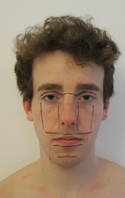
structure of the face
|
on the right there's an image which shows and explains the perfect or ideal facial structure. i thought it would be an INTERESTING idea to draw these 'perfect' proportions onto people's faces and then photograph them, to see just how realistic these proportions are.
i saw many pieces of work expressing the expectations of beauty and make up using a similar technique of drawing on people's faces. however, i couldn't seem to find any presenting the idea of the actual facial structure. |

|
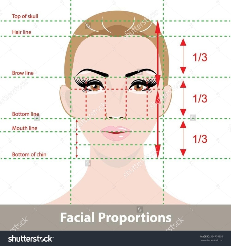
i found a relatively simple image showing the ideal facial structure that i could then draw onto a person's face.
|
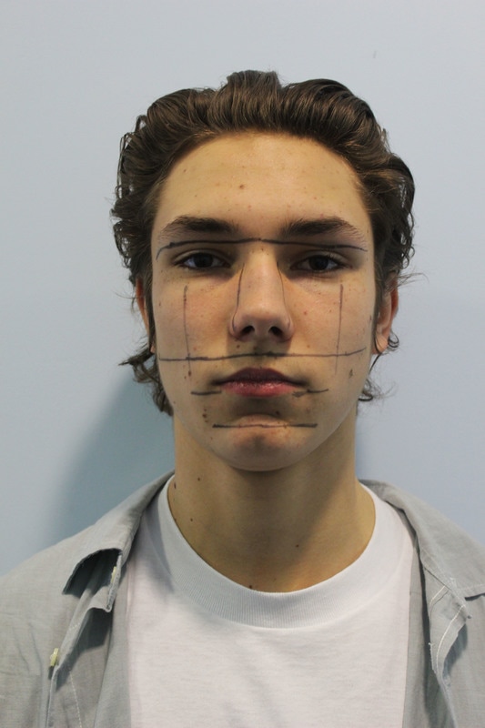
Using a black pen and a ruler i measured and marked a face in order to determine how close to the 'ideal' face it was.
|
|
As shown, the face was actually pretty close in terms of proportions. the lips and nose were a tiny bit higher than the 'ideal'. but the eyes and overall facial proportions are actually pretty close to the 'ideal'.
|
i repeated this with another person to see if the similarities between the 'ideal' proportions and the first person were consistent or if it were a COINCIDENCE. as shown they were a little off but still quite accurate.
|
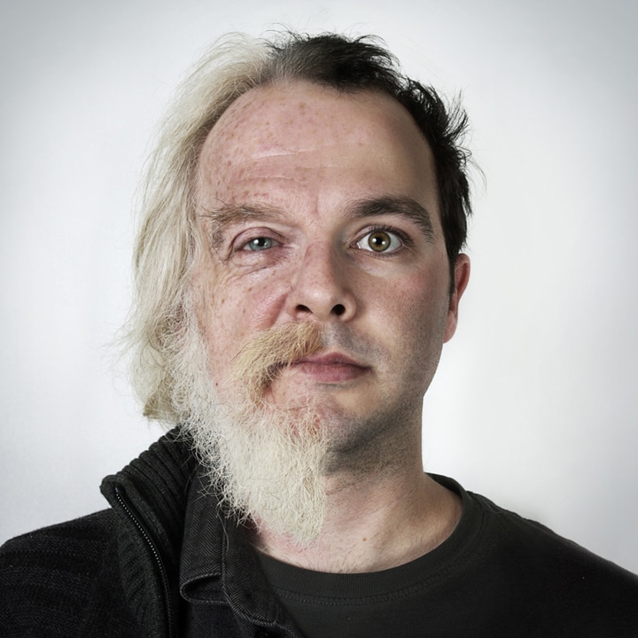
after doing a couple of photographs i have decided to develop the idea of exploring the structure of the face. for this development i will be looking at comparative facial structures both between families and the same person young and old.
Development:
ulric collette
http://www.ulriccollette.com/
example work:
|
|

|
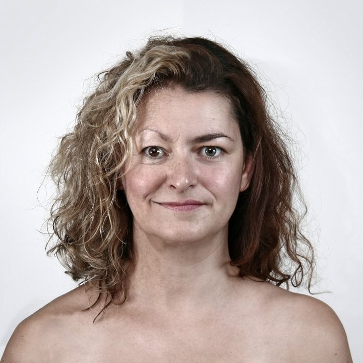
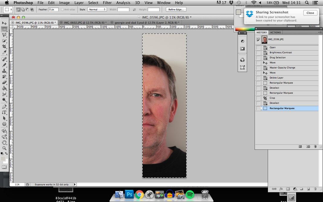
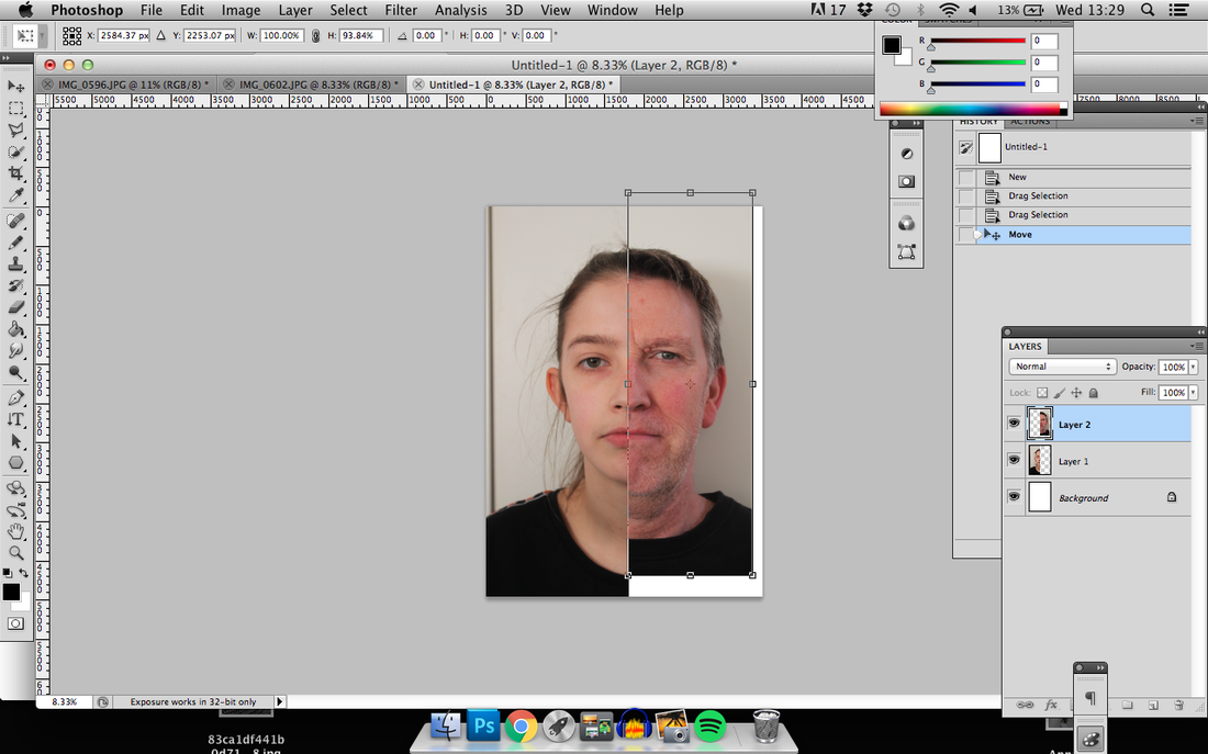
Father Daughter comparison

|
first i adjusted the brightness and contrast of the two separate photographs and cropped both so that only half there faces remained.
|
|
|
i then used the free transform tool in order to re shape the photographs so the face shapes matched better.
|
i then used the clone stamp tool in order to merge the two pictures together.
|

|
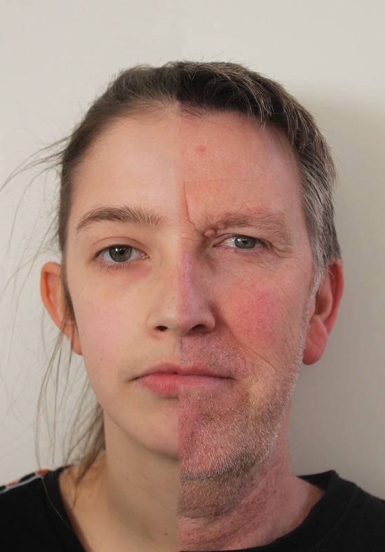
i think this PHOTOGRAPH is quite interesting because apart from the nose and PERHAPS the ears the physical features appear quite different. however, i still think the two people do look strongly related and i can't really figure out why. I FOUND THE PHOTOSHOP WORK BEHIND THIS IMAGE VERY CHALLENGING AS IT WAS SOMETHING I HAVE NEVER ATTEMPTED BEFORE. however, given that it was the first time i think the faces are merged ok, the top of the image was more SUCCESSFUL. i think this was because the facial hair at the bottom of the image was a lot harder to merge. the difference in skin tone also added to the difficultly.
third strand
structure of society
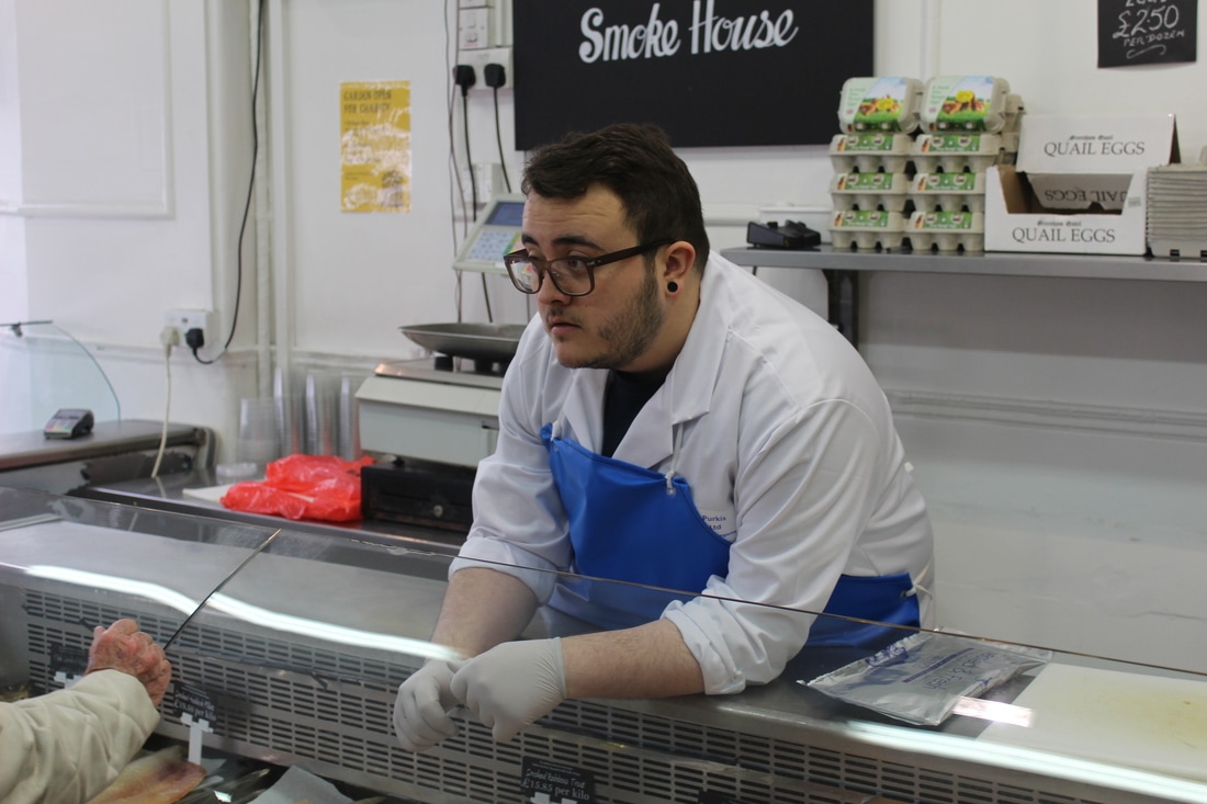
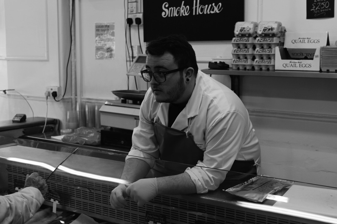
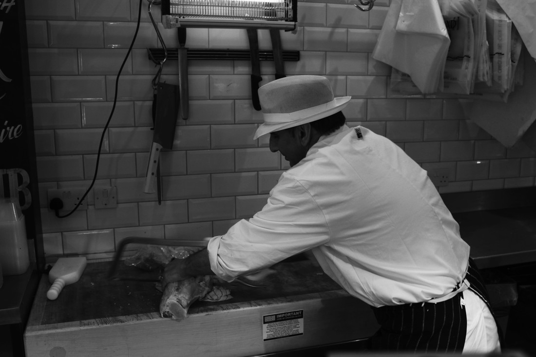
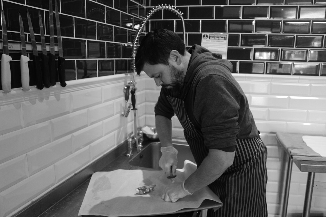
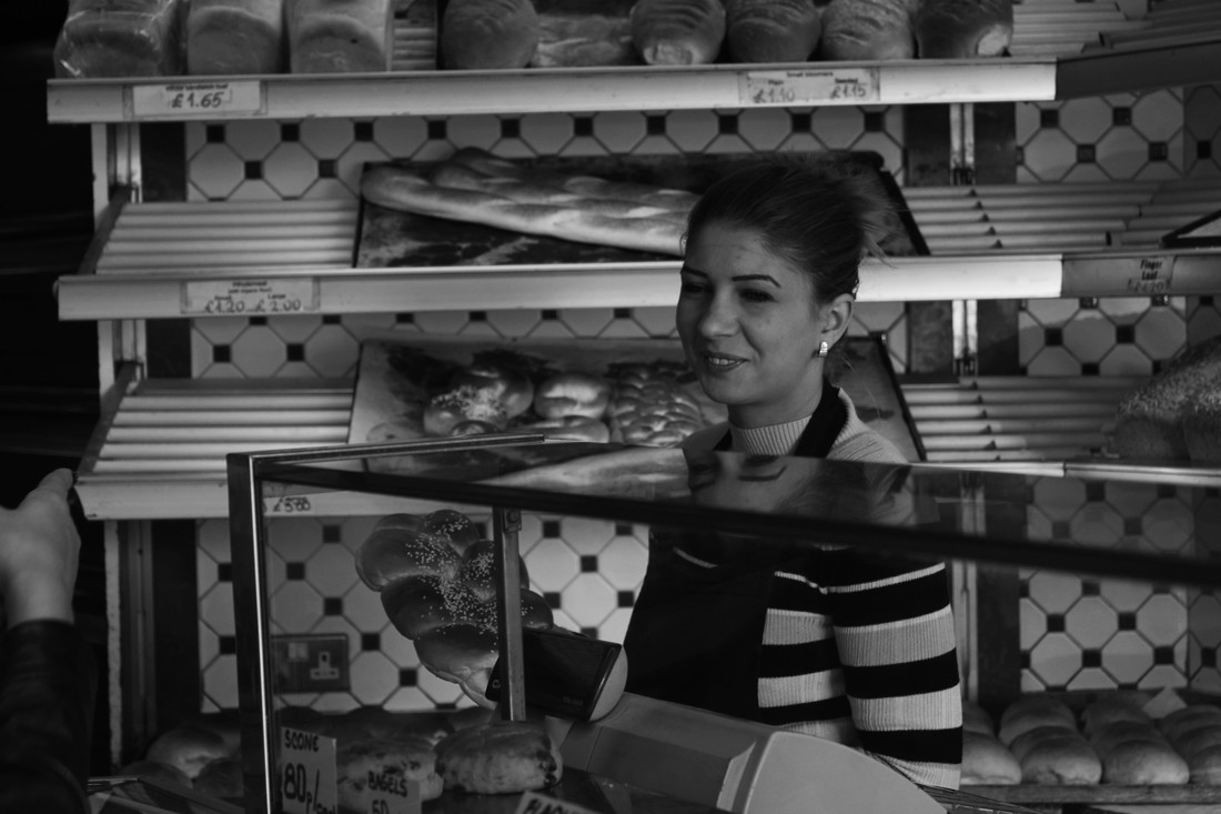
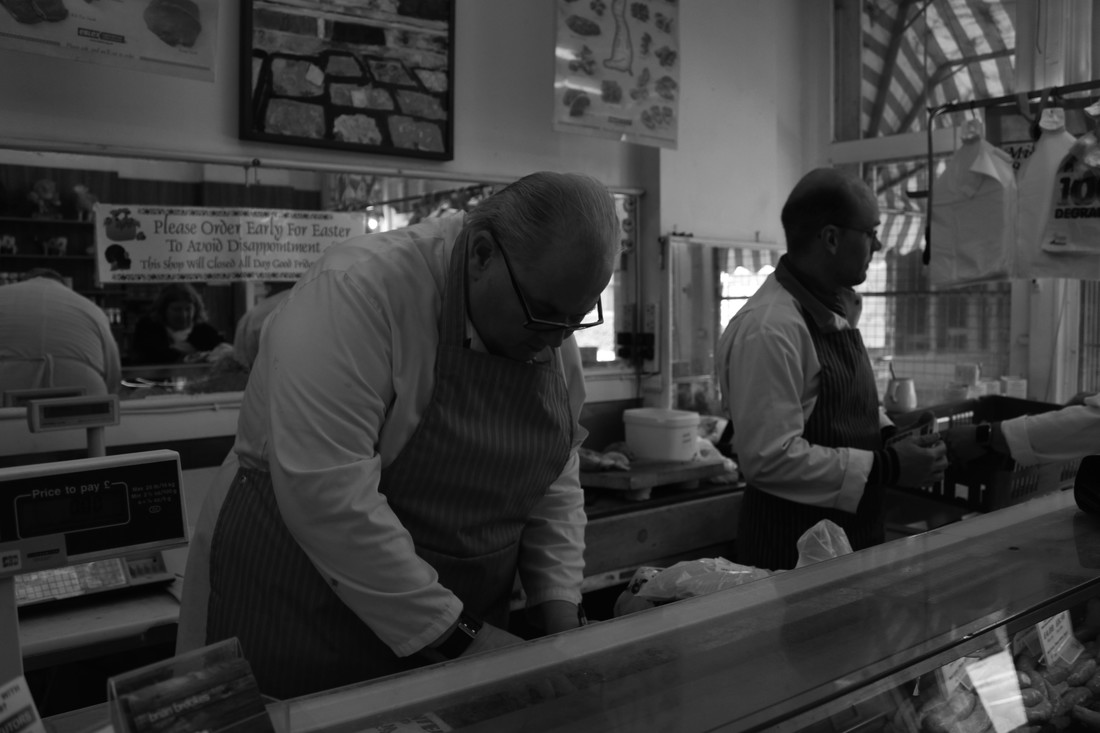
Working people:
I decided to look at everyday working people in the local community. i visited two butchers, two fishmongers and a bakers. i focused on people working with aprons on to further link the photographs. i tried to capture my subjects in LANDSCAPE, so that, although they themselves filled the majority of the frame, their SURROUNDINGS were still evident.
CONTACT SHEETS
|
|
Edit experimentation
original photograph

edited black and white PHOTOGRAph
|

edited colour photograph
I edited the first photograph in both colour and black and white in order to determine which would give me a better outcome for this series of photographs. from this I've decided i will edit the rest of the PHOTOGRAPHS in black and white. this was because i think in the colour edit the bold colours in the background slightly overpower the subject in the foreground.
|
edits
www
i think the photographs make a nice collection of images that DISPLAY working people within the local community. i think the black and white makes the images nicer as it ensures the viewer doesn't lose focus by getting drawn to the bold colours in the background.
ebi
i think i could have more shots of the people actually working as only 2 of the 5 final images show the people actually practising their trade.
although these images turned out quite well and i could develop it by exploring working people commuting from the local area into the city etc. i've decided that i would like to change course slightly and explore structure of society through looking at democracy with a focus on the freedom of speech.
freedom of speech
THADDEUS POPE
http://thadpope.com/
example work:

|
|
|
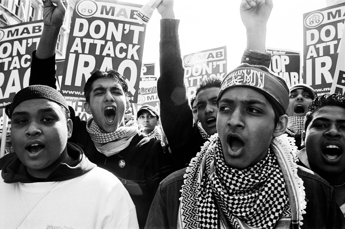
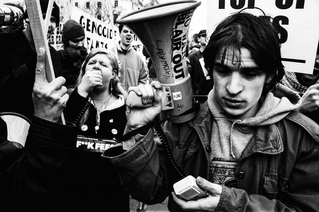
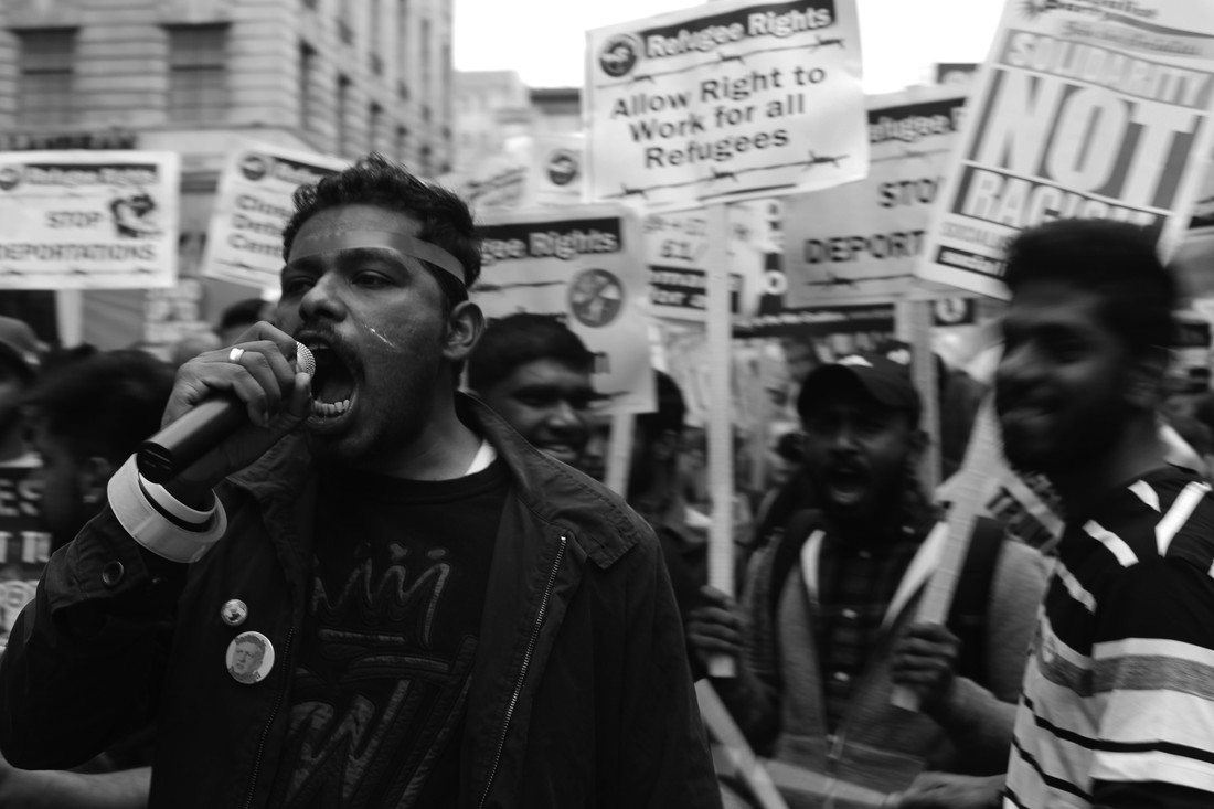
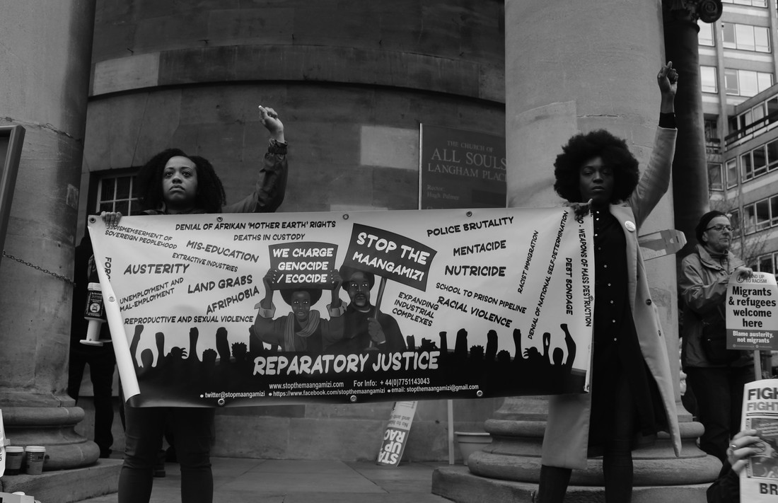
protests are a powerful action, it's a sign that the people want a say in how things are done and is a FUNDAMENTAL right of any democracy. photographs have photographed protests around the world for a long time, to further promote the message, and to capture the raw emotions on display at such events. protests show how the structure of society isn't quite as straight forward as the simple, traditional PYRAMID makes it seem. it displays the very fact that ULTIMATELY the power does really belong to the people.
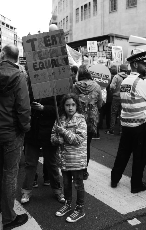
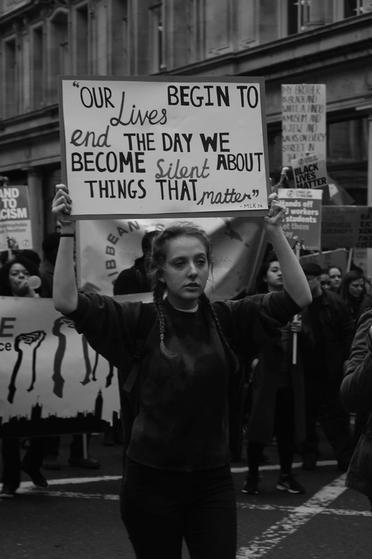
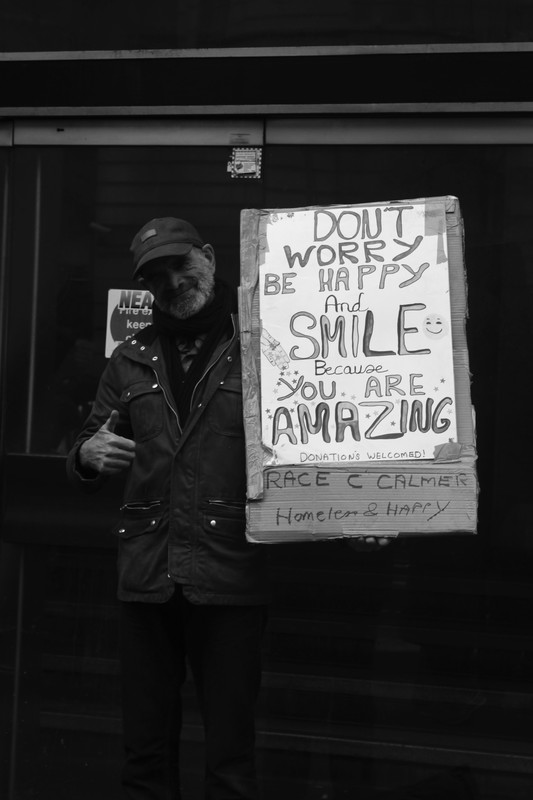
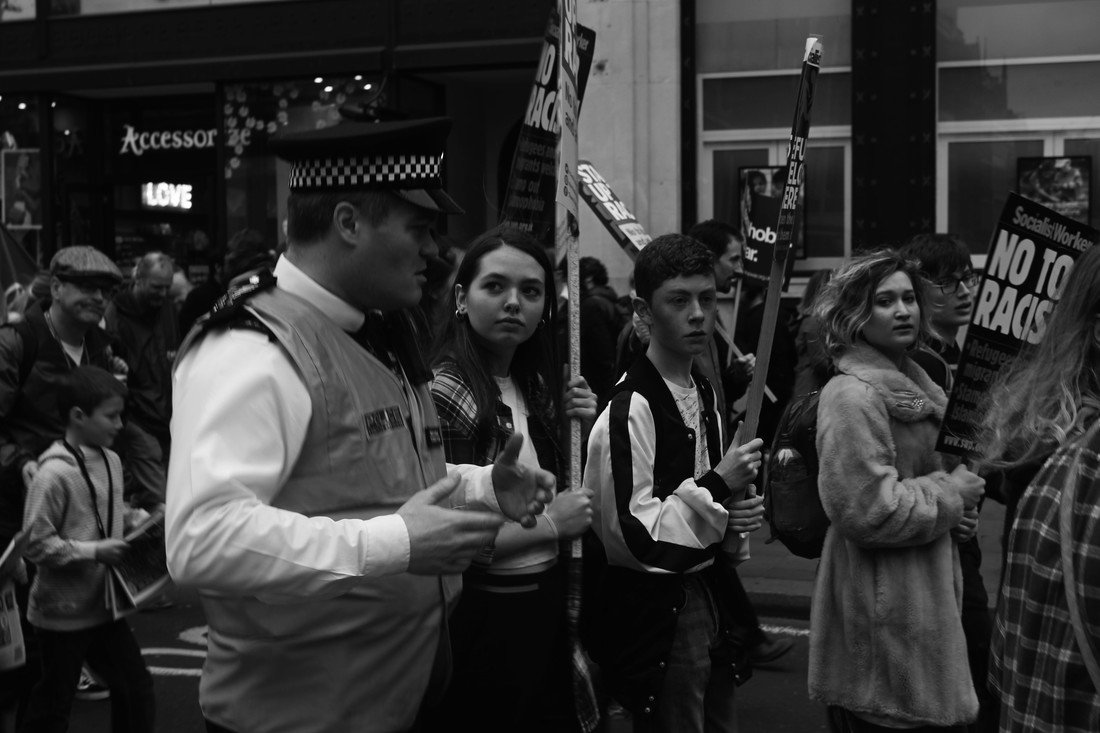
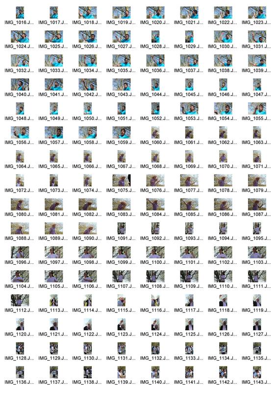
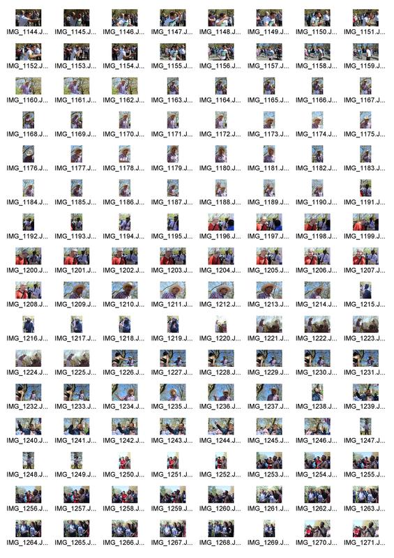
all my photographs were taken on the 18th march at the March Against Racism - National Demo for UN Anti-Racism Day.
all my photographs were taken on the 18th march at the March Against Racism - National Demo for UN Anti-Racism Day.
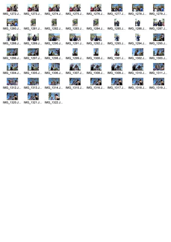
CONTACT SHEETS
|


|
EDITS
|
|
|

|
www
i think the PHOTOGRAPHS i took displayed the unity and passion that took place at the march. i think they PHOTOGRAPHS also correctly show that the demographic, no matter how different, can if they choose, have the power to come together and voice the concerns about how attitudes or policy needs to be changed.
ebi
i would have like to get pictures closer to peoples's faces and really display the roar emotion they had. however, this was difficult to do as i had to be respectful to people.
i feel as though these images show the unity that people can have across society. from rich to poor and from MINORITIES and non-minorities alike. i think it paints a powerful picture of how great the world could be if there was less hatred and more unity and understanding. After photographing this protst i think i would like to further explore the idea of freedom of speech.
development:
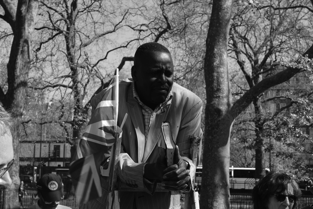
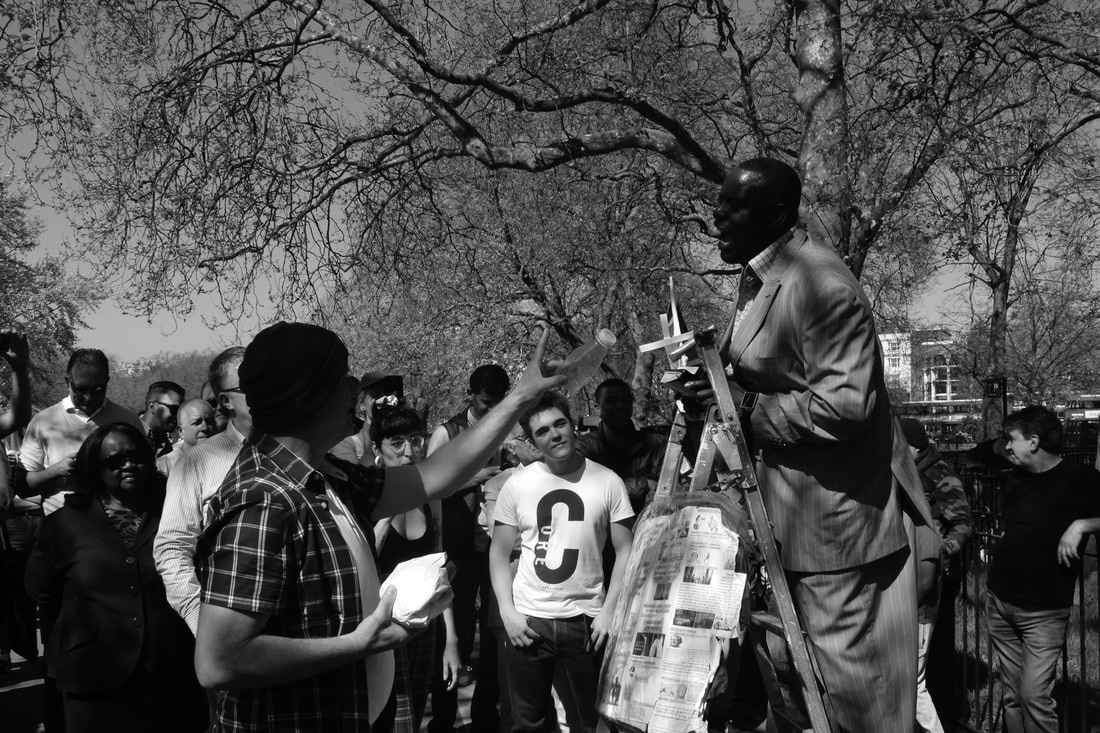
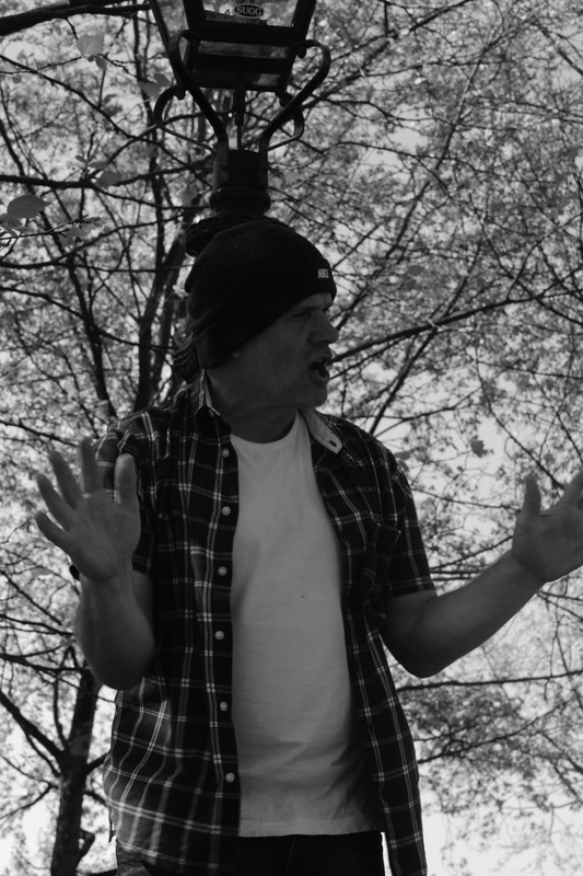
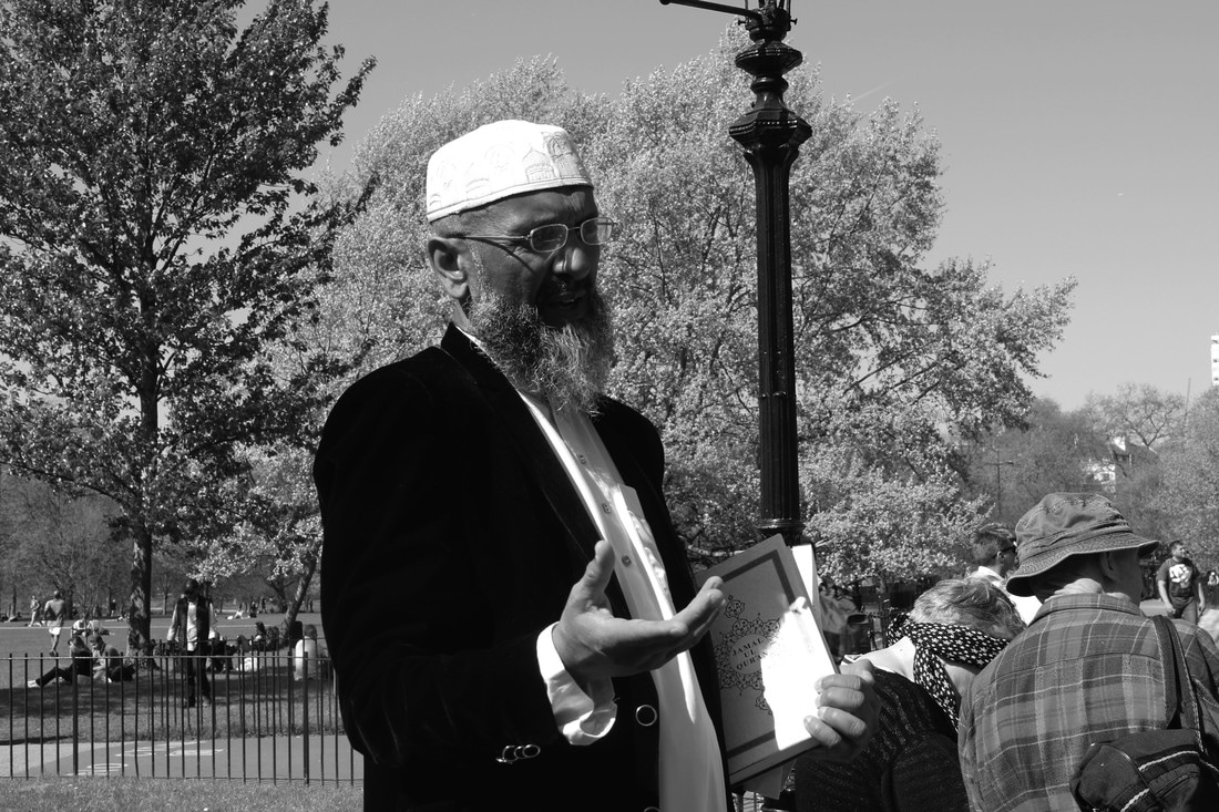
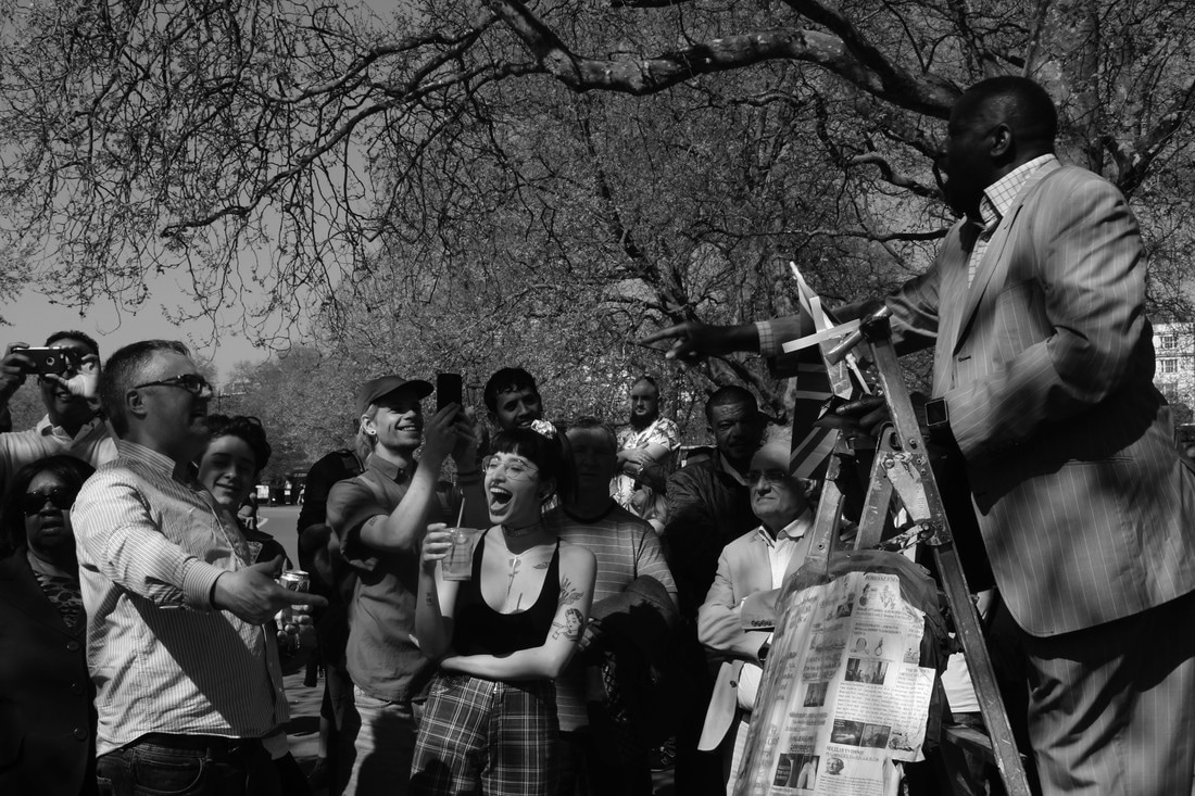
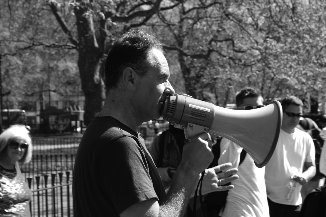
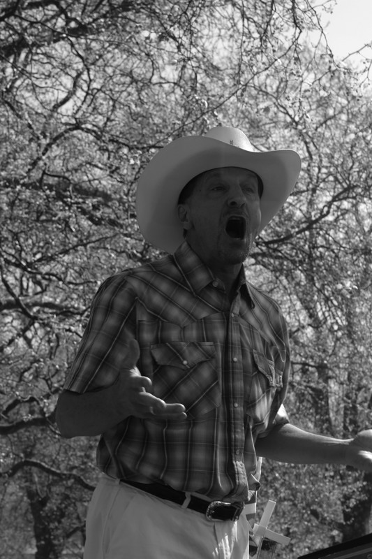
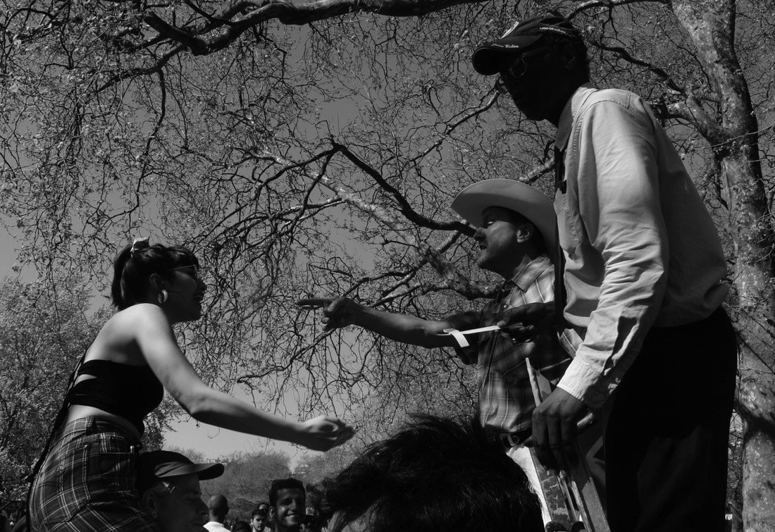
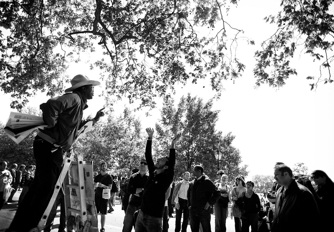
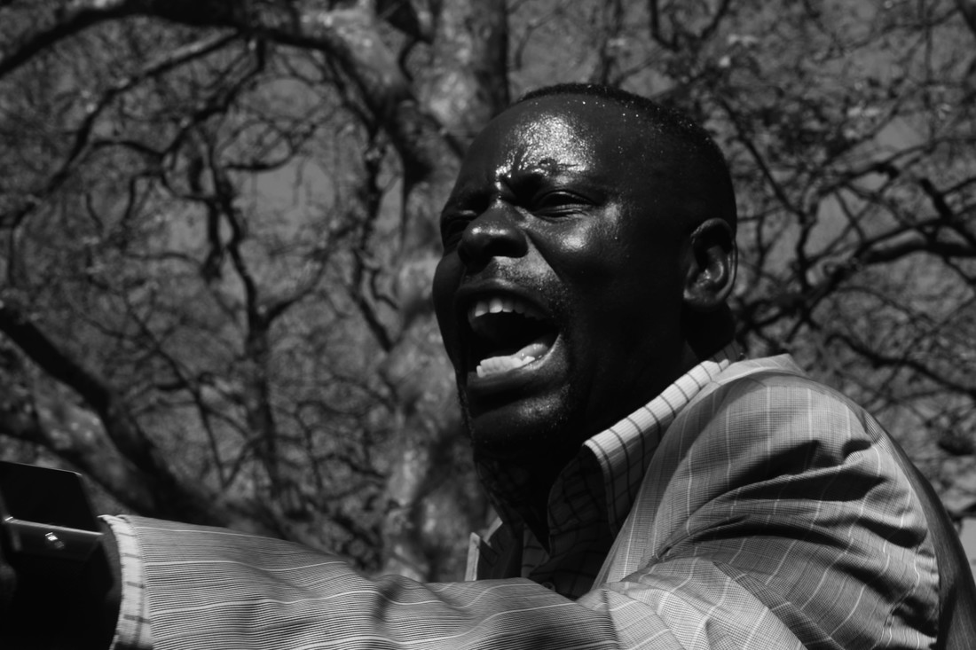
Speakers' Corner
|
The origins of Speakers' Corner as it is known today stem from 1866, when a meeting of the Reform League demanding the extension of the franchise, was suppressed by the Government. Marches and protests had long convened or terminated their routes in Hyde Park, often at Speakers' Corner itself. Finding the park locked, demonstrators tore up hundreds of yards of railings to gain access, and three days of rioting followed. The next year, when a crowd of 150,000 defied another government ban and marched to Hyde Park, police and troops did not intervene. Spencer Walpole, the Home Secretary, resigned the next day. In the 1872 Parks Regulation Act, the right to meet and speak freely in Hyde Park was established through a series of regulations governing the conduct of meetings.
Historic figures such as Karl Marx, Vladimir Lenin and George Orwell were known to often use the area to demonstrate free speech. |
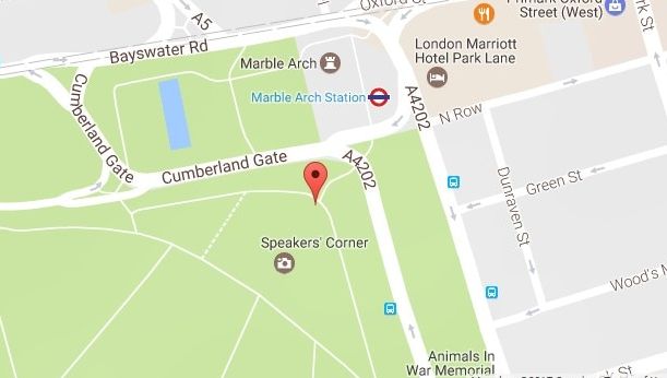
location of Speakers' corner in hyde park.
|
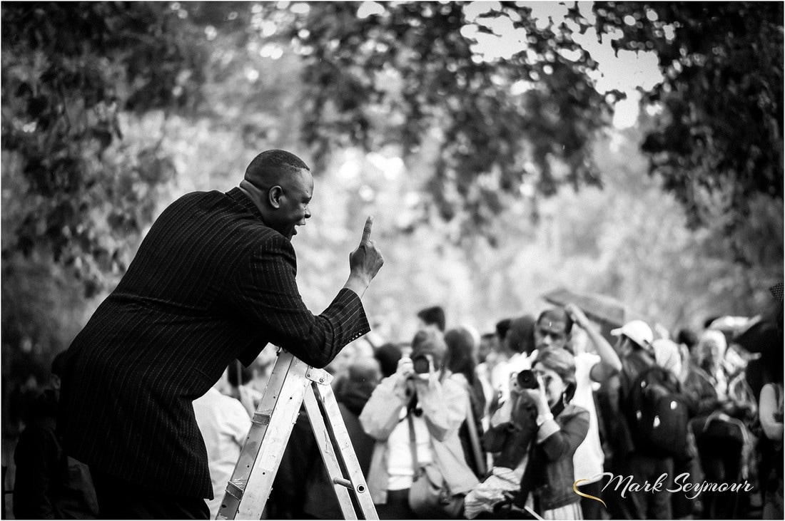
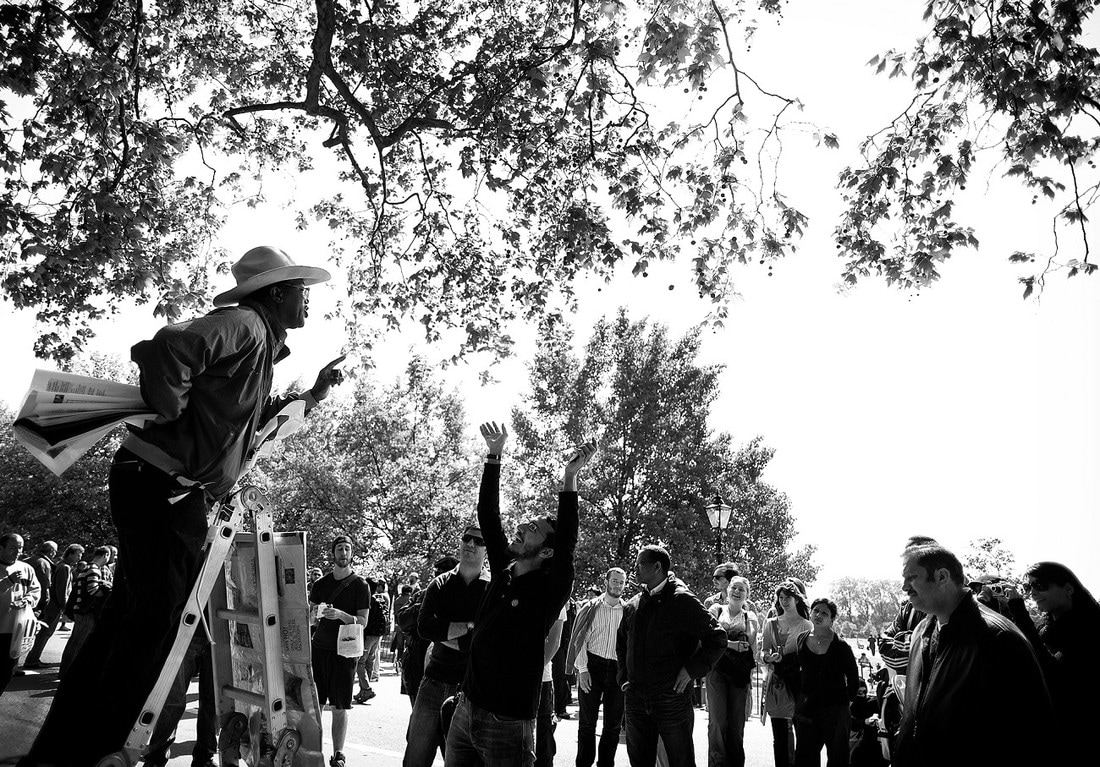
mark seymour
https://www.shootthestreet.co.uk/
example work:
|

|
|
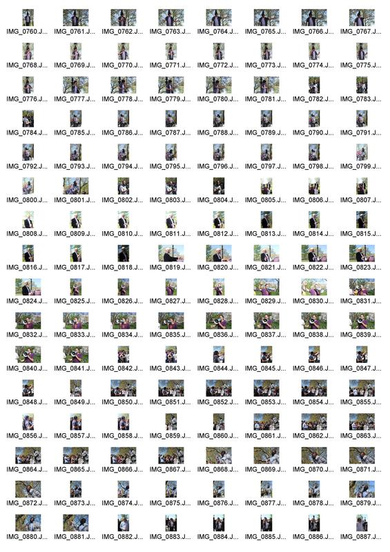
Contact sheets
|

|
|
EDITS

|
|


|
|
|

|
|

|
|
|
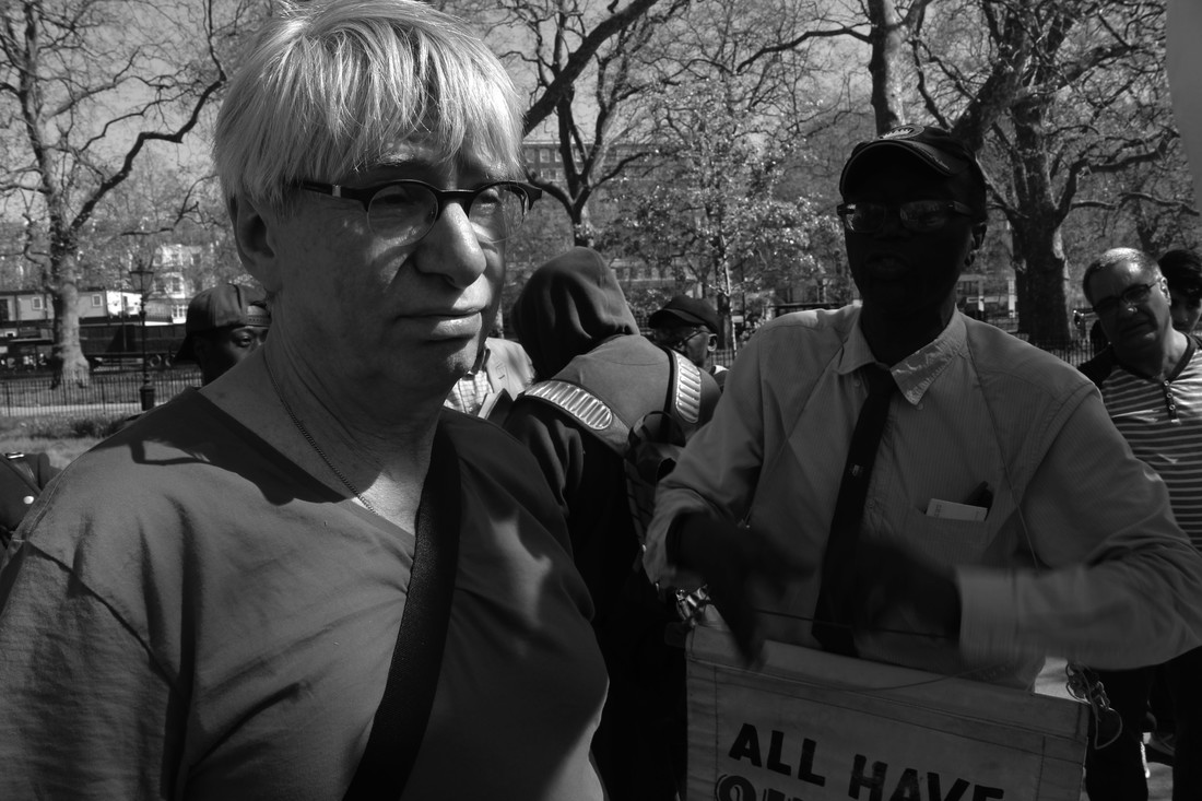
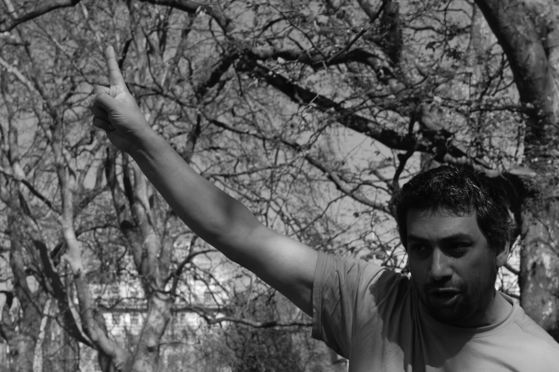
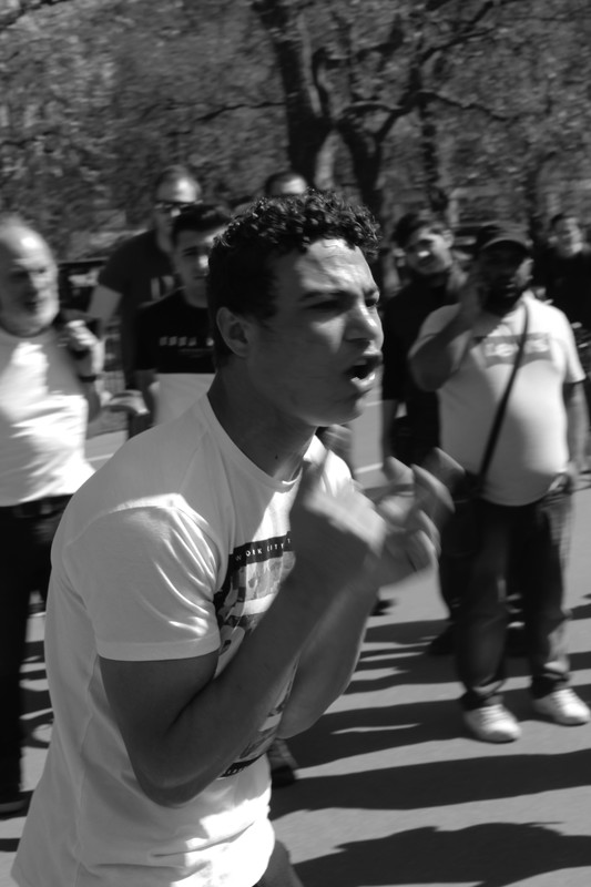
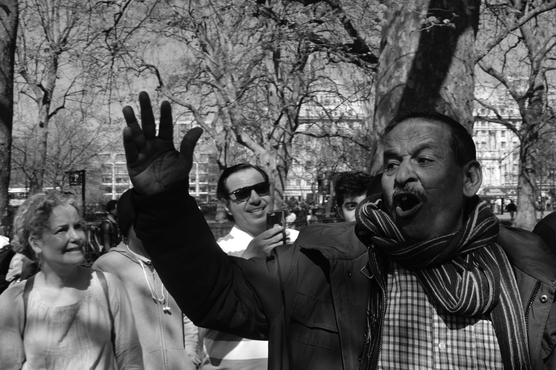
www
i thnk my photographs show the emotion and passion of both the speakers and the AUDIENCE. i think they're powerful images that correctly portray our fundamental right of freedom of speech. i think the black and white style is suitable for the photographs, as i feel it strips the images of UNNECESSARY distractions so the viewer can focus on the speaker and the meaning behind the images.
ebi
i think it could be interesting if what they were saying was DISPLAYED as well as the photographs as i think this would make the images more realistic and powerful. i also think, it could have be interesting to explore there raw EMOTIONS by getting extreme close ups while they were speaking.
artist and me
ARTIST me
|
|
i think my photographs ended up coming out quite differently from the artist's. i think, as a whole this is BECAUSE i tried to focus on the speakers' passion and to do this i tendered to take my PHOTOGRAPHS a lot closer to my subjects than the artist. in contrast, seymour tried to capture more in his frame in order to encompass more of the surroundings. i used slightly darker tones and less contrast in my images, COMPARED with seymour who appears to make a point of the open spaces by increasing the brightness and having a higher contrast between the sky and the people below. overall, i think seymour wanted to depict the whole context of the situation, and i wanted to focus on the individuals.
Further development:
i found an example of a video displaying the speakers delivering their sermons to the crowds and the interactions between the audience and the speakers.
using this video as inspiration and brainstorming some other ideas i've decided to try and create a video of similar sort; showing the speakers and the interactions with the audience. i want to display this along side a collection of interviews with the public asking about the IMPORTANCE of speakers' corner and freedom of speech. furthermore, i want to take portraits of the speakers and display these along side the video.
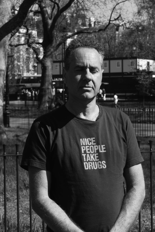
portraits
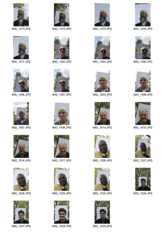
editing process
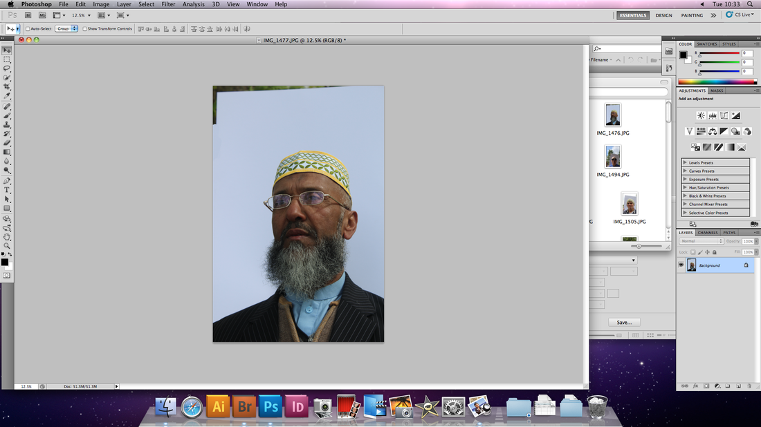
first, i used the clone tool in order to extended the white backdrop so it would fill the frame.
|

|

i then cropped the photographs so that the subject didn't appear too distant.
|

|

i then put the photographs in black and white to further enhance their expressions.
|

|
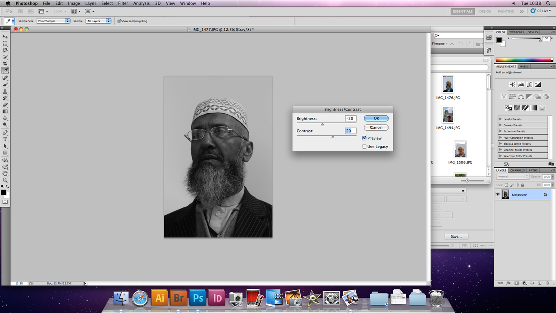
finally, i adjusted the brightness and contrast levels. i also adjusted the curves where NECESSARY.
|
edited portraits
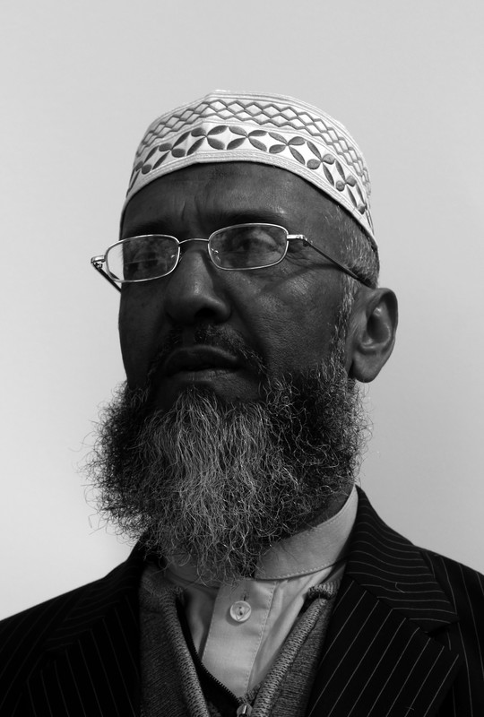
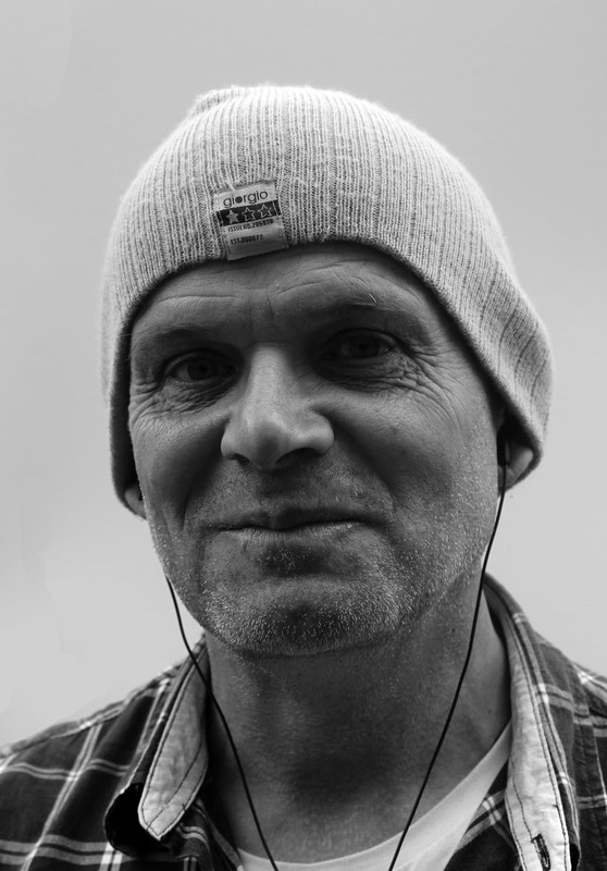
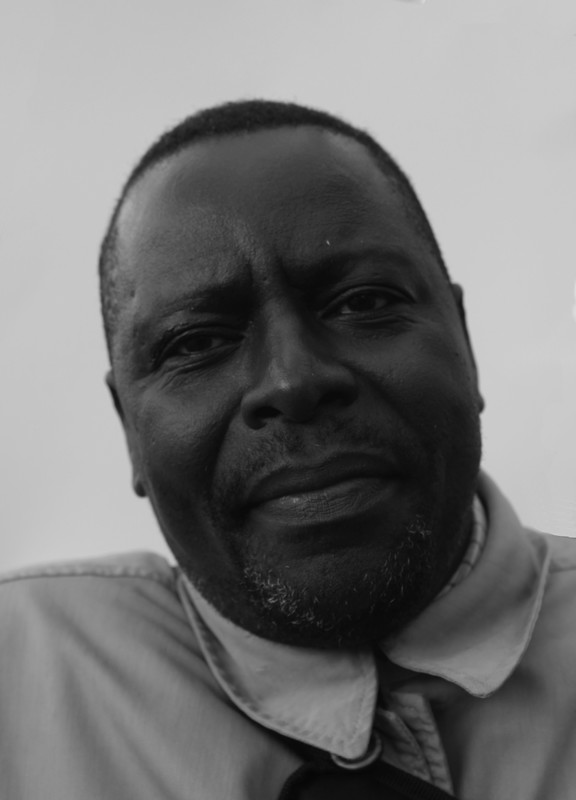
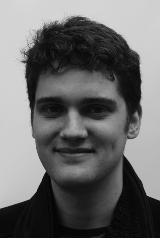
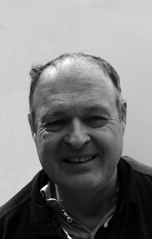
i think these portraits are visually interesting, the tones and textures of the faces make the expressions come to life. THE ADJUSTMENT OF BRIGHTNESS AND CONTRAST CHANGES THE USE OF LIGHT AND SHADOW IN ORDER TO DRAW ATTENTION TO THEIR FEATURES. i feel the use of black and white photography combined with the plain backdrop further accentuates the features. i purposely didn't instruct the subjects into a specific poses, as i felt this would falsify the images. as a result, i think the portraits feel more personal as the expressions are their own and in that sense you really get a real feel for their personalities.
Development process

|

|

|

|

|
video
editing process
|
|
Final Prints
|
|
|

