THE WHITE PAPER TEST
Artists
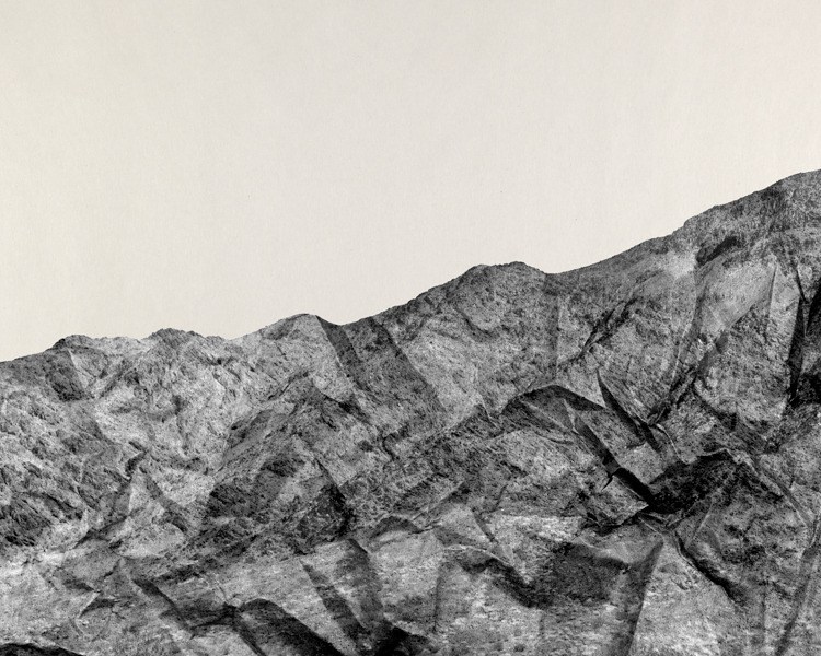
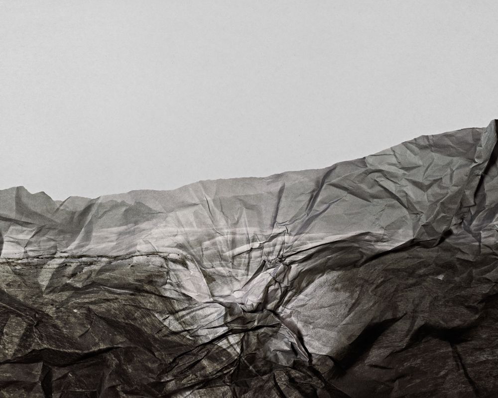
Brendan Austin
creates imaginary landscapes out of crumpled pieces of paper. He calls them 'Paper Mountains'. the resulting images appear both recognisable as landscapes but also suggest a sense of artifice. Humble materials are made to carry an important message.
creates imaginary landscapes out of crumpled pieces of paper. He calls them 'Paper Mountains'. the resulting images appear both recognisable as landscapes but also suggest a sense of artifice. Humble materials are made to carry an important message.
|
|
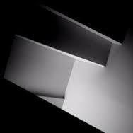
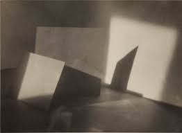
Jaroslav Rössler
known for combining different styles of modern photography including cubism, futurism, constructivism, new objectivity, and abstraction. he uses lines and shapes, exploring the contrast of light and shade. He experimented with a wide range of techniques and processes including photograms and double exposures.
known for combining different styles of modern photography including cubism, futurism, constructivism, new objectivity, and abstraction. he uses lines and shapes, exploring the contrast of light and shade. He experimented with a wide range of techniques and processes including photograms and double exposures.
|
|
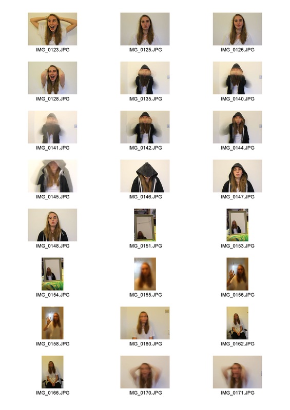
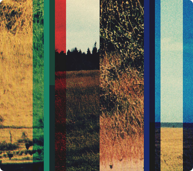
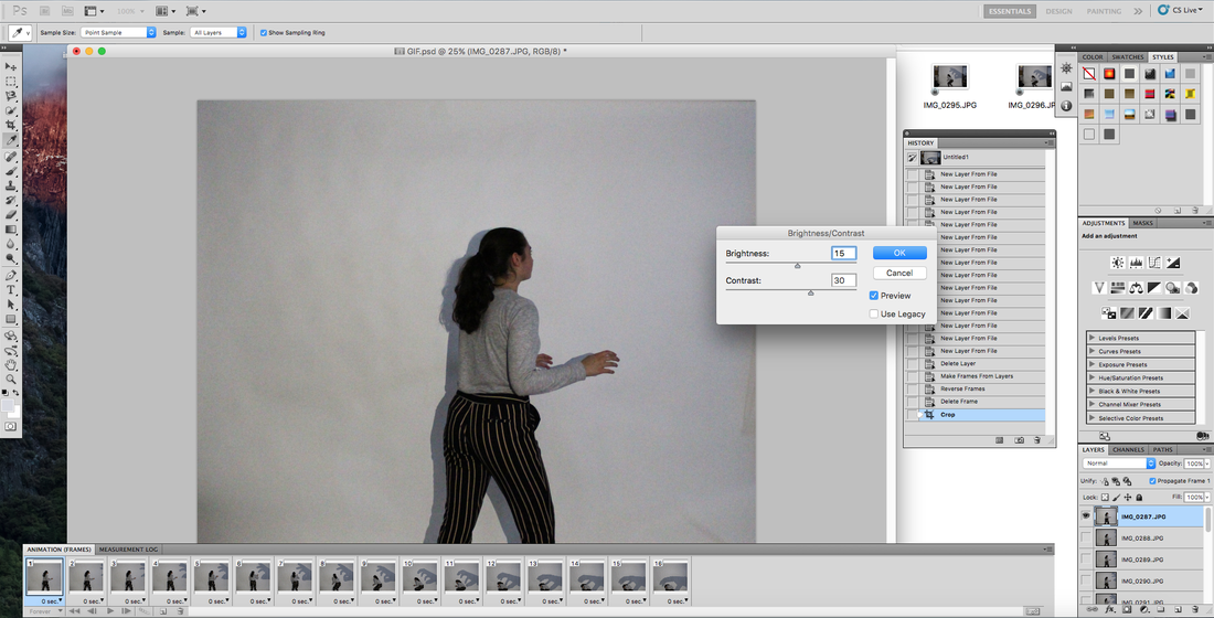
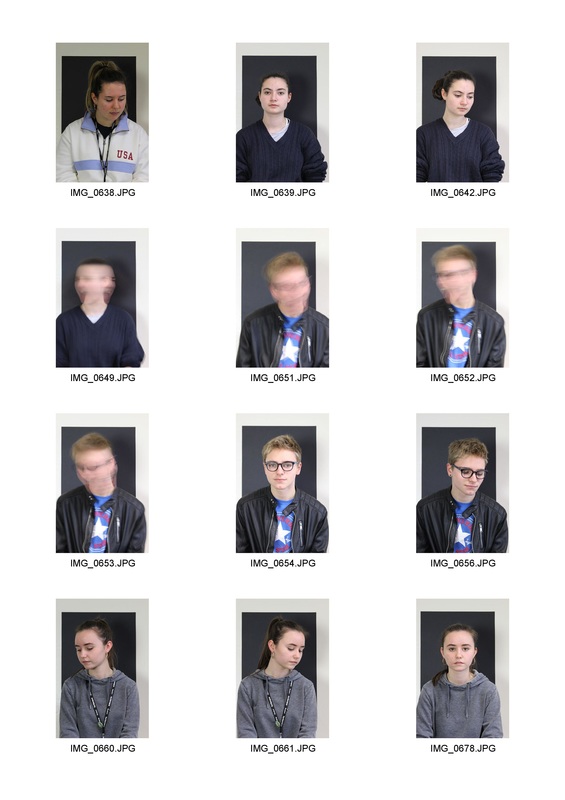
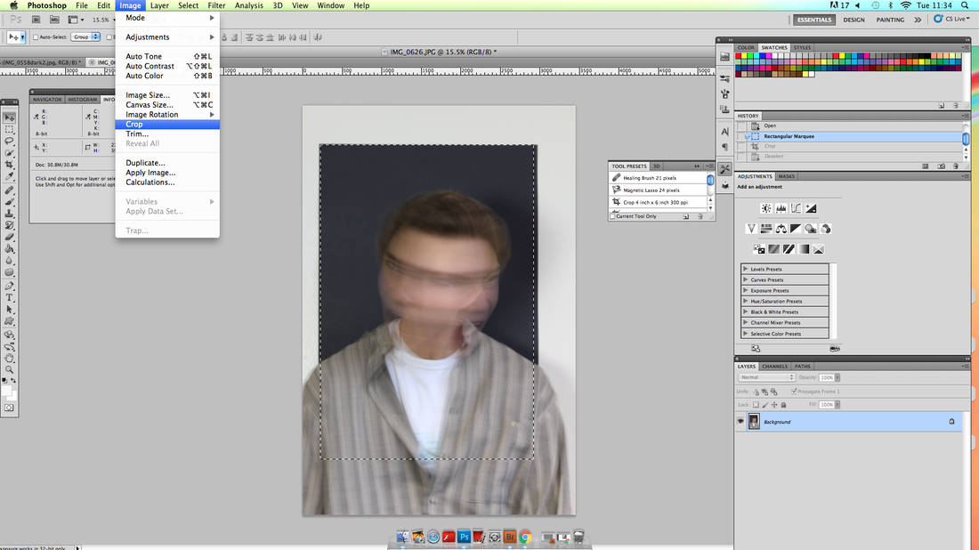
task: take 24 photographs of one piece of white paper. you may fold or crumple the paper but cannot tear or rip it.
contact sheet

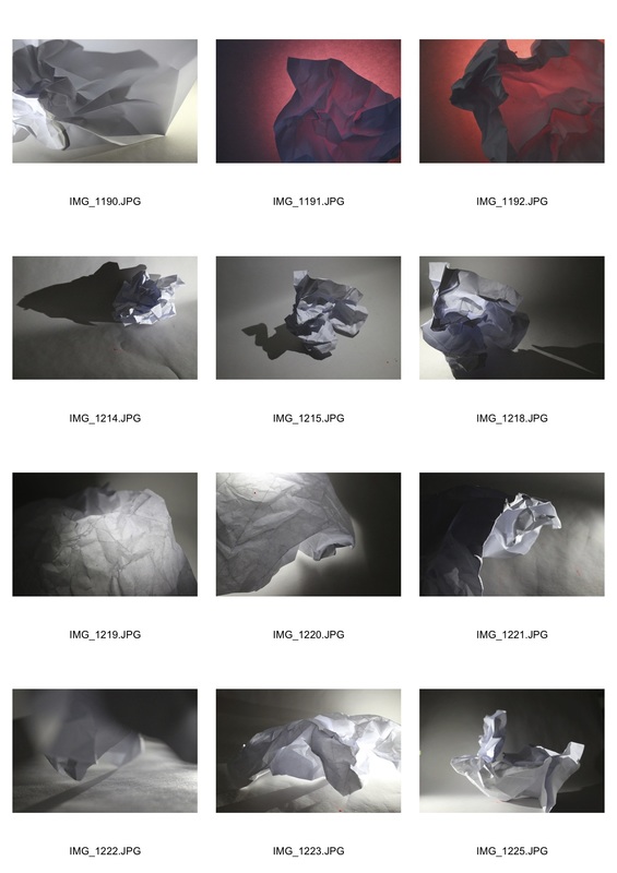
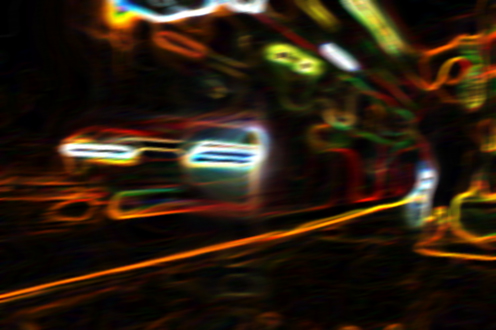
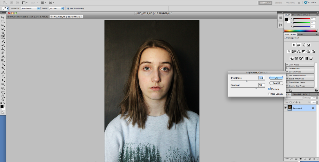
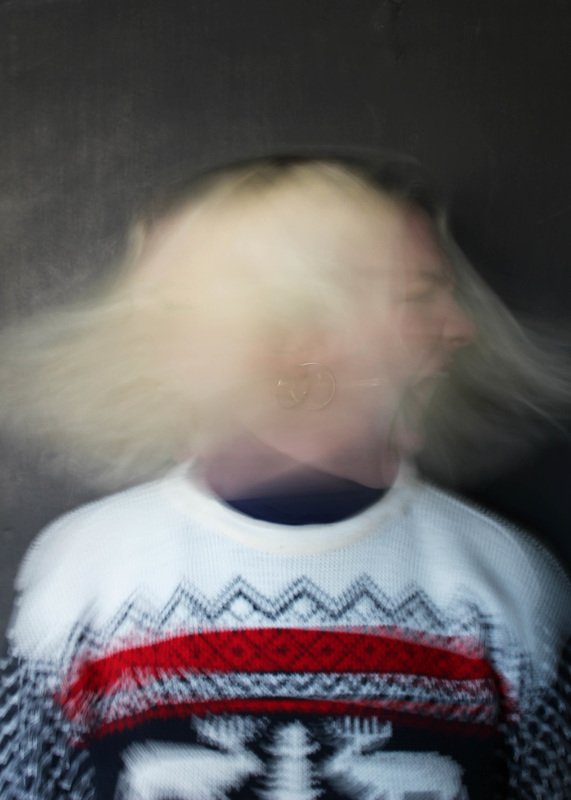
I increased brightness, this Causes the lighter areas to look blured and appear as if they were merged.
i cropped the PHOTOGRAPH so it could appear as of the subject could be something other than a singular piece of paper.
|
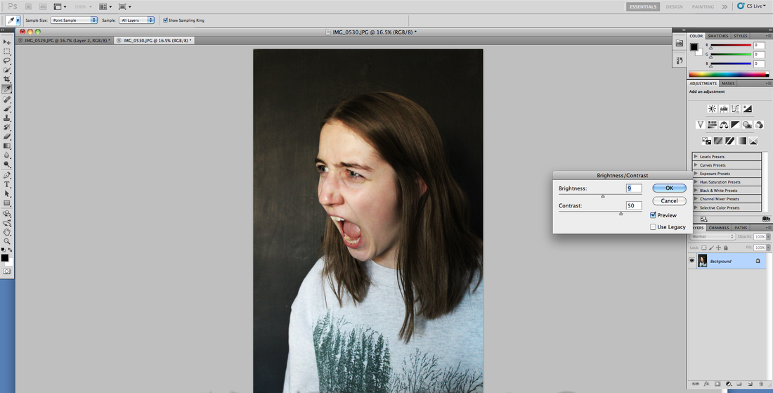
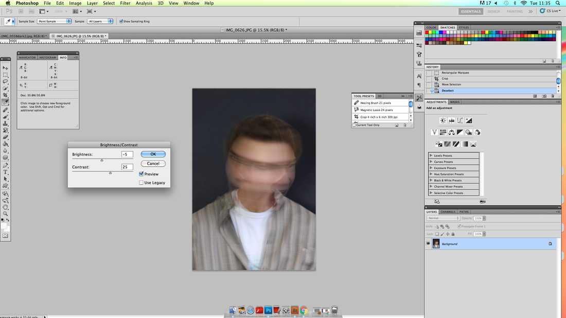
the INCREASED contrast CREATES an eerie atmosphere.
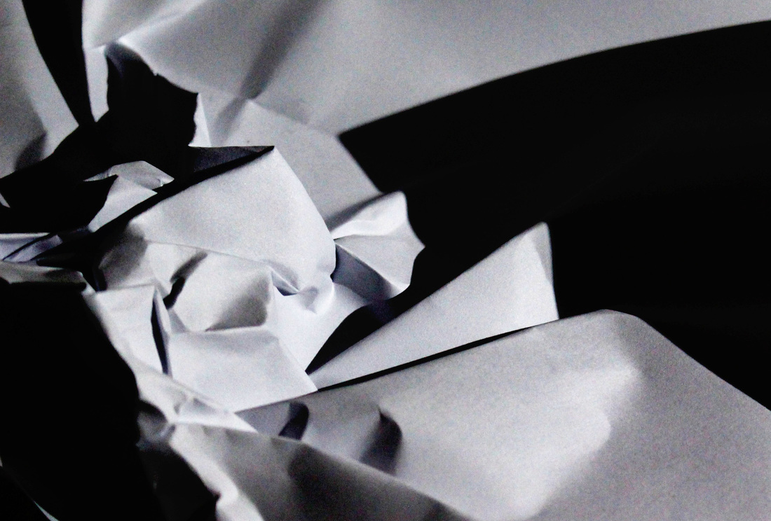
the INCREASED contrast STRENGTHENS the shadows. this highlights the folds in the paper.
|
Artist and me
artist |
my response |
development
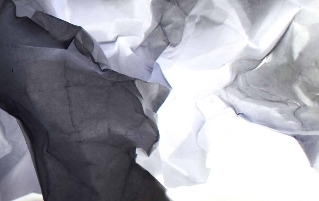
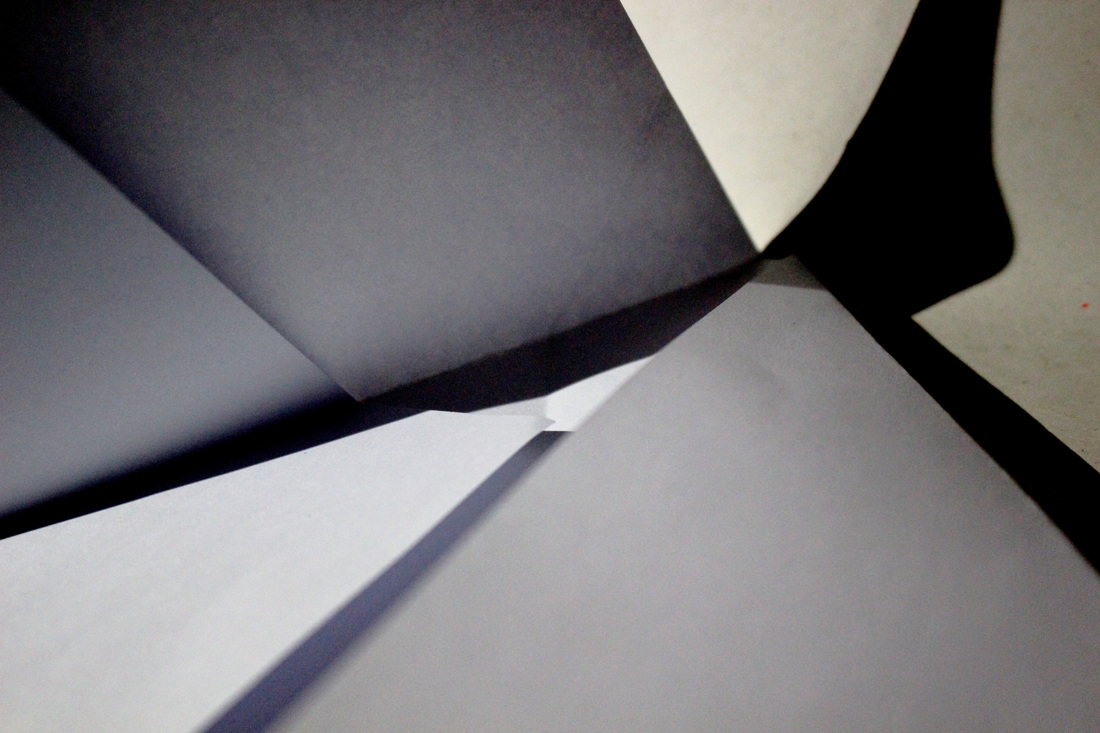
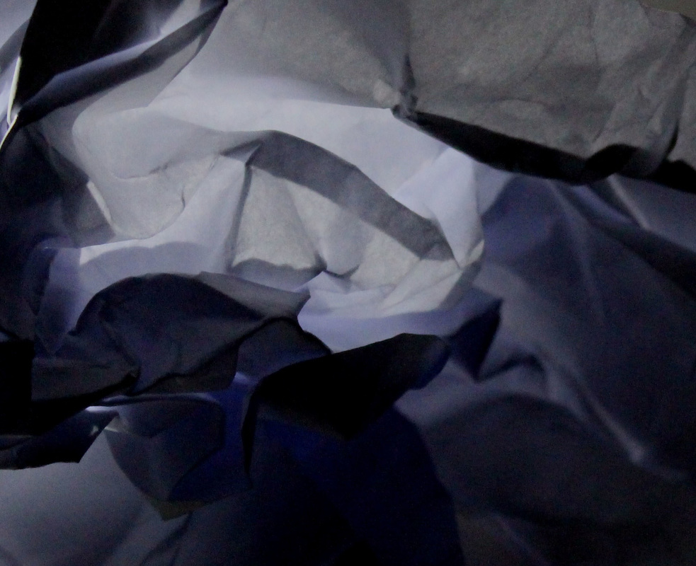
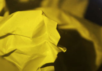
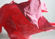
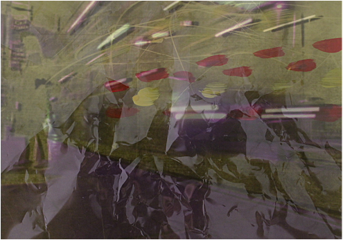
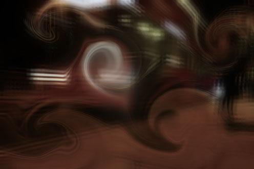
here I experimented using different colour paper, glass panes and cellophane
i changed the brightness and contrast to enhance the foreground focus of the photograph.
|
I changed the contrast so their was further EMPHASIS placed on the depth of field.
|

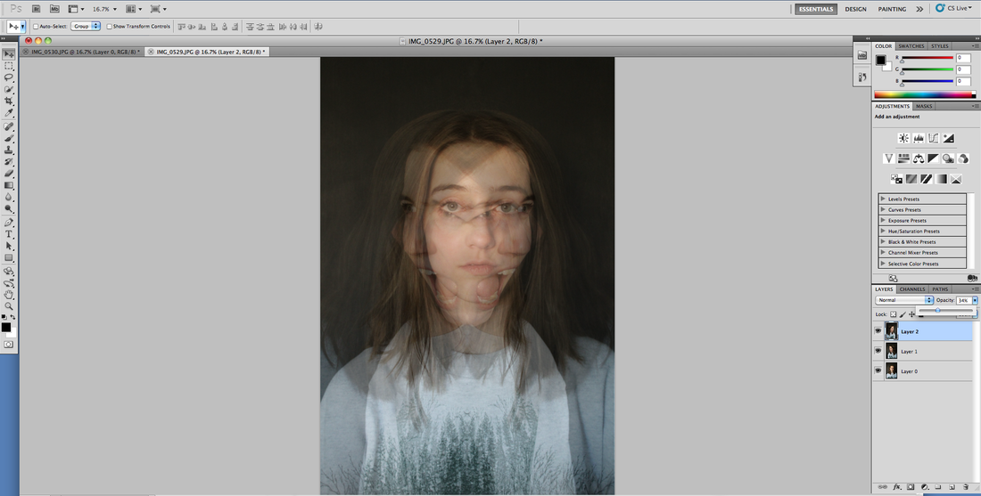
I increased the brightness so the colours get further INTERTWINED and CREATE confusion within the photograph.
|
www
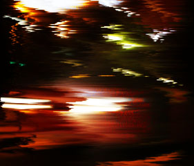
i think the first photogarphs with the colour were more effective. my 3rd edit was my favourite as its quite hard for the viewer to work out what the image is actually of.
ebi
in the development section i think my i could have taken more photographs with more confusion and distortion so much that it would be unclear what the orginal subject of the photograph was.
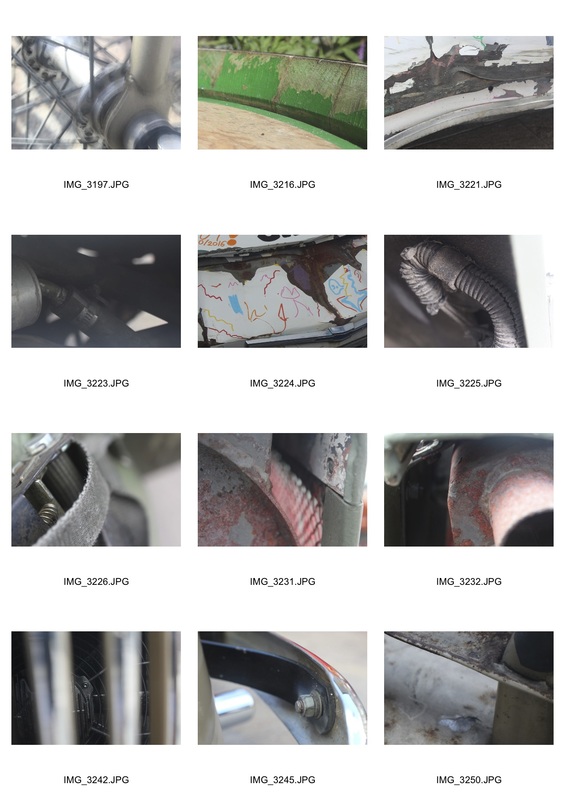
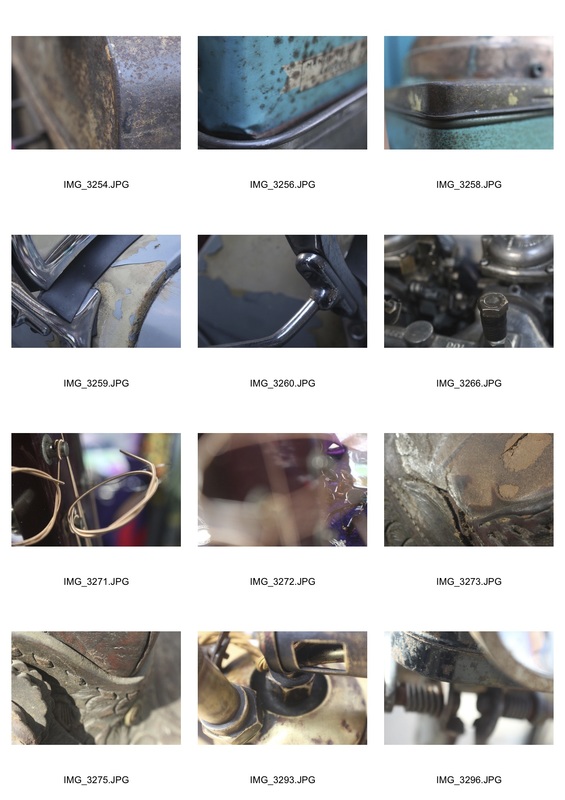
kings cross vintage fair
to photograph this seris of photographs i travelled into central london to a VINTAGE fair near kings cross. here i took photographs of vintage cars and ARTEFACTS. i tried to capture the subjects IMPERFECTIONS and its interesting shapes and textures.

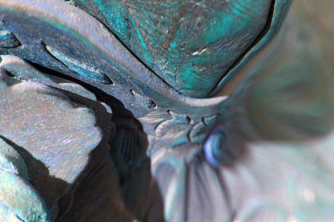
i took image 3221 and put it into photoshop. I added noise to get a grainy texture. i then used radial blur to distort the image. I then changed the hue, saturation and colour balance to edit the image further.
|
i took image 3275 and put it into photoshop. i pinched the image at the centre to draw attention towards the middle of the image. i then used colur balance and saturation to edit the image further.
|
www
i think both of my final edits are intriging to the viewer as they creatre confusion as the are shot from close range on specfic parts of objects and i feel the editing i did on photoshop also helped enhance the confusion.
ebi
i feel as if i could have cropped some of the other images and experimented more with them in order to transfrom them into something new.
experimental development of an ORIGINAL photograph
Original photograph
|
I developed the photograph from an ACETATE sheet. after it was fully developed I placed the photograph it bleach and scratched the surface. I then lightly burnt the surface.
|

I took my DEVELOPED photograph and painted on it. i then placed a piece of yellow cellophane over the photograph and photographed it.
|
i then put it into photoshop and superimposed the oginal photograph onto it and edited the hue and saturation.
|
i took the ORIGINAL piece of acetate and place ORANGE cellophane behind it and photographed it.
|

I put this photograph into photoshop and used liquify to DISTORT the image. i then CREATED a new layer and inverted it. I then changed the colour balance.
|
I took the developed PHOTOGRAPH and used neon glow to edit the image. i then used liquify to distort the image.
|
I took the original photograph and put it into photoshop. i SOLARIZED the image and then used motion blur to further distort it.
|
i took the ORIGINAL photograph and fragmented it twice. i then CREATED a new layer and liquified it. I blended the layers so both were visible. I then lowered the saturation.
|
i took the original photograph and in photoshop and cropped it. i then diffused it and then added wind. then i blured the image. finally i changed the brightness and contrast.
|
www
over all my developments i think i experimented successfully with both developed and digital photographs in many different ways with varying degrees of success.
ebi
i think it could have been interesting to crop the image to focus on a very specific section of the photograph and then edit just that part.
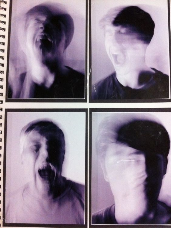
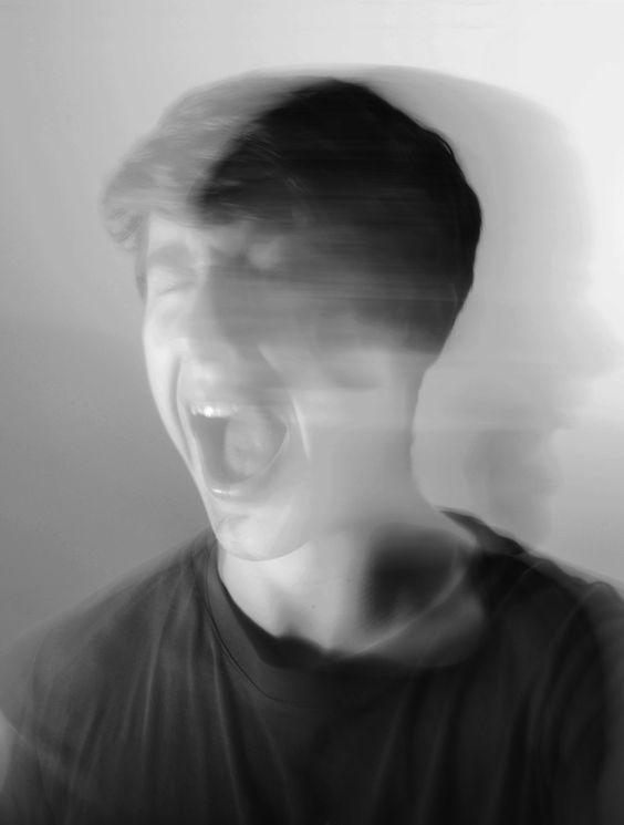
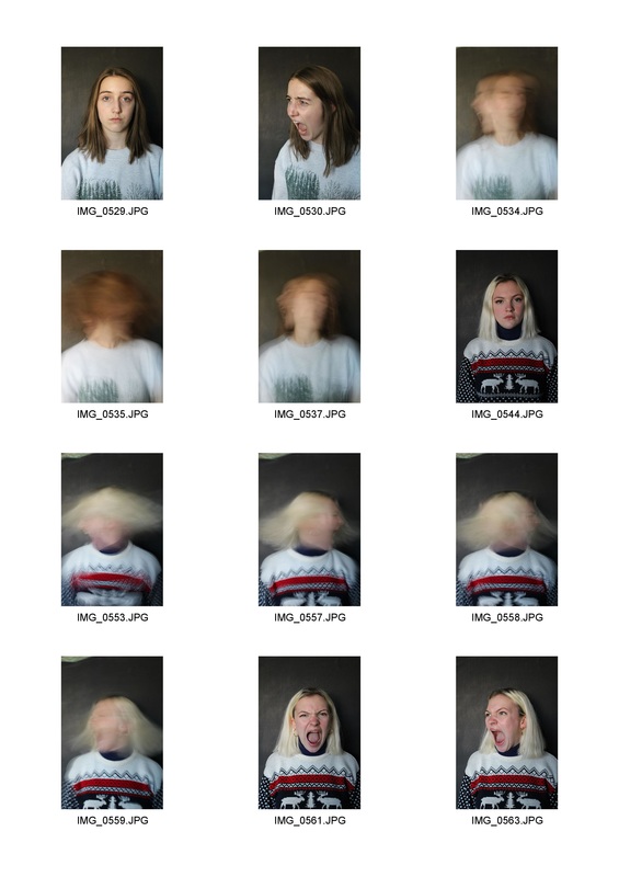
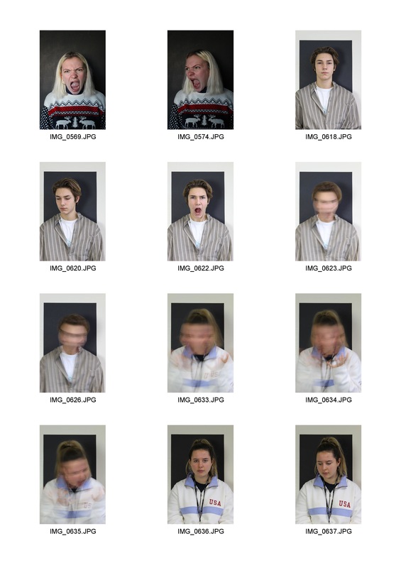
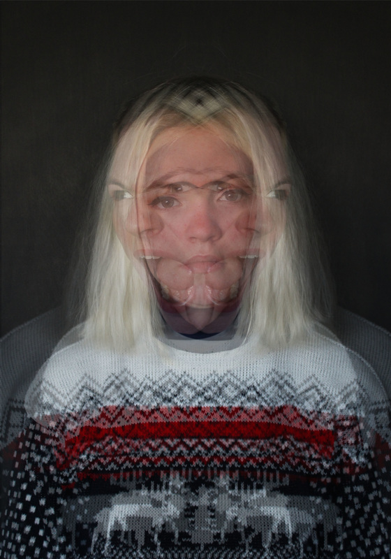
Abstract PORTRAITURE
Using the work of Bill Jacobson and Erwin Blumenfeld as inspiration create a number of different abstract portraits. Use glass pains, cellophane and lights to help develop the portraits.
contact sheet
First Response
example work of bill jacobson
|
|
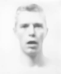
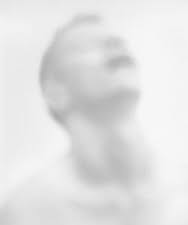
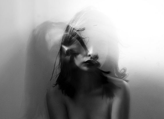
JACOBson blurs and softens the edges and features in a painterly style that reflected Jacobson’s preoccupation with loss and mortality in the early 1990s. his themes tie into his observations of the AIDS epidemic. The faces are hard to grasp, difficult to discern as they recede into the white field of the photograph. Jacobson conveys the sense of futility in trying to capture a human likeness in memory or portraiture.
my Response to bill JACobson
|
|
|
example work of erwin blumenfeld
|
|
has been called "one of the most innovative and influential photographers of the 20th century." he had an extensive background in classical and modern painting. He was one of the few artists to do all of his printing, both COLOUR and black-and-white, in the darkroom himself. Among other techniques in his photography and darkroom work, he used mirrors, veils, double exposure, solarisation, and sandwich printing.
my response to erwin blumenfeld
|
|
|
artist and me
artist my response
|

|
i have used glass mirrors to ABSTRAct my portrait like blumenfeld has. i have ABSTraCTED my photograph further in photoshop by duplicating the image and flipping it and then layering this over the ORIGINAL, by doing this further confusion is added to the photograph. in contrast blumenfeld kept his portraits RELATIVITY UNTOUCHED after the photograph was taken through glass.
www
i think i successfully used techniques used by the artists to inform my own work and i'm pleased with the outcome. especially with my response to erwin blumefeld, i felt that i managed to use the techniques but at the same time produce something a bit different from tht of his own work.
ebi
in my response to bill jacobson i think i could have experimented further with the idea of blur and maybe i could have incorpreted the use of black and white shown in his work.
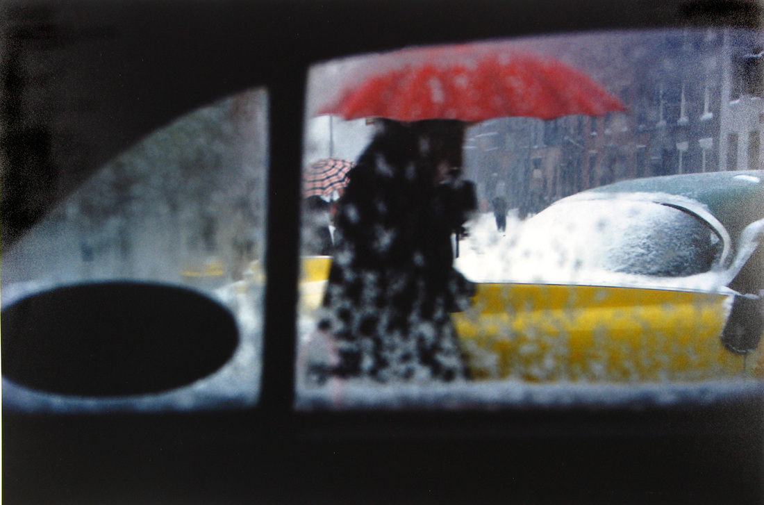
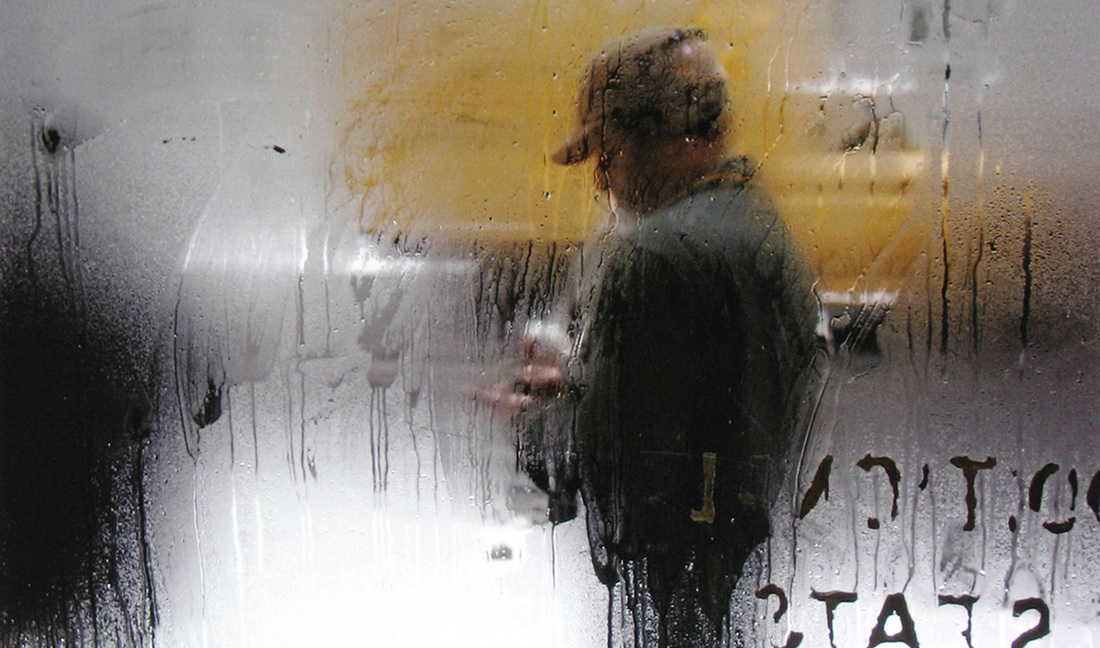
Saul Leiter
Example work of saul leiter
|
|
|
|
my Response to saul leiter
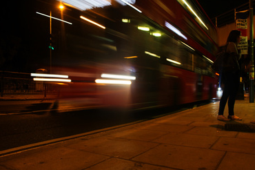
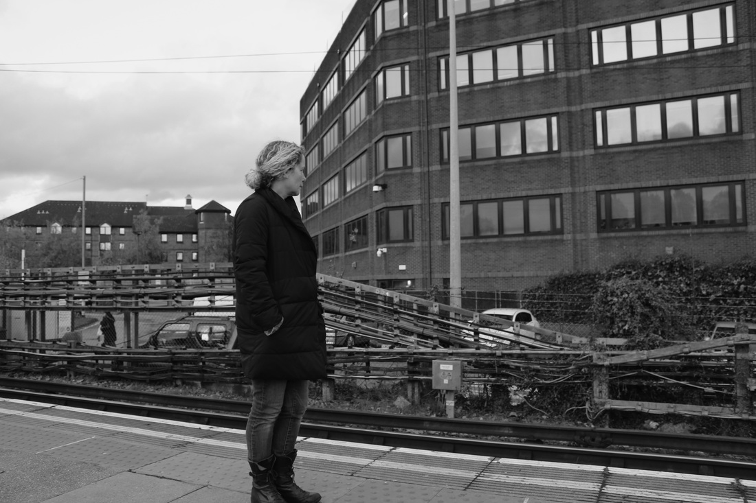
i went to camden and the surrounding area to take these photographs. i tried to capture people in there everyday lives to capture everyday moments. i tried in use a high contrast between light and dark as saul leiter does in most of his work.
contact sheet
final photographs
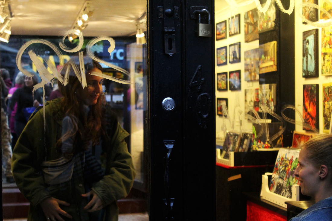
here there is a high contrast between the darkness of outside and the bright artificial lights inside. the photograph presents an everyday conversation inside a shop.
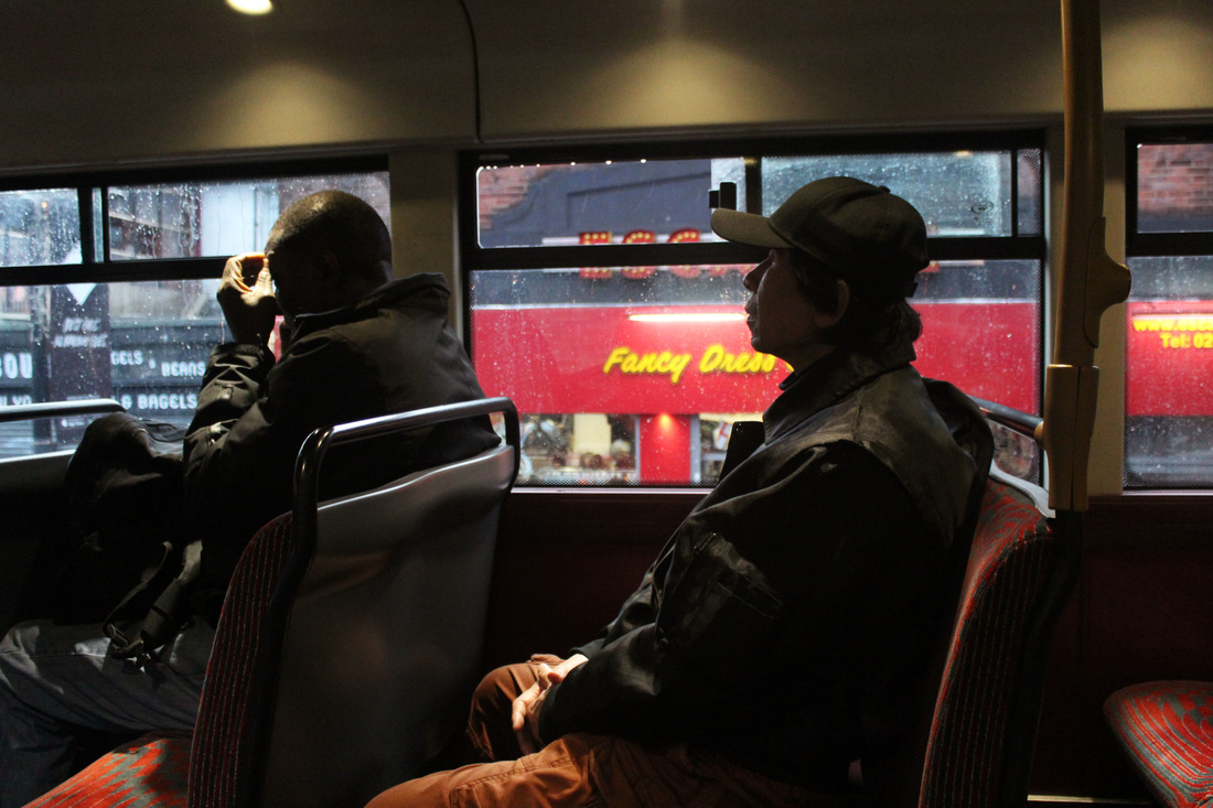
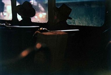
here a man is depicted sitting on a bus letting the world go by. here a high contrast is also portrayed.
|
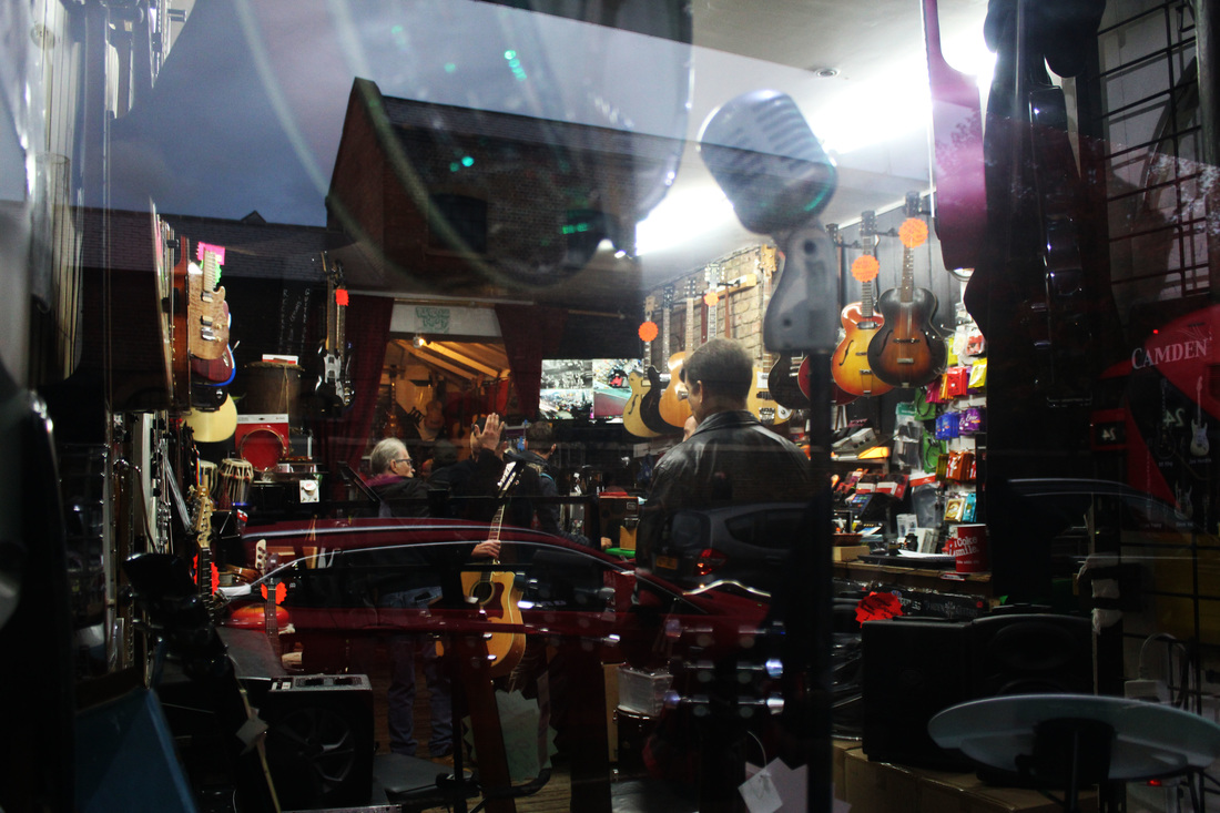
here the everyday business is captured. there is a clear reflection of the busy streets in the window. Again there is a high contrast between inside and outside the shop.
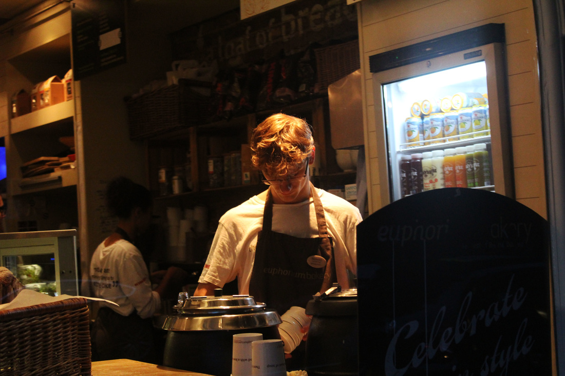
In this photograph a man is working in a shop. There is a high contrast between the spotlight on him and the darkness of the shadows in which his colleague is working.
|
development of final photographs
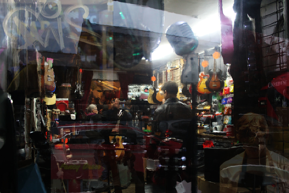
One photograph was taken and the other three photographs were cropped and then layered on top. I then changed the opacity and fill strength so the images blend into the original photograph. on top of the original glass the photograph was taken through, In Photoshop I added a filter of blocked glass to add further distortion to the image. however I still kept having a high contrast in mind and this is clearly shown throughout the photograph.
artist and me
artist
|
my response
|
i think both photographs use a high contrast between the dark inside the light of the outside. in my response the people are more present and this makes it feel more like it's captured from everyday life. both photographs have high saturation levels which creates a pleasant tone.
www
i was very pleased with the way my response turned out. i think i successfully used high contrast between areas of light and dark to emphasis certain aspects of the images. like saul leiter i think i successflly used glass or windows in my photographs to present the idea that the images are taken from the outside and therefore showing reality.
ebi
it would have been better if i'd varied the distance at which the photographs were taken at in order to creatre a sense of distance between the subject and the photographer.
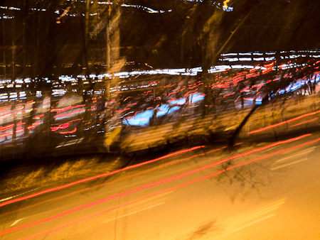
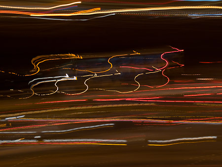
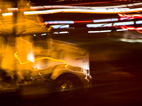
the three strands
strand one
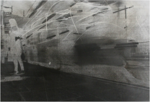
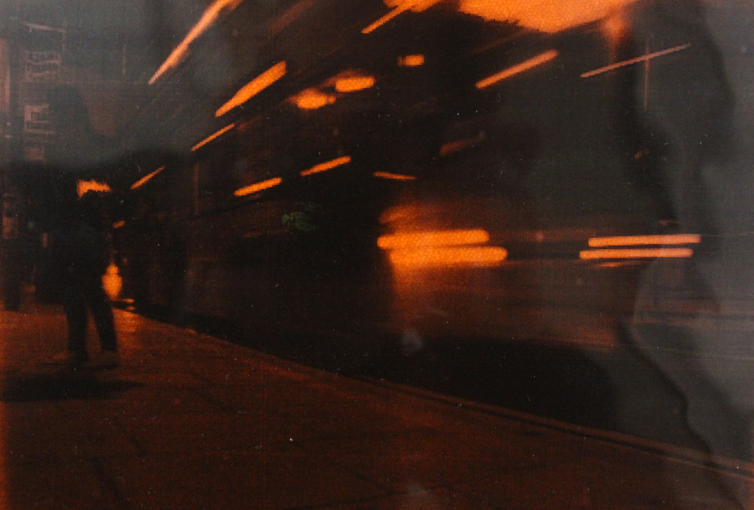
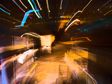
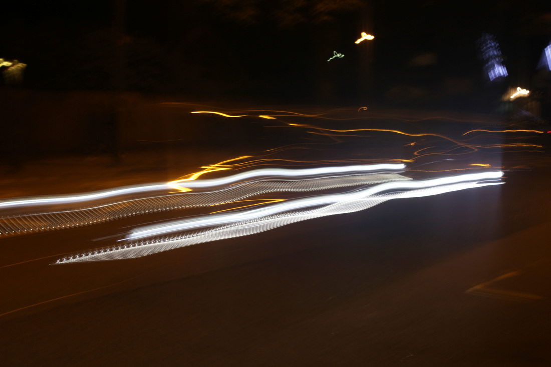
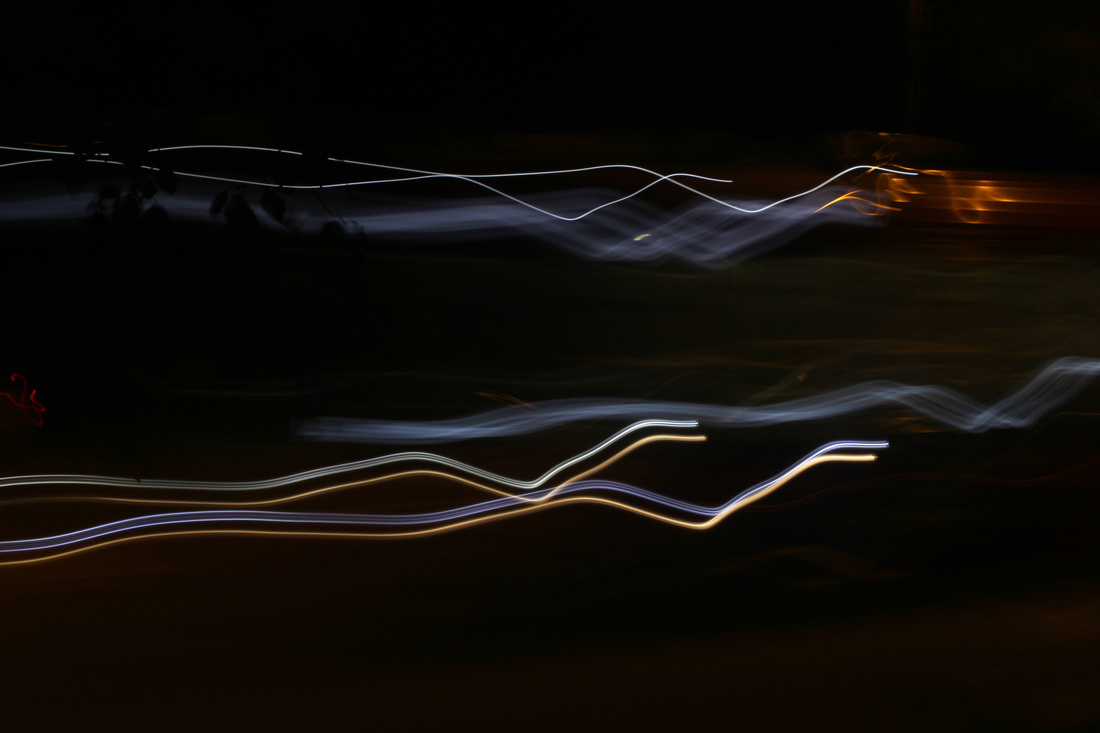
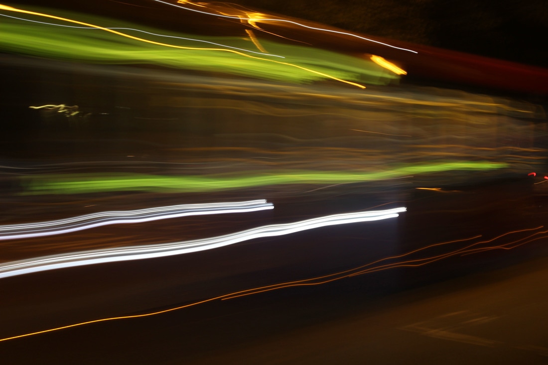
for strand one I'm doing abstraction based on the theme of city life. the main artist inspiring my work is tom bovo, a new york based photograph that captures everyday life in the city. he frequently uses prolonged exposure in his work in create streaks of light flowing through his work.
example work of tom bovo
|
|
|
|
first response
These PHOTOGRAPHs were taken on east finchley high road.
contact sheet
photographs
In these photographs the prolonged light exposure demonstrates how time can be manipulated within photography to present more than what we as humans can see with our eyes. the light in these photographs shows how a simple headlight with the design function of safety can be drawn out through time and can be presented as something entirely new through the medium of photography.
for all the photographs I edited both the contrast and the brightness in order to accentuate the light trails but at the same time make sure the background is clearly visible in order to keep the light trails in perspective.
for all the photographs I edited both the contrast and the brightness in order to accentuate the light trails but at the same time make sure the background is clearly visible in order to keep the light trails in perspective.
I took this photograph free hand to create light trails that weren't completely straight this creates a sense of imperfection. here I captured two different colour light trails.
I took the photograph free hand and while the lenses shutter was still open I gently moved the camera up and down, this created wavy light trails across the frame.
|

I took this photograph free hand to create light trails that weren't completely straight this creates a sense of imperfection. I captured multiple coloured light trails shown right from the top down to the bottom of the frame, this reflects the different layers time depictured.
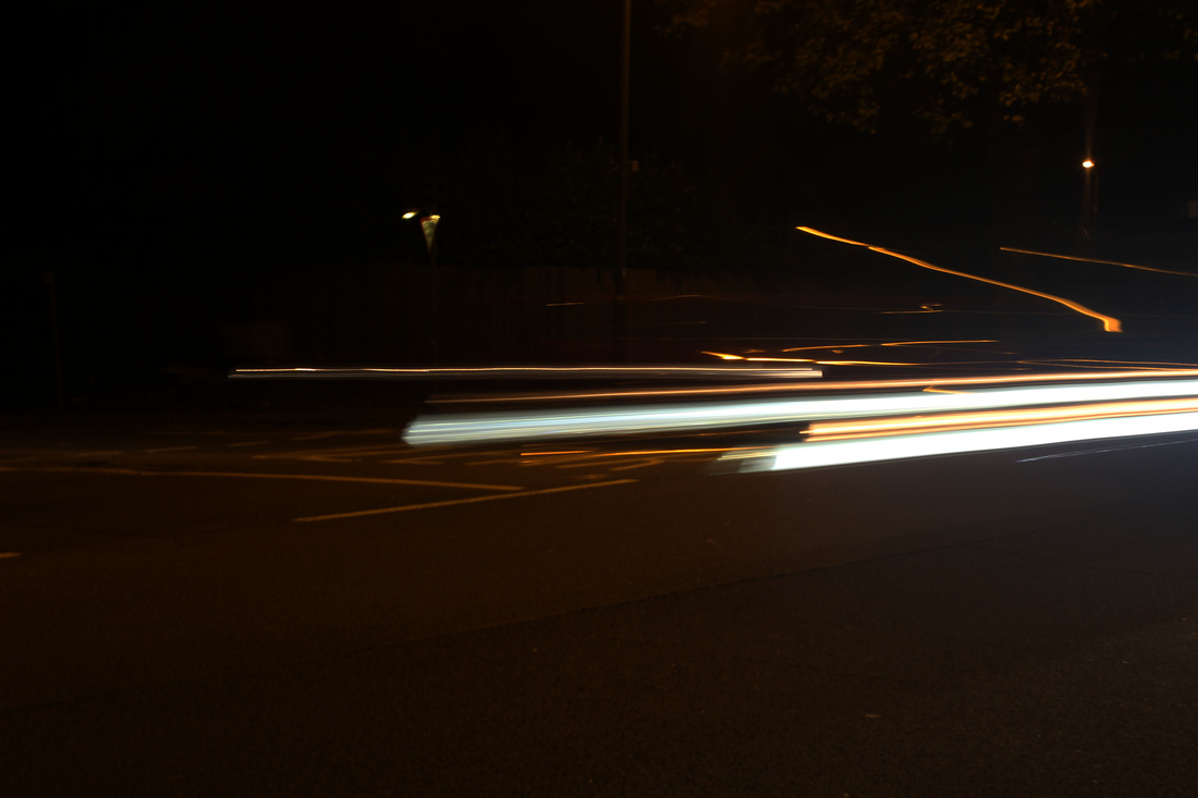
when taking this photograph I used a tripod in order to create straight beams of light across the frame. this presents the light as uniform and tidy.
|
artist and me
artist my response

|
|
Both photographs are taken without the use of a tripod so as a result the light trails in both pieces are wavy lines instead of straight ones. both use little or no editing after the photograph is taken. they both use a long shutter speed in order to let more light in and create the light trails. tom bovo has framed his photograph in a way that several light trails from different objects are INCORPORATED into the photograph, in contrast my photograph includes one object with several light trails taking up the entire frame.
Strand two
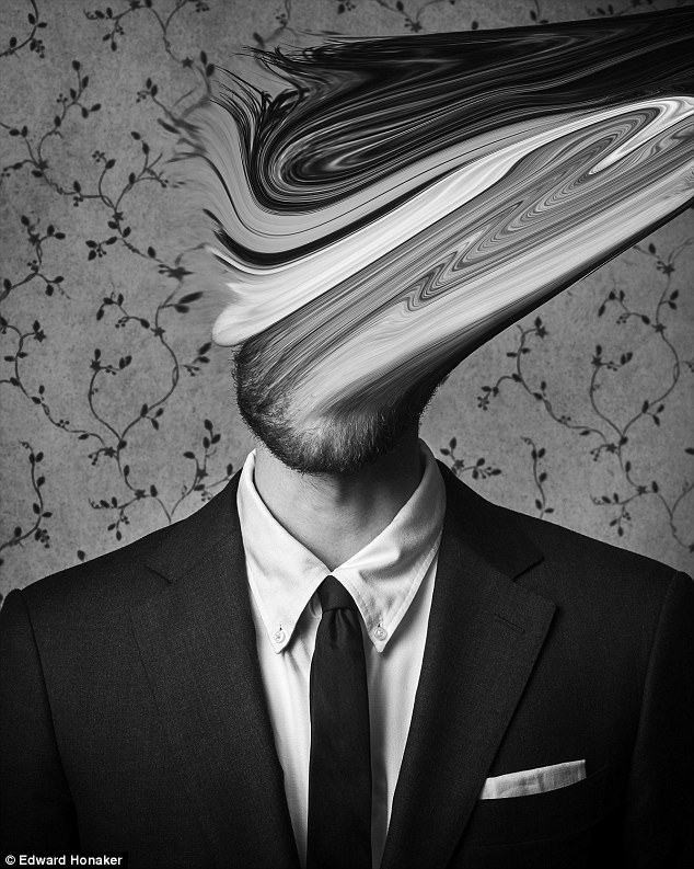
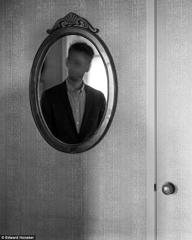
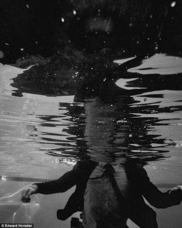
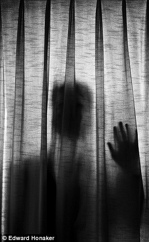
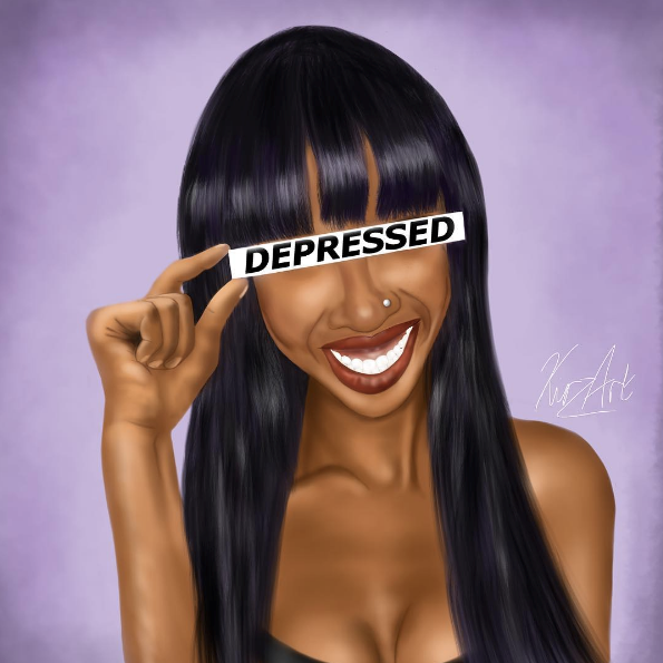
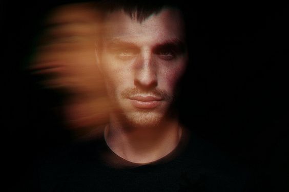
for strand two I'm presenting abstraction through portraiture. the main artist inspiring my work is Edward honaker, a Californian photographer that reflects his own depression and anxiety through his work. Edward's face is blurred or covered in all of the haunting black and white photos, which are meant to portray the helplessness felt by someone who is battling a depressive disorder.
example work of Edward Honaker
|
|
|
|
first response
contact sheet
Photographs
i have edited all of the following photographs in black and white, like the artist edward HONaKER, this is so there are no background colours taking from the meaning and focus of the pictures.

|
|
|
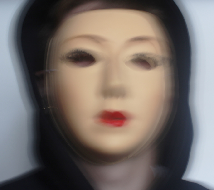
Construction: here the use of a mirror shows she is just a reflection of her previous self - there but not truly. the blur of the head represents how the mind is shaken and distorted.
editing: I cropped the image so only the MIRROR is shown, this is to focus the photograph on the subject rather than the surroundings. i then edited the CONTRAST and brightness of the image. 
construction: the blur of the head reflects the the illness and how she has a distorted view of the world surround her and how inside her head her THOUGHTS have not been set straight.
editing: I edited the brightness, contrast and EXPOSURE. 
construction: Here the contrast between her internal and external emotions and feelings are expressed through the use of layering.
editing: I adjusted the brightness, contrast and exposure on Photoshop. |
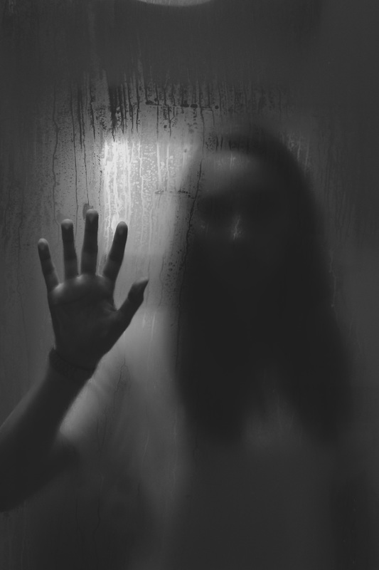
construction: here her hand pressed against the glass signifies the reaching for help. while the shadow figure shows she is just a shadow of true herself. the window's light in the background shows how distant she is from the reality that surrounds her.
editing: i adjusted the exposure, CONTRAST and brightness levels in order to further the EERINESS of the image. 
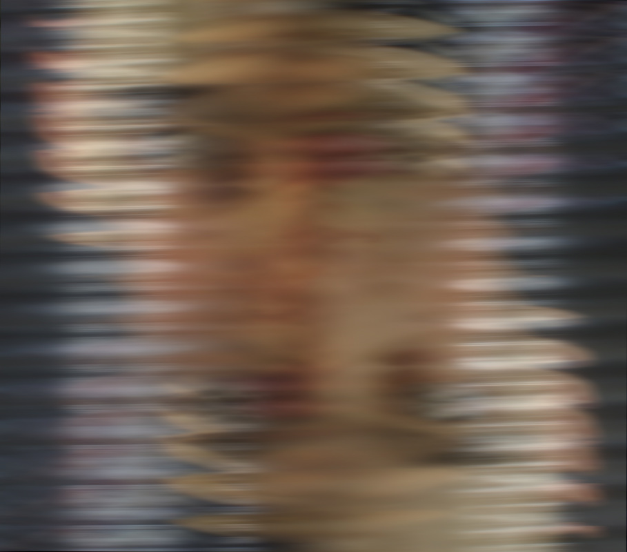
construction: here her true emotions are presented rather than what is reflected on the outer shell. editing: I EDITED THE BRIGHTNESS, CONTRAST AND EXPOSURE in order to CREATE further DISTORTION within the image. 
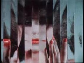
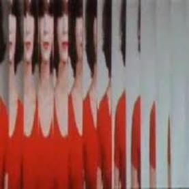
construction: Here I replicated different strips within her face and over layered them upon one another in order to create a weaved like pattern using different parts of the face. this represents her confusion and helplessness.
editing: I adjusted the brightness, contrast and exposure on Photoshop. |
artist and me
artist my response

|

|
both use the subject in a similar position. in my response i made sure some of the face was visible rather than in the artist's photograph where the subject is completely a silhouette. my PHOTOGRAPH has a softer contrast which makes the body less PROMINENT and the hand more so, in contrast HONaker used a high contrast making the person really stand out from the curtain.
strand three
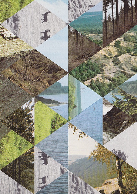
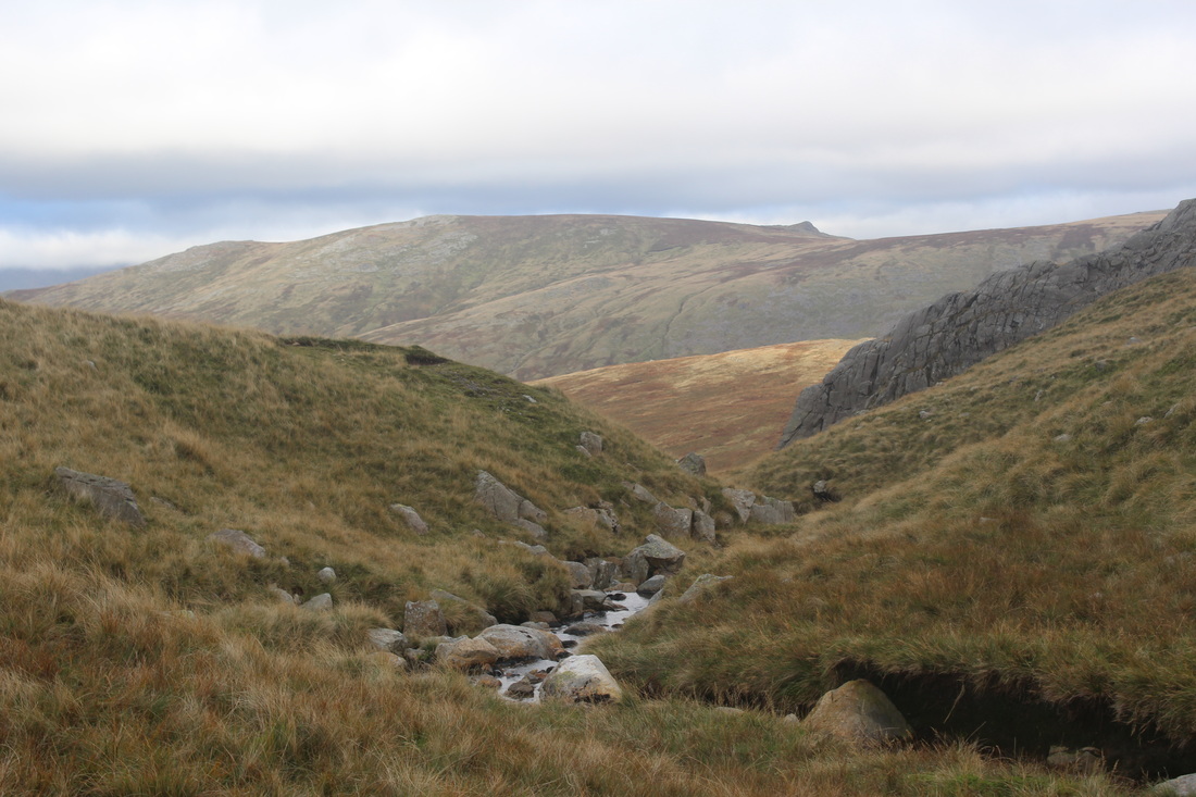
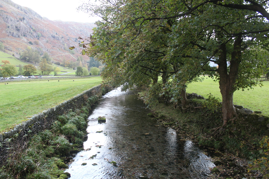
for strand three I will present abstraction through using several images in a geometric collage. the main artist influencing my work is jelle martens, a Belgian photographer. he uses nature as a focal point throughout his work especially trees and water.
example work of jelle martens

|
|
|
|
first response
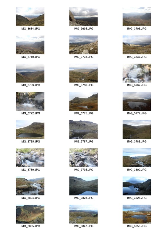
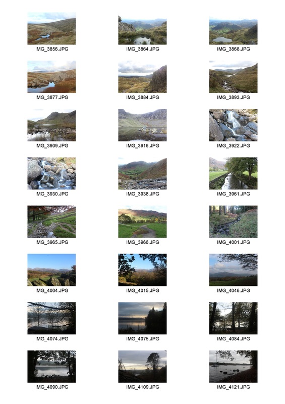
all of the following photographs were taken in the lake district, near lake windermere.
contact sheet
First collage
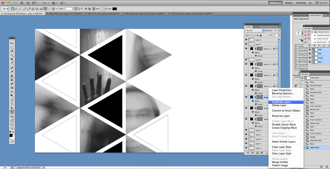
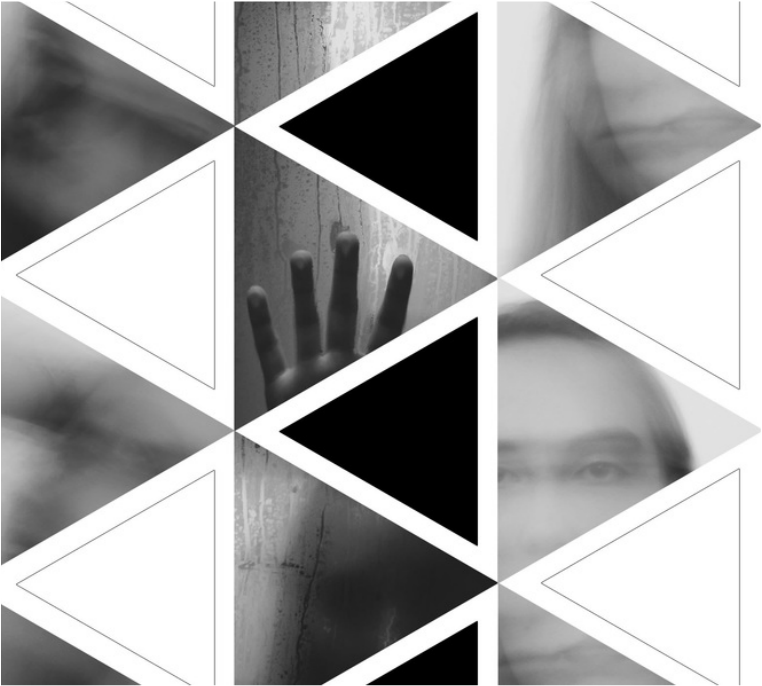
I selected three photographs from the contact sheet and printed them out i then cut them up into different shapes and sizes. i then placed them back together to reform a photograph.
the three selected photographs
|

|
|
reformed photograph
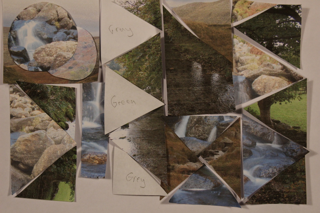
creating my final collage
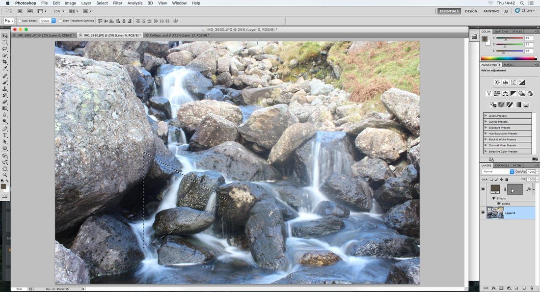
for each triangle i had to select the shape and then copy and paste it onto new picture.
|
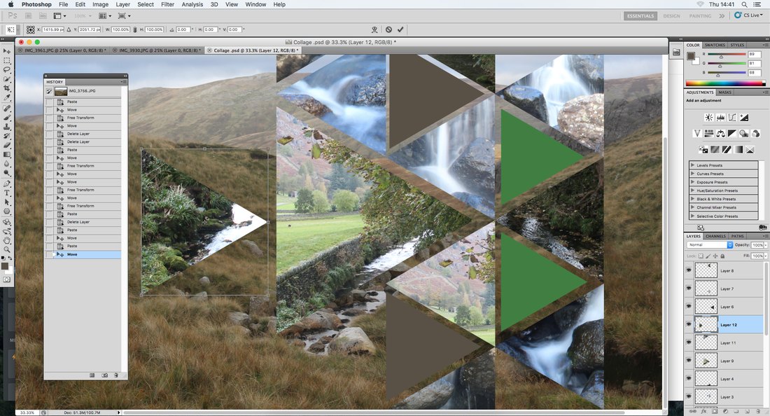
I THEn HAD TO USE THE FREE TRANSFORM TOOL TO ENSURE ALL THE TRIANGLE WERE IDENTICAL AND IN LINE.
|

this PICture is composed from three INDIVIDUAL PHOTOGRAPHS which have been cut and pasted to create geometric shapes. some of the triangles are DIFFERENT sizes and some have been filled with block colours that reflect the SURROUNDINGs.
artist and me
artist my response

|

|
both images dipic the countryside and nature through the use of collage. i experimented using VARYING size triangles. i also left small gaps IN-BETWEEN the TRIANGLES in order to expose a background image, instead martens didn't have a background image and INSTEAD just FITTED all the triangles exactly.
development of a strand
I have chosen to develop on strand 2 as I believe it has the most potential for interesting development and exploration. as I started to touch on in my first response I want to develop my work to produce more representational work rather than just abstraction. this is because I think more people can relate to art when they can try and understand and explore the meanings and develop their own interpretation of what the work is presenting. I think within abstraction it is harder for people with a non-artistic way of thinking to understand and interpret the artwork in all it's meaning. this is shown by EEG brain scans which show that while viewing abstract art, non-artists showed less arousal than artists. However, while viewing figurative art, both artists and non-artists had comparable arousal and ability to pay attention and evaluate the art stimuli. therefore this suggests abstract art requires more expertise to appreciate it than does figurative art. [Source: https://www.ncbi.nlm.nih.gov/pubmed/21425703].
Artists used as inspiration
Kirsty latoya
http://www.kirzart.com/

|
|
|
Kirsty Latoya is a self-taught freelance illustrator who does incredibly detailed, quality art pieces. She specializes in shape and form, supports individuality and demonstrates her appreciation for non-conventional beauty through her art.
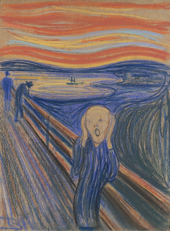
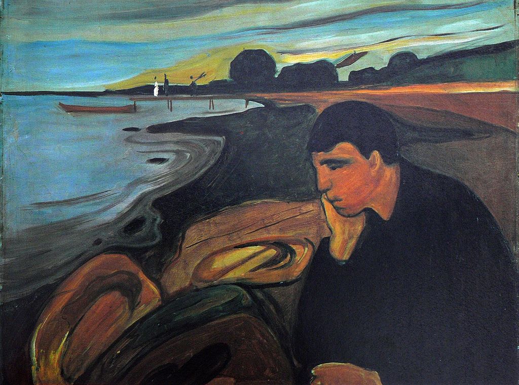
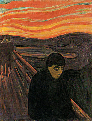
Edvard Munch
|
|
|
Edvard Munch is said to have suffered from depression, agoraphobia, a nervous breakdown and to have had hallucinations, one of which inspired "The Scream." Mental illness also ran in his family, most notably with his sister. The Norwegian artist said of the relationship between his mental illness and his work, "My fear of life is necessary to me, as is my illness. without anxiety and illness, I am a ship without a rudder ... my sufferings are part of my self and my art. They are indistinguishable from me, and their destruction would destroy my art." He wrote in one of his journals, "Illness, insanity and death were the black angels that kept watch over my cradle and accompanied me all my life."
Bobby Baker

|
|
|
Bobby baker is an actor who documented his therapy by drawing a picture in a notebook everyday of his recovery. he was quoted saying; "I think mental illness is the worst of anything. The hierarchy of suffering is sort of bound into our society. But my personal experience is that the isolation and anguish of severe mental illness was much worse than having something physical that people could understand better."
intial development
the premise of my initial development is TO PRESENT SHOCKING STATISTICS ABOUT MENTAL ILLNESS THROUGH MY WORK. i have split this intial development into three sections; working people, young people and old people. i have done this in order to explore the topic through a wide range of ages.
Working People
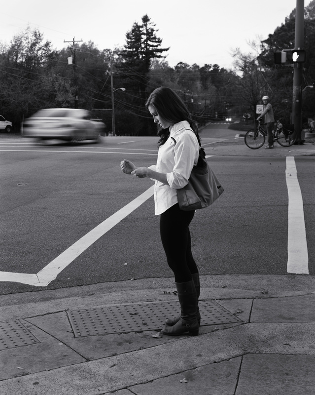
for example it's predicted that 1 in 6 days that working people take off work are due to some sort of mental illness. using this statistic i could have a blurred tube train in the background with somebody of working age in focus in the foreground with their back to the train. another possible idea is to have a double exposure or long exposure of everybody moving around a single person who is in focus and still - this idea would also reflect the idea that mental illness cannot be seen and is often ignored or unnoticed by many people.
alexey titarenko
this is an artist that uses the blurred movement of people in this work.
|
here i could do something similar in terms of the movement of people and objects and having them blurred in the background. except i would have the main focus on somebody in the foreground who would stay still for the shot.
|
|
contact sheet

the next three photographs are based on the following statistics:
1 IN 6 DAYS THAT WORKING PEOPLE TAKE OFF WORK ARE DUE TO SOME SORT OF MENTAL ILLNESS.
1 IN 6 DAYS THAT WORKING PEOPLE TAKE OFF WORK ARE DUE TO SOME SORT OF MENTAL ILLNESS.
here i used a long exposure of 1/6 in order to capture the internal emotions of the person. i like the photograph as i think it is a powerful image. it's relatively unedited with only a slight change to the brightness and contrast and i think that it's this simplicity of the photograph that says so much. the contrast between the blurred character in the foreground and the still background expresses the ease of extreme change similar to people who experience bi-polar disorder.
this photograph not only represents the statistic but also shows how the world can travel by yet the person can feel like nothing has changed this is shown by the blurred train in the background with the unnatural like stillness of the in focus person in the foreground. the reflection in the tube also shows the person looking down at the tracks as if contemplating suicide. again i think this is a powerful photograph and can be interpreted in different ways depending on what aspect of the image the viewer chooses to focus on.
this PHOTOGraPH shows how the brain can almost become removed or distant compared with its surroundings. the balck and white edit and adjustment of contrast and brightness makes the dark tones come through more and this creates darker more serious mood.
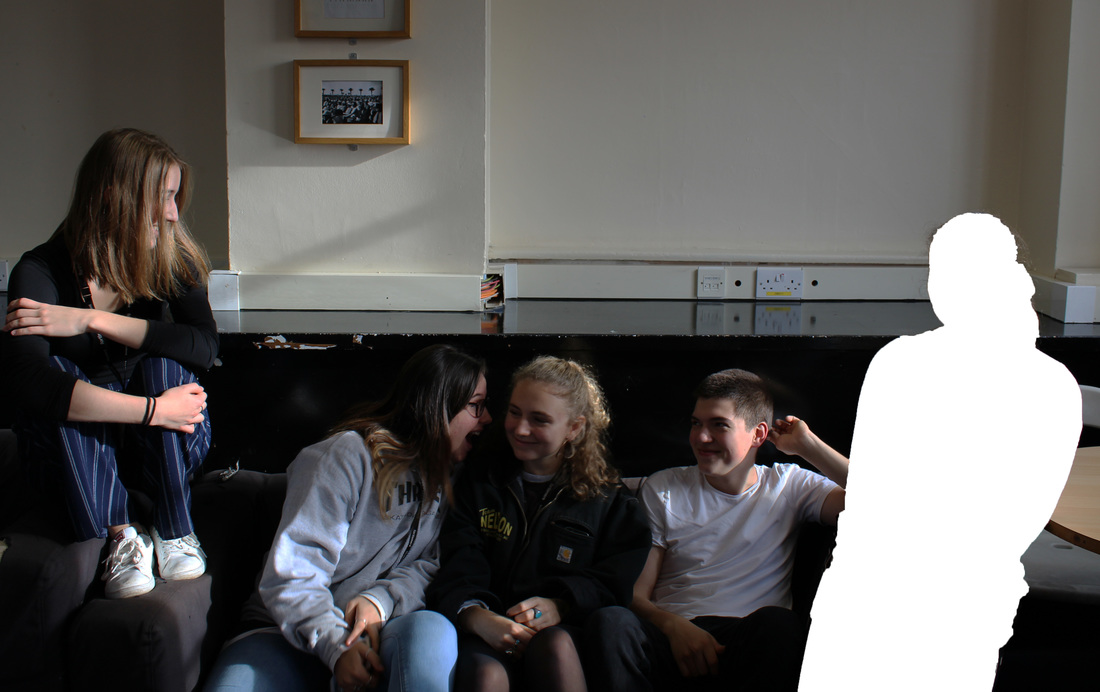
Young People
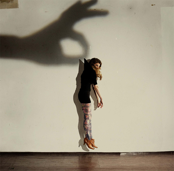
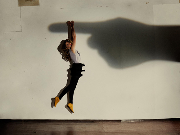
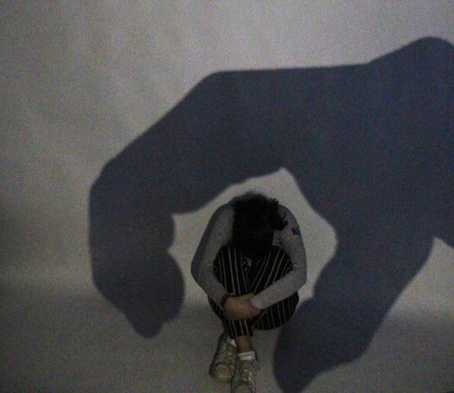
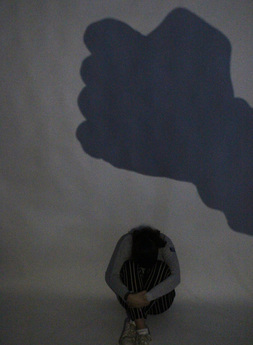
another idea is based on the statistic that 20% of adolescents may experience a mental health problem in any given year. i could have 5 teenagers in a line sitting on a sofa with 4 of them laughing and enjoying themselves but have 1 (representing the 20%) stone faced clearly not involved and looking isolated. another way to express the feeling of being trapped is to take inspiration from Russ and reyn's shadow puppets. my idea is to expand on the use of hand shadows but use it to portray entrapment, e.g. have a shadow of a closed fist and someone crouching below looking helpless as if they were about to be crushed.
Russ And Reyn Shadow Puppets
|
russ and reyn are a photography team based in new york and their work in fun and has an element of humor
|
|
contact sheet

|
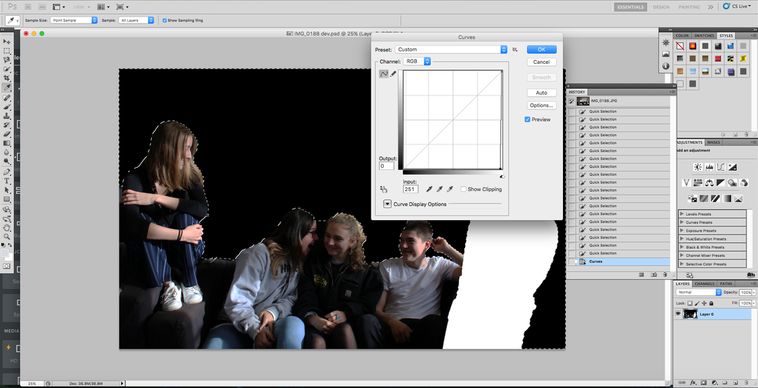
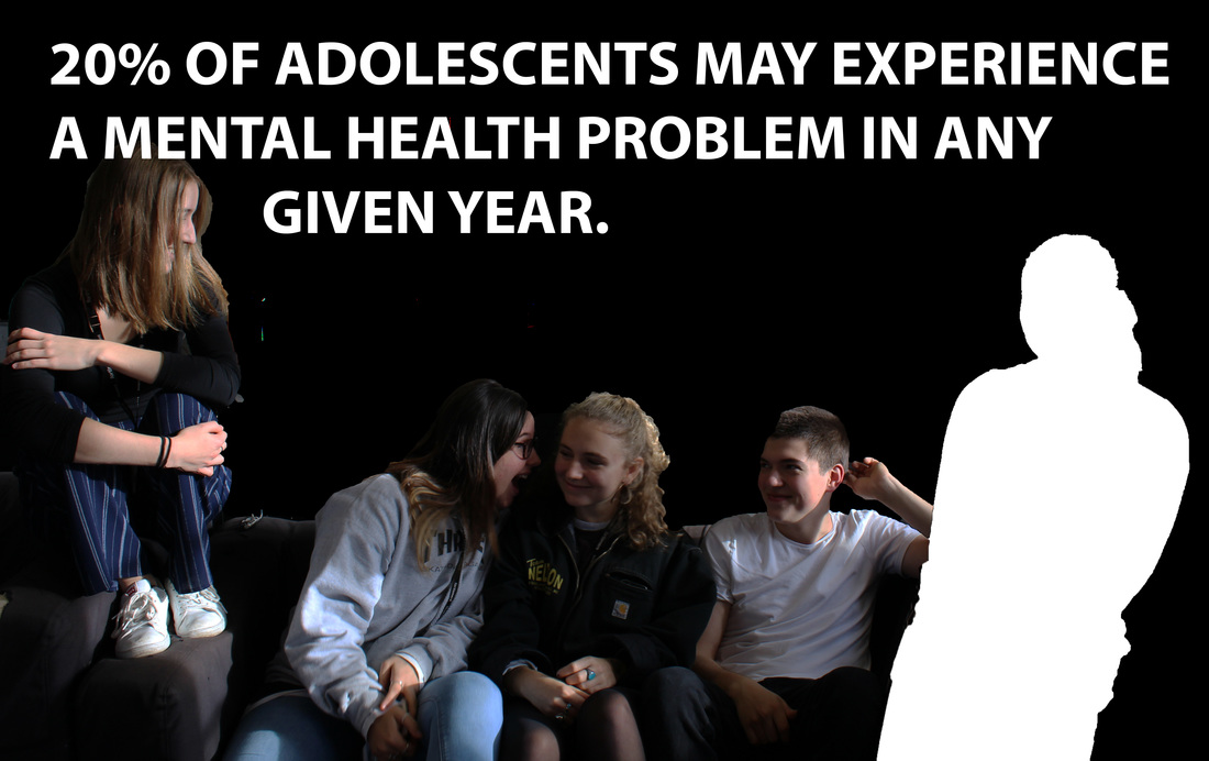
i used the quick selection tool in photoshop in order to slect one person and blank them out of the photo. four of the five people are enjoying themselves in contrast to the 1 (20%) person who is blanked out. this reflects that statistic that 20% OF ADOLESCENTS MAY EXPERIENCE A MENTAL HEALTH PROBLEM IN ANY GIVEN YEAR.
|
|
i then decided the background could be blanked out in order to focus on the subject. so agagin i used the quick selection tool and made the background black. i then used the text tool to express the meaning/statistic directly onto the image.
|
although this photograph shows the statistic more clearly i feel as though the image above this one is more powerful as it reflects it as more of an everyday thing.
|
|
i didn't think these photographs came out very well as it was hard to balance the light needed in order to create the shadow and enough total light to light up the frame. however I like the idea so as a result i decided that i could create a GIF in which the shadow could chase the subject as to portray the entrapment felt.
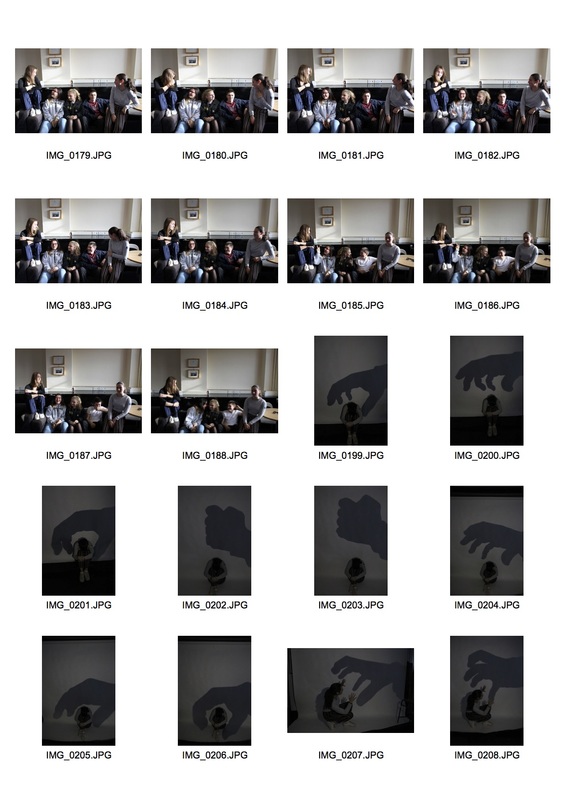
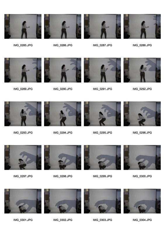
gif contact sheet
|
|
|
|
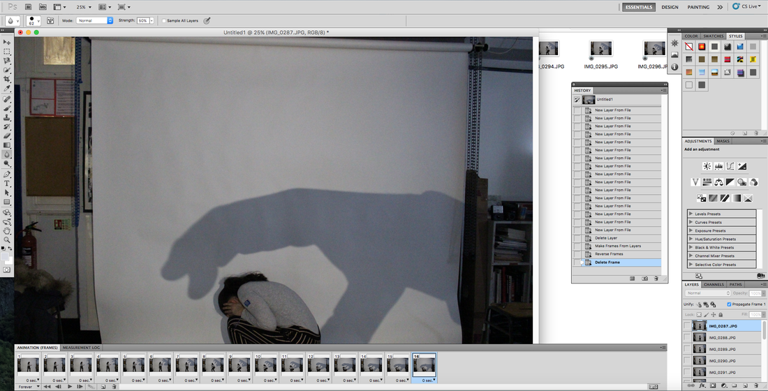
i took the images and turned each one into a layer. i then turned each layer into a frame.
|
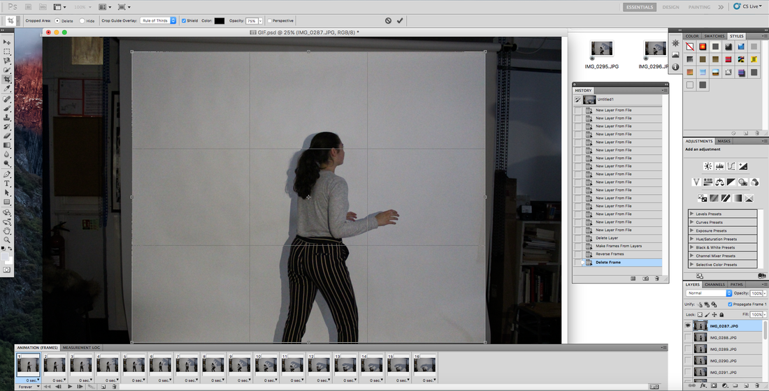
i then cropped all the frmaes so the focus was drawn to the meaning and not surroundings.
|
i then changed the brightness and contrast levels so the image was more focused and clearer.
|
gif

20% OF ADOLESCENTS MAY EXPERIENCE A MENTAL HEALTH PROBLEM IN ANY GIVEN YEAR.
Collage
I really liked the use of the collage i used in my 3rd strand and had an idea that i could use the same technique but using my photographs reflecting mental illness not nature.
i first selected what i thought to be the interesting part of the images in the form of triangles. i added them one by one onto a plain white background.
|
i then created both filled and outlined triangles and added these to the collage to fit with the triangles with an image inside it..
|
10% of children and young people (aged 5-16 years) have a clinically diagnosable mental problem.
i think the use of the collage can be used as a metaphor for the distortion of the brain.
Older People
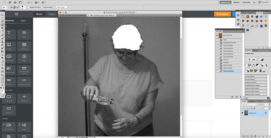
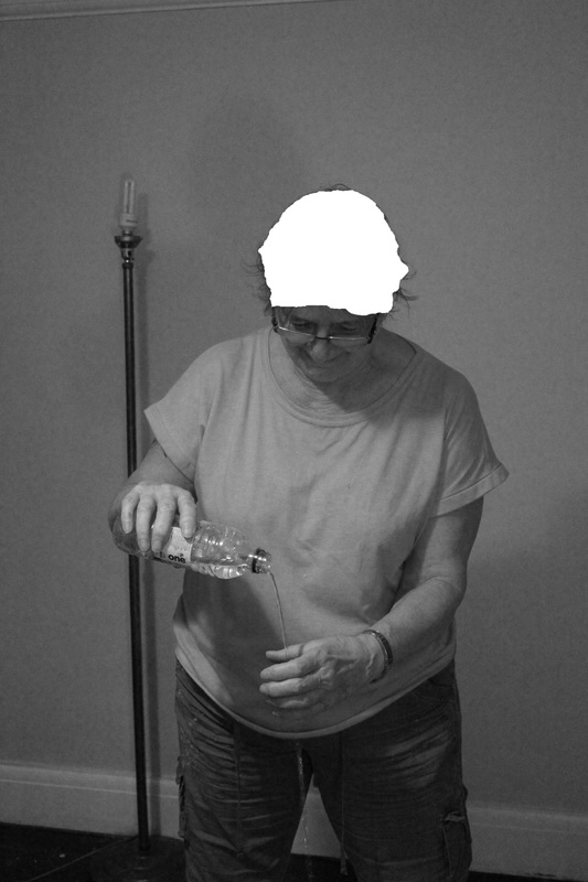
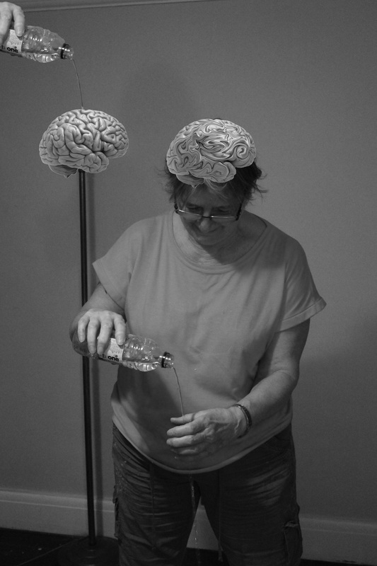
my third idea is focused on older people. i could also reflect the fact that In 2014, a report from Alzheimer’s Disease International estimated that the number of people living with dementia worldwide was 44 million. i could represent this by taking photos of older people doing everyday tasks but without including the main item. e.g. reading a newspaper in an armchair but without actually holding the newspaper. other ideas are the misplacement of objects, many people close to an Alzheimer's sufferer will tell you sometimes they will forget the task they are going and will misplace items E.G. I could photograph someone putting a kettle in the fridge.
eric pickersgill
|
pickersgill is an artist that takes photographs with people not holding items but focuses on technology and often uses moblie phones.
|
|
contact sheet
|
|

|
|
|
this is my first edit. i really like the concept behind the photograph and i think it has a powerful message. it shows the loss of memory and destruction of the brain.
|
this image portrays the idea of the damage that DEMENTIA has on the brain really well. i like the simplicity of the COMposition in contrast with the complexity of the DISEASE.
|
after my first two edits i decided that the photograph would be more powerful in its SIMPLEST form with just a slight edit to the brightness and contrast. i presented the photograph with a easy to understand shocking statistic.
THIS PHOTOGRAPH IS INSPIRED BY ERIC PIKERSGILL WHO MAINLY USES TECHNOLOGY IN HIS WORK BUT I LIKED THE IDEA AND THOUGHT THE SAME KIND OF THING COULD PRESENT SOMETHING ENTIRELY DIFFERENT LIKE THE LOSS OF MEMORY.
THIS PHOTOGRAPH IS INSPIRED BY ERIC PIKERSGILL WHO MAINLY USES TECHNOLOGY IN HIS WORK BUT I LIKED THE IDEA AND THOUGHT THE SAME KIND OF THING COULD PRESENT SOMETHING ENTIRELY DIFFERENT LIKE THE LOSS OF MEMORY.
225,000 people will develop dementia this year in the uk, that’s one every three minutes.

|
i used the quick select tool in photoshop to select the person and the kettle. the absence of colour is meant to reflect the absence of mind and the fading of function.
|
here I used the idea that she has forgotten what she's done with the kettle and instead of boiling it she has placed it in the fridge. the inspiration behind this photograph is an article I read in which a wife of a Alzheimer's sufferer was talking about her husband's disease and she talked about how one time she came into their kitchen to find him putting the kettle in the fridge. this story really touched me and made me release how devastating Alzheimer's can be not only for the sufferer but also the ones close to them.
i changed the background to black and white so It doesn't distract the viewer from the main subject of the image.
|
I then selected the person using the quick selection tool and changed the saturation so the colours stand out more and draw the viewers attention to the main focus.
|
the idea behind this photograph is that she has forgot what task she is doing and has placed her shoes on her feet. although it may seem over the top I think it's a powerful image that clearly gets the message across as it represents just how devastating Alzheimer's disease is.
THIS PHOTOGRAPH IS also INSPIRED BY ERIC PIKERSGILL and i think it presents the idea of meory loss and damage quite well. by taking away an item that should OBVIOUSLY be there it creates a powerful image that represents the shocking effect ALZHEIMER'S disease can have. the composition of the photograph which shows the subject to be pushed to one side of the frame depics how alzheimer's disease can cause people to be lonely and feel a lack of self worth.
development into portraiture
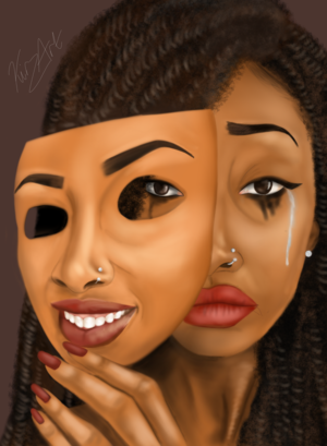
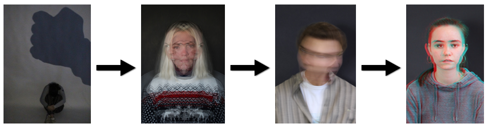
i have chosen to develop my ideas into portraiture. the main reason for this is i believe by focusing soley on people's facial features it draws attention to their raw emotion and true feelings. although i do think many of my previous photographs were very powerful i think this is a real avenue that i can explore and experiment within to produce a new developed body of work which reflects the very real issue of mental illness.
these are a few photographs i like from various artists and photographers that express mental illness:
these are a few photographs i like from various artists and photographers that express mental illness:
|
|

|
|
|
contact sheet
|
|
triple exposure portraiture
the idea behind this specific development is that what most people see in normal everyday life is the orginal straight faced photograph but what most people can't comprehend or understand is the other photographs portraying the true emotions. to show this through the medium of photography i layered the different photograhs in order to show both the external and internal emotions.
here i changed the brightness and cointrast in order to place exphasis on the facial features and their expressions.
|
HERE I CHANGED THE BRIGHTNESS AND COINTRAST IN ORDER TO PLACE EXPHASIS ON THE FACIAL FEATURES AND THEIR EXPRESSIONS.
|

here i horozontially flipped the image so the photohgraph was effectly reflected.
|
i then layered both the edited photograph and the flipped copy onto the first photograph and changed the fill and opacity in order to get the effect i wanted.
|

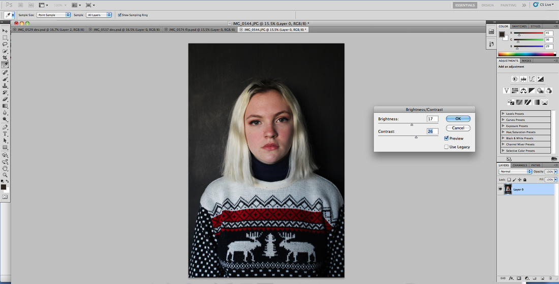
first i adjusted the brightness and contrast
|
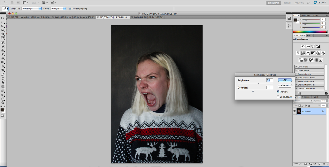
i then had to adjust the brightness and contrast of the other photograph
|
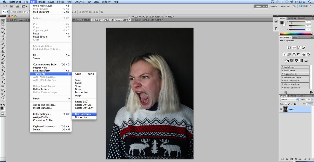
i then horizontally flipped the photograph so i had two symetrical photographs
|
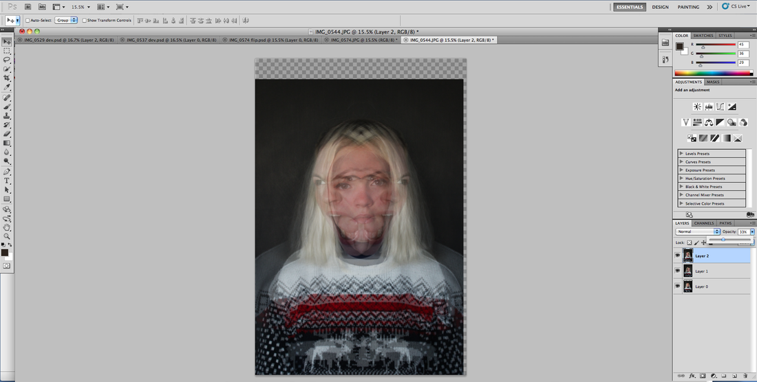
i then overlayered the three different photographs, aligned them and adjusted fill and opacity to get the right effect.
|

i then cropped the image so it was aligned.
|
prolonged exposure portraiture
i then chose to develop my oringal idea of triple exposure into prolonged exposure which is a technique in which you increase the the lengh of time the lens is open for, this means that you are able to caputure an image over several seconds. however the longer the lens is open for the more light that is let in, this means you have to counter balance this using the white-balance. i chose to use this technique as it expresses the inner emtions that have appeared to be supressed to the outside world. these photos express soley the internal emotions rather than comparing the internal with the external. i think this is powerful as this shines light on the side that people don't normally see.
First i cropped the image so that the focus was soley on the subject.
|
i then adjused the brightness and contrast to enhance the image.
|

i first cropped the photograph so the focus was on the subject not the background
|
i then adjusted the brightness and contrast
|


|
here i changed the brightness and contrast levels in order for the subject to stand out against the background.
|

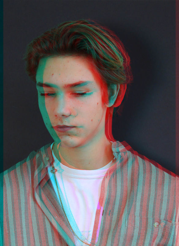
3-D Effect Portraiture
for this development i've introduced the concept of the third dimension within my work. i've used the concept as a metaphor; with normal vision one can see the image but it doesn't completey make sense however when one uses 3d glasses the image makes sense and becomes complete. this reflects the nature of having a mental illness; one can't quite comprehend the enormity of having a mental illness and how much it impacts one life until they, in some capacity, experience the repercussions.
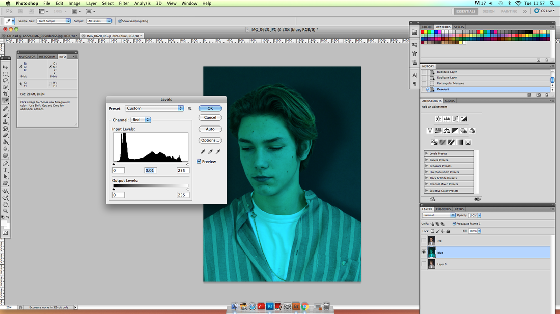
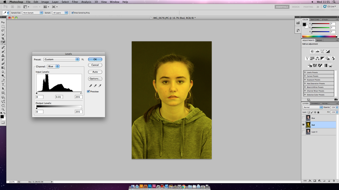
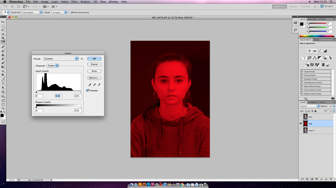
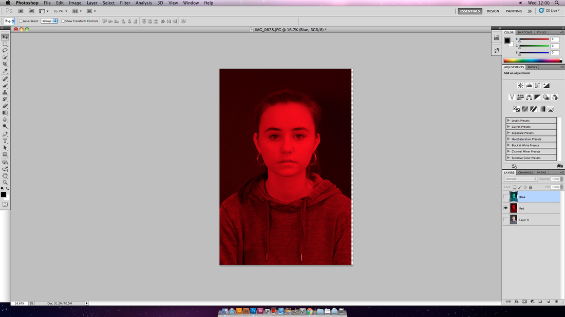
first i duplicated the oringal image twice. i named these duplicates red and blue. i selected the 'blue' layer and changed the red level.
|
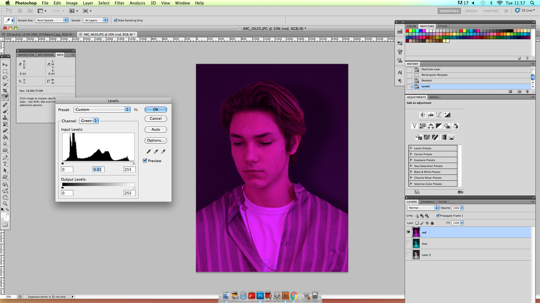
i then selected the 'red' layer and changed the green levels which in turn turned the layer purple.
|
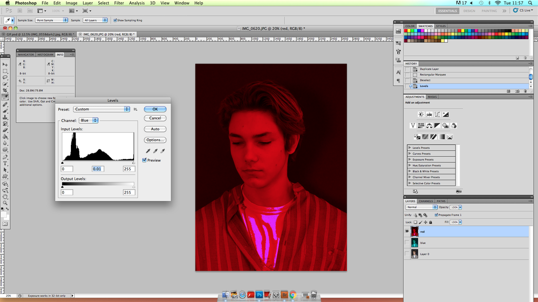
i then, while still having the 'red' layer selected, changed the blue levels so the layer became red.
|

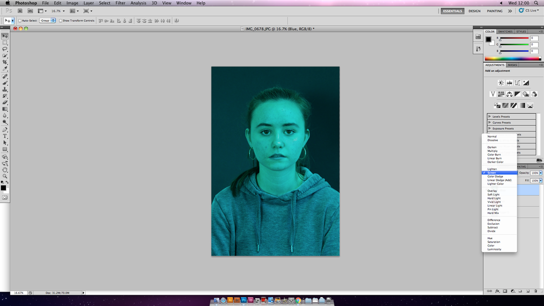
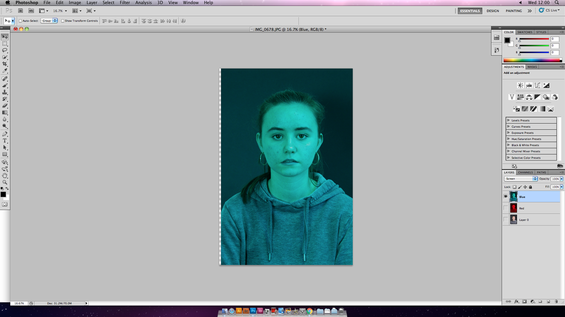
i changed the layer setting from normal to screen on both the red and blue layers so that the layers combined in the right way
|
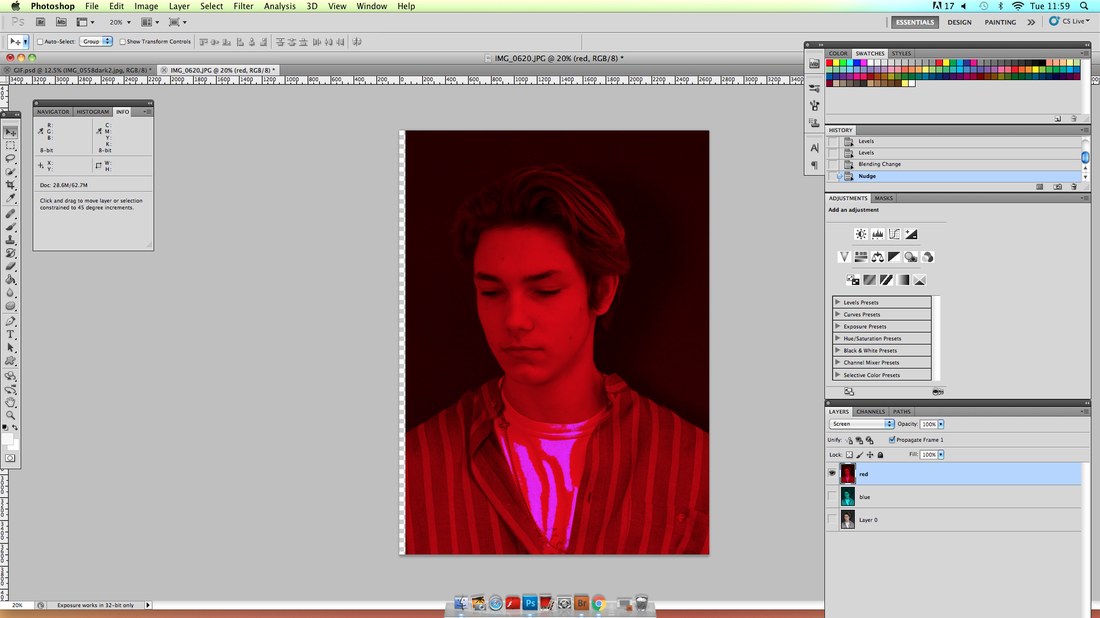
i then slected the whole red layer and moved it 10 notches to the right
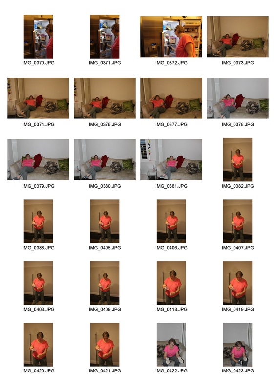
|
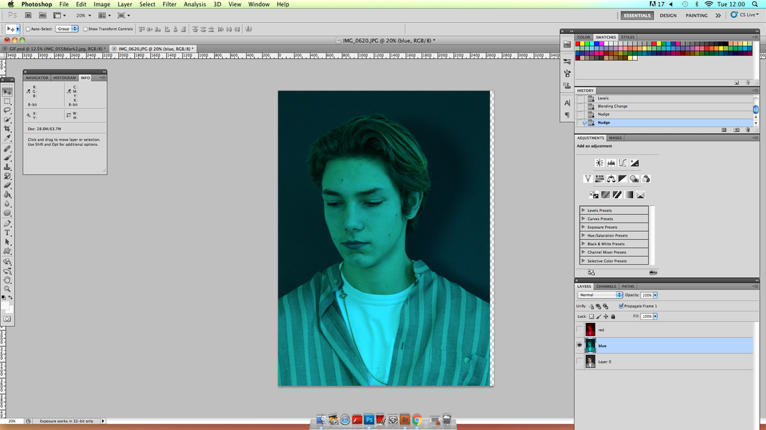
i then slected the whole blue layer and moved it 10 notches to the left
|

i first cropped the photograoh so the subject was the main focus.
|
FIRST I DUPLICATED THE ORINGAL IMAGE TWICE. I NAMED THESE DUPLICATES RED AND BLUE. I SELECTED THE 'red' LAYER AND CHANGED THE blue LEVEL.
|
I THEN, WHILE STILL HAVING THE 'RED' LAYER SELECTED, CHANGED THE green LEVELS SO THE LAYER BECAME RED.
|

I THEN SELECTED THE 'blue' LAYER AND CHANGED THE red LEVELS WHICH IN TURN TURNED THE LAYER bluey green.
|
I CHANGED THE LAYER SETTING FROM NORMAL TO SCREEN ON BOTH THE RED AND BLUE LAYERS SO THAT THE LAYERS COMBINED IN THE RIGHT WAY.
|
I THEN SLECTED THE WHOLE BLUE LAYER AND MOVED IT 7 NOTCHES TO THE right.
|
I THEN SLECTED THE WHOLE RED LAYER AND MOVED IT 7 NOTCHES TO THE left.
|
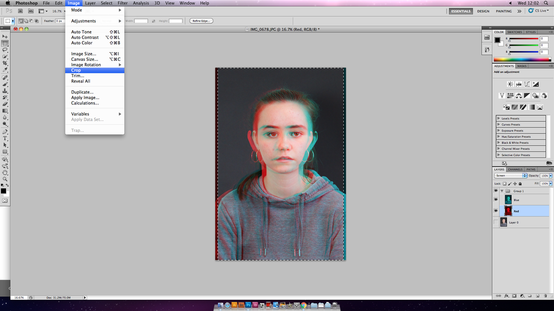
i then cropped the image for a second time.
|

Process of development
My FINAL PIECE
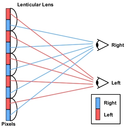
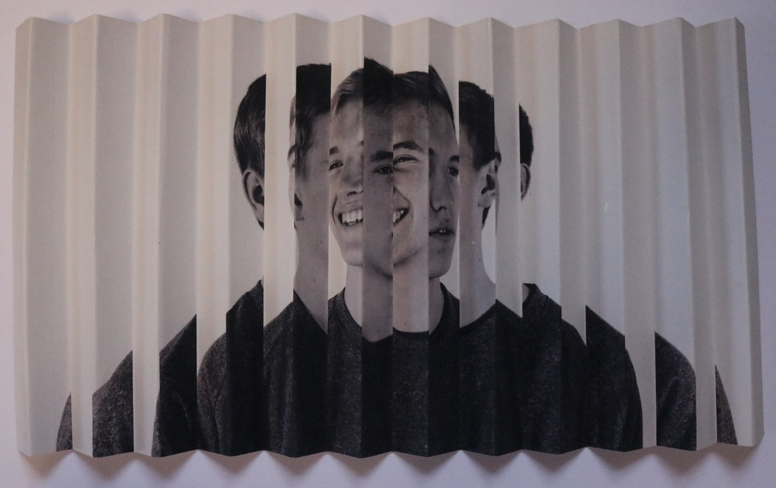
for my final piece I'm going to CREATE A pair OF LENTICULARS. A LENTICULAR IS AN IMAGE THAT APPEARS DIFFERENTLY DEPENDING ON HOW YOU LOOK AT IT. LENTICULAR'S USUALLY REQUIRE A SPECIAL PLASTIC SHEET CONSISTING OF MANY TINY CONVEX LENSES, BUT I'm going to MAKE A SIMPLE ONE WITH JUST TWO PHOTOS AND SOME PAPER. this pair of lenticulars will represent different mental illnesses.
|
As you can see in the diagram two seperate photographs are used (red and Blue) and depending on the angle the lenticular is viewed at the image seen by the viewer will change from the red photograph to the blue photograph.
|
i'm going to present my final piece as both a physical piece and i'm also going to create a gif panning round each piece in order to present an online copy as well.
artist inspiration
Patrick Hughes
Patrick Hughes is an artist that creates Reverspectives. these are three-dimensional paintings that when viewed from the front initially give the impression of viewing a painted flat surface that shows a perspective view. However as soon as the viewer moves their head even slightly the three dimensional surface that supports the perspective view accentuates the depth of the image and accelerates the shifting perspective far more than the brain normally allows. although clearly I am not creating reverspectives. Hughes and his work made me think about how I could using the third dimension in order to a change the perspective within my work. from this idea I did some research and came across LENTICULARS.
example work of Patrick Hughes
experimental 1st attempt
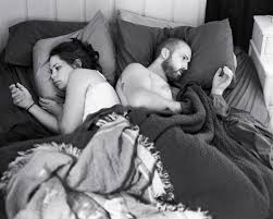
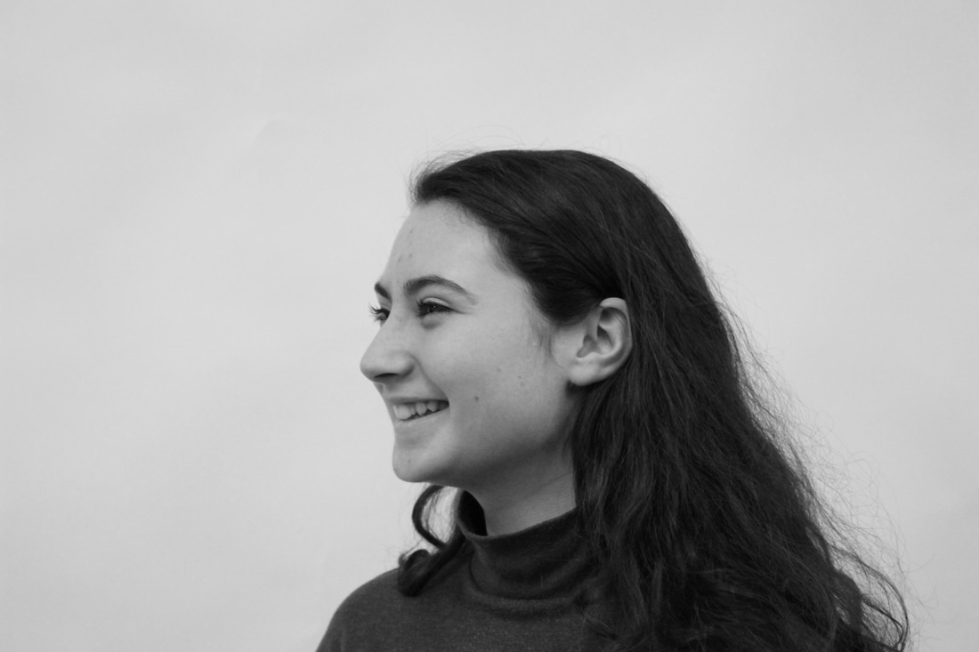
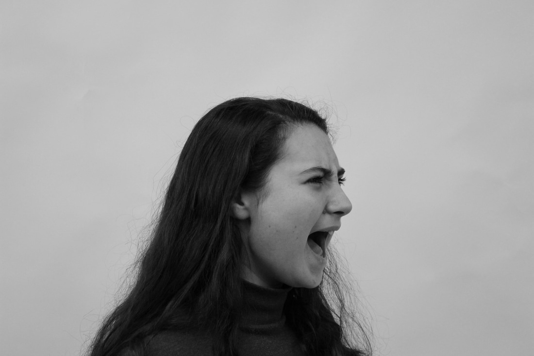
for my 1st attempt i took two photogaphs of the same person. this one is representing the mental illness of bipolar disorder. Bipolar disorder, also known as manic depression, is a mental disorder with periods of depression and periods of elevated mood. The elevated mood is significant and is known as mania or hypomania, depending on its severity, or whether symptoms of psychosis are present. During mania, an individual behaves or feels abnormally energetic, happy or irritable. Individuals often make poorly thought out decisions with little regard to the consequences. The need for sleep is usually reduced during manic phases. During periods of depression there may be crying, a negative outlook on life, and poor eye contact with others. the risk of suicide among those with the illness is high at greater than 6 percent over 20 years, while self-harm occurs in 30–40 percent.
i'm presenting this in my work. in one photograph they are shown to have extreme happiness, in the second photograph they are shown to be in saddness or anger. i then put both of these photographs in black and white using photoshop.
these are the two photographs:
i'm presenting this in my work. in one photograph they are shown to have extreme happiness, in the second photograph they are shown to be in saddness or anger. i then put both of these photographs in black and white using photoshop.
these are the two photographs:
|
|
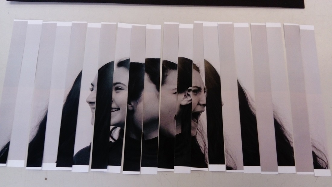
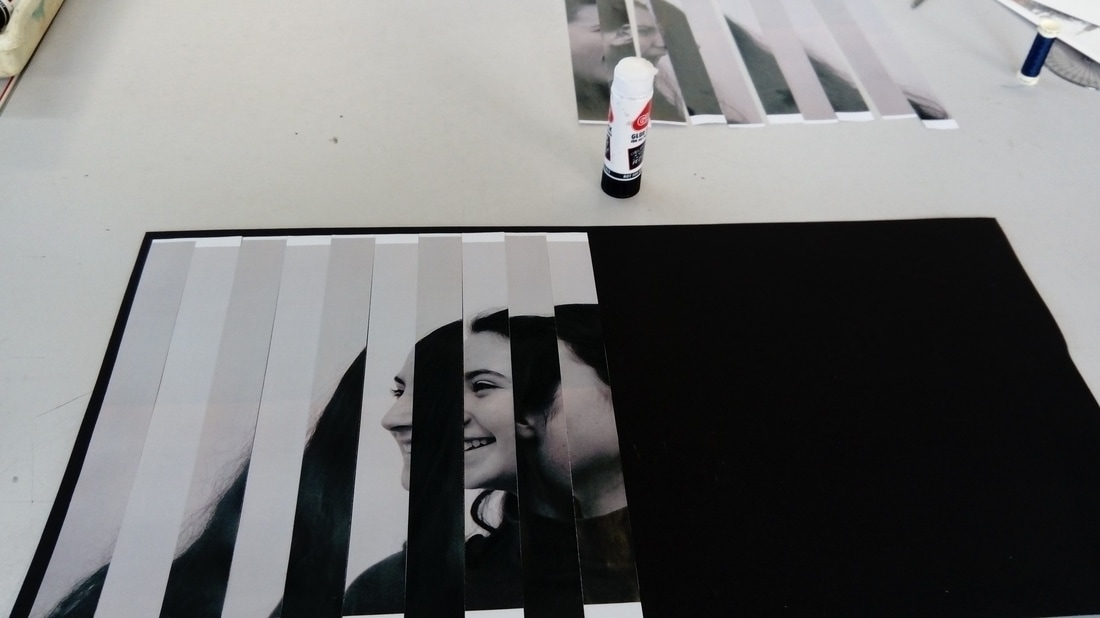
their are two possible methods i could use to create my series of lenticulars. one way is two print off both the photographs and measure equal strips and cut the two photographs into those strips. i would then stick these strips, alternating between photographs, on a piece of thick card. i would then fold the card to create the lenicular effect. the second way is to darg both the photogaphs into photoshop and then cut them into strips and form the collage on photoshop. i would then print this off onto card and then i'd fold the card in the zig zag pattern. i've decided for my experimental attempt i will attempt both methods to see which is more effective as then choose that method to do for the final series of lenticulars.
1st Method
(STICK AND PASTE)
|
|
|
i printed out the 2 photographs and cut them into equal strips. i then layed them out in the correct order.
|
i then stuck these strips onto thick black card, which i then folded.
|
|
|
|
|
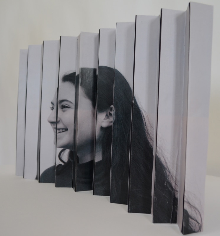
this was taken from the right hand side and shows the elevated mood in bipolar.
|
this is the folded piece taken from straight in front of it.
|
THIS WAS TAKEN FROM THE left HAND SIDE AND SHOWS THE depression side of BIPOLAR.
|
2nd method
(photoshop)

|
|
|
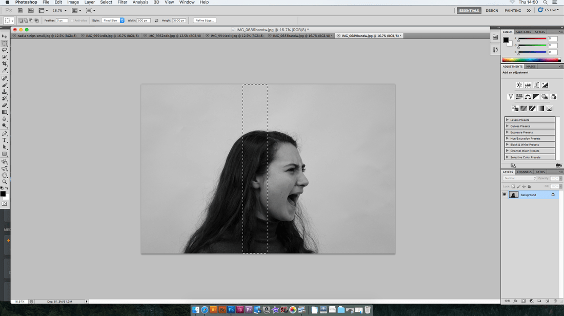
i changed the slection tool so it selected a certain area (500 pixels x 3500 pixels).
|
i did this on both photographs add added them to a new canvis.
|
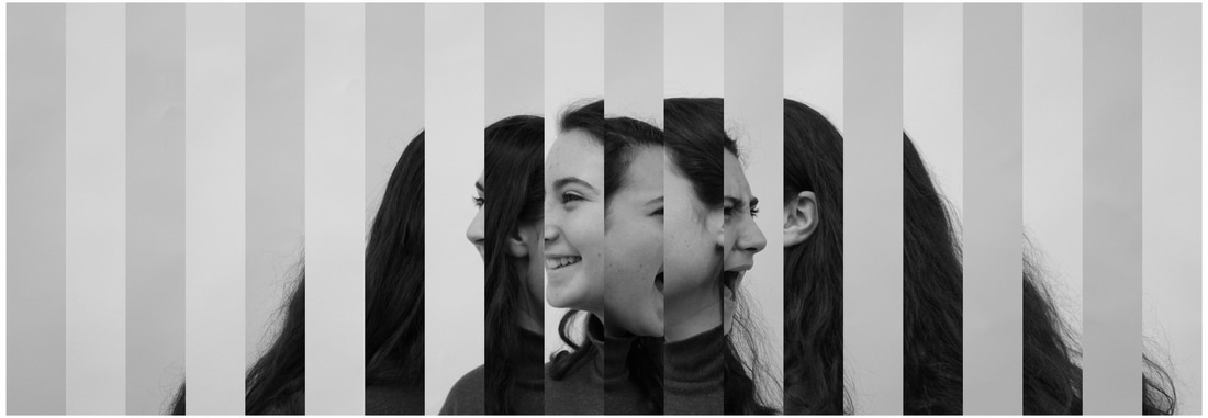
this is the final edit. i printed this out and folded it into a concertinner.
|
|
|
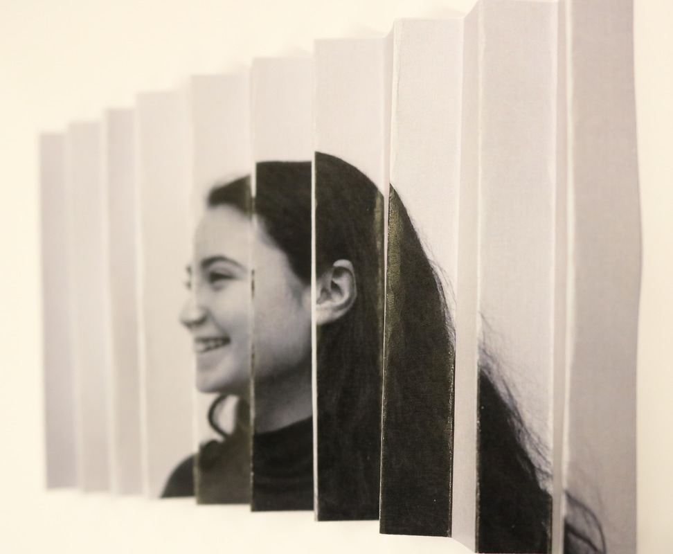
|
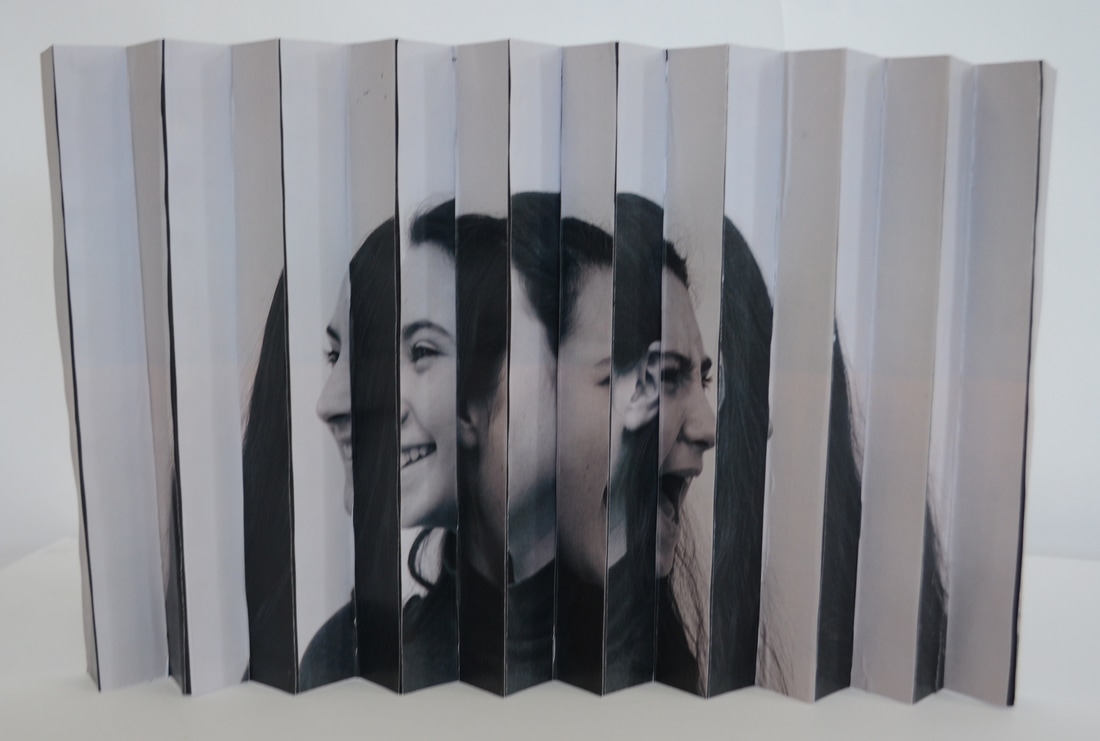
this angle shows THE ELEVATED MOOD KNOWN AS MANIA OR HYPOMANIA.
|
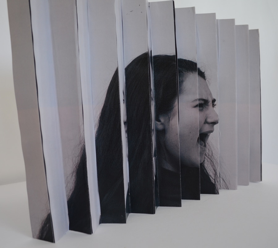
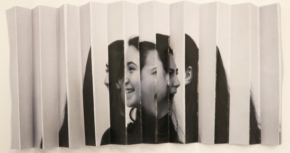
i folded the edit back and forth. this photograph is taken from right in front of it.
|
the angle shows the depressive mood of bipolar.
|
Conclusion: after doing this one as a first attempt i think i will do the photoshop method for my final two although i like the effect they both give and the idea works with both pieces, i found the photoshop method was quicker and more precise and that's why i'm going to continue with it.
a series of LENTICULARs
for my final piece i'm going to produce a pair of lenticulars. each one will represent a different mental illness and their impacts they have on people.
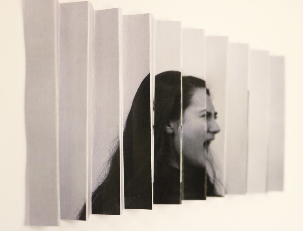
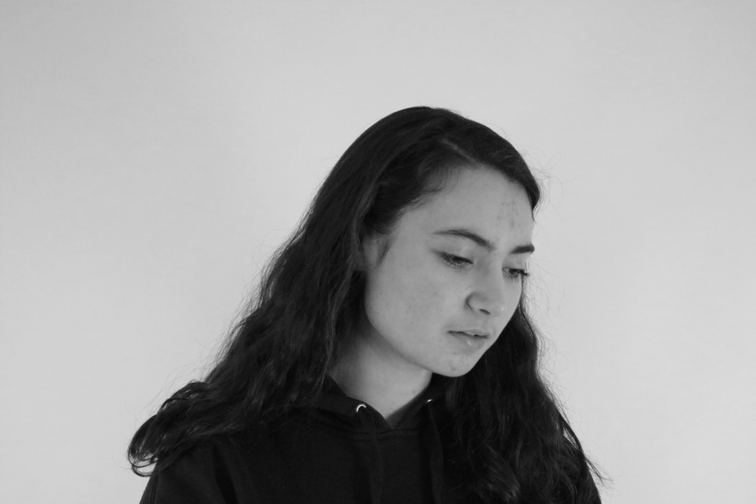
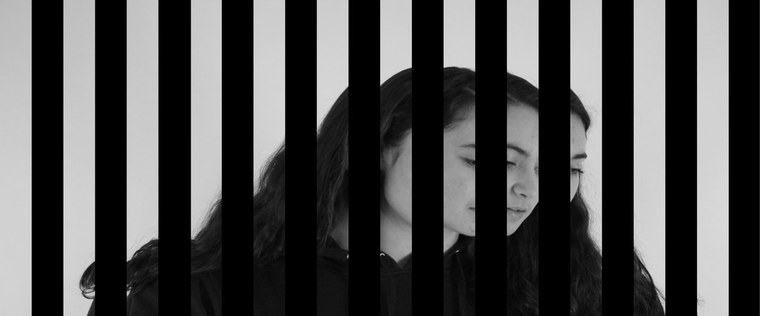
suicidal depression
my idea for this lenticular is to have one photograph with a person looking sad representing the depression. the other photograph will be plain black; this is open to interpretation by the viewer but it can represent them losing control of their mind, them feeling like they are no longer their and finally it could mean they've committed suicde so are physically no longer there.

i adjusted both the brightness and contrast.
|

i then made the photograph black and white so the colour doesn't subtract from the emotion.
|
|

|
photoshop edit.
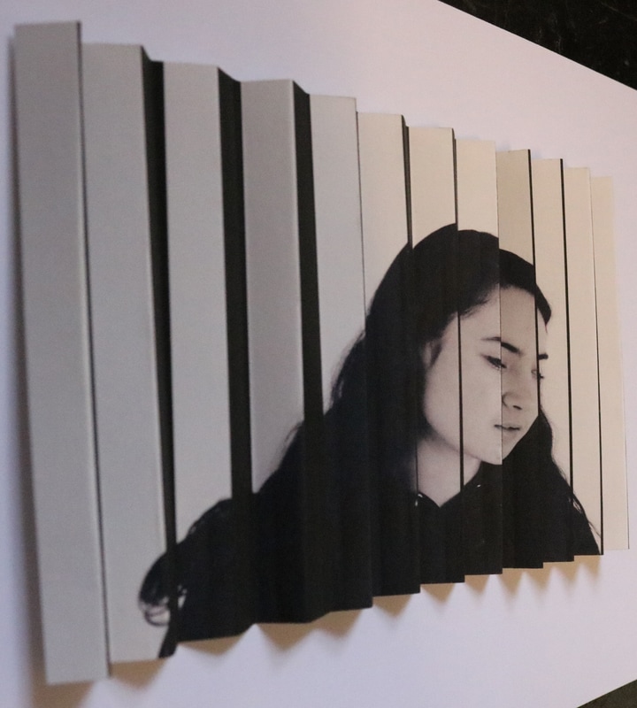
practice
before i did the bigger version i printed a smaller version on thick A4 paper in order to see if the effect works with the two images i had chosen. i think it was successful.
|
|
|
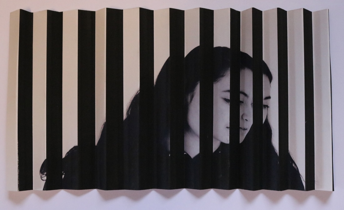
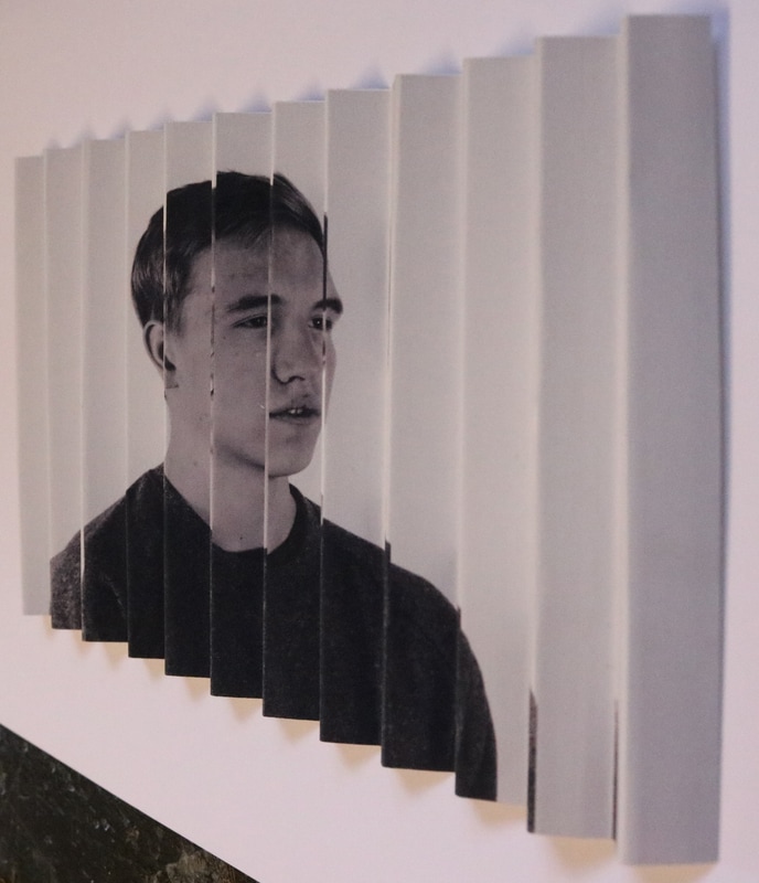
bipolar
BIPOLAR DISORDER, ALSO KNOWN AS MANIC DEPRESSION, IS A MENTAL DISORDER WITH PERIODS OF DEPRESSION AND PERIODS OF ELEVATED MOOD. THE ELEVATED MOOD IS SIGNIFICANT AND IS KNOWN AS MANIA OR HYPOMANIA, DEPENDING ON ITS SEVERITY, OR WHETHER SYMPTOMS OF PSYCHOSIS ARE PRESENT. DURING MANIA, AN INDIVIDUAL BEHAVES OR FEELS ABNORMALLY ENERGETIC, HAPPY OR IRRITABLE. INDIVIDUALS OFTEN MAKE POORLY THOUGHT OUT DECISIONS WITH LITTLE REGARD TO THE CONSEQUENCES. THE NEED FOR SLEEP IS USUALLY REDUCED DURING MANIC PHASES. DURING PERIODS OF DEPRESSION THERE MAY BE CRYING, A NEGATIVE OUTLOOK ON LIFE, AND POOR EYE CONTACT WITH OTHERS. THE RISK OF SUICIDE AMONG THOSE WITH THE ILLNESS IS HIGH AT GREATER THAN 6 PERCENT OVER 20 YEARS, WHILE SELF-HARM OCCURS IN 30–40 PERCENT.
this photograph depics THE ELEVATED MOOD.
|

this photograph shows the depression side.
|

photoshop edit.
practice
BEFORE I DID THE BIGGER VERSION I PRINTED A SMALLER VERSION ON THICK A4 PAPER IN ORDER TO SEE IF THE EFFECT WORKS WITH THE TWO IMAGES I HAD CHOSEN. I THINK IT WAS SUCCESSFUL.

THIS ANGLE SHOWS THE ELEVATED MOOD KNOWN AS MANIA OR HYPOMANIA.
|
I FOLDED THE EDIT BACK AND FORTH. THIS PHOTOGRAPH IS TAKEN FROM RIGHT IN FRONT OF IT.
|
THE ANGLE SHOWS THE DEPRESSIVE MOOD OF BIPOLAR.
|
filming
In order to show my work fully i'm going to film a pan view of my LENTICULARs. this way someone looking at my work online can experience the art even though they can't physically move around it. in order to ensure my video is more steady i will use a stroboframe as i pan around the work, hopefully this will make the work easier to understand and experience.
here is a practice filming of what i will do for my two final pieces:
Final Piece Draft Pan Video from Nat Hodge on Vimeo.
Mounting
i'm going to present my final piece on mount board. i will get an a1 mount board and then i will get the pieces professionally printed in a1. i will score the mount board on alternate sides at the width as the strips on the print. i will then cut the strips from my print and, using mount spray, attach the strips onto the mount board.
